Session 03 - HTML Forms & Tables, Introduction to CSS
Harvard Extension School
Fall 2021
Course Web Site: https://cscie12.dce.harvard.edu/
Topics
- Markup Recap
- Accessibility
- Forms - Basic
- Accessibility: Label Element
- HTML5 forms
- Tables
- Accessibilty of Tables
- Presentation - Cascading Style Sheets (CSS)
- CSS Mechanics - rules and selectors
- Basic Selectors - elements, class, id
- CSS Properties and Values
- Box Model or Block Model
- display property
- Tools: Your Browser
Presentation contains 79 slides
Markup Recap
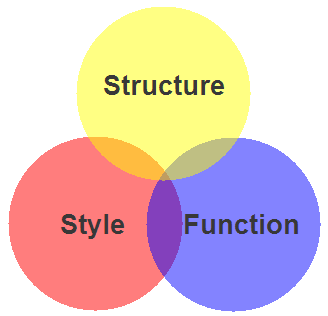
- HTML5 — Structure / Markup
- Structure
- Content
- CSS — Style / Presentation
- Style
- Presentation
- Appearance
- Javascript — Function
- Actions
- Manipulations
Components of HTML Elements
Markup for a Hypertext link:
<a href="http://www.harvard.edu/">Harvard</a>How it would render in a web browser:
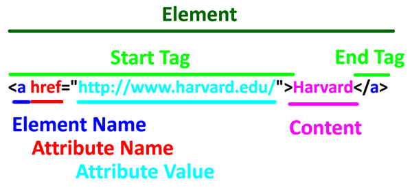
Start Tag<a href="http://www.harvard.edu/">Harvard</a>
Element Name<a href="http://www.harvard.edu/">Harvard</a>
Attribute<a href="http://www.harvard.edu/">Harvard</a>
Attribute Value <a href="http://www.harvard.edu/">Harvard</a>
Content <a href="http://www.harvard.edu/">Harvard</a>
End Tag <a href="http://www.harvard.edu/">Harvard</a>
Essential HTML5 Document Structure
<!DOCTYPE html>
<html lang="en">
  <head>
    <meta charset="utf-8" />
    <title>Document Title</title>
  </head>
  <body>
    <header><!-- page header --></header>
    <main><!-- main content of page --></main>
    <footer><!-- page footer --></footer>
  </body>
</html>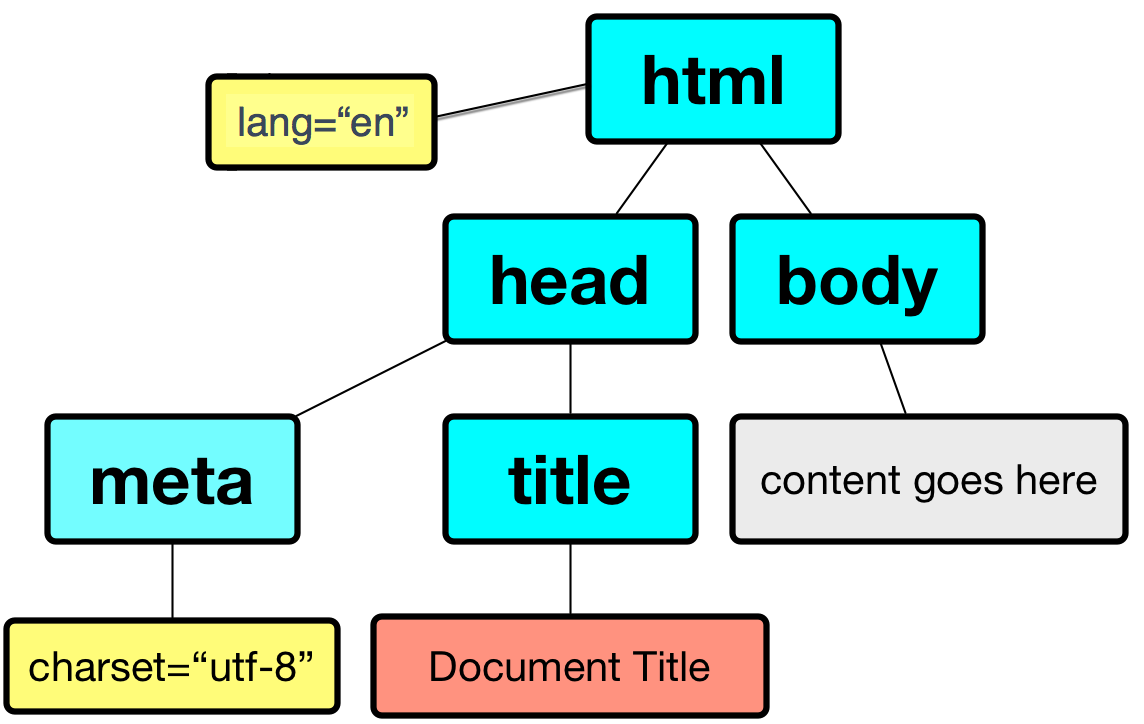
- html
- head
- meta
- title
- body
- head
Accessibility
W3C: Web Accessibility Initiative
Strategies, standards, and supporting resources to make the Web accessible to people with disabilities.
WebAIM
Forms - Basic
Two elements for forms are in our list of most commonly seen elements:
forminputbutton
Forms
Forms are the "front-end" for the HTTP Client to send information back to the HTTP Server. The submitted information is passed from the HTTP Server to a server-side program that processes the information and produces a response for the browser.
Forms
- Text
- Single line (text input)
- Password
- Text area (textarea)
- Choices
- Choose one
- radio group
- option list (menu)
- Choose multiple
- checkbox group
- Choose one
- File Upload
- Hidden
- Submit
Forms
form
- method ("get" or "post")
- action (URL of server-side program to process submitted data/information)
While exploring forms, it is useful to use a simple server-side script that simply echo back the name/value information your form submitted (https://cs12.net/form/submit.php).
 <form method="post" action="https://cs12.net/form/submit.php">Email Address:
   <input type="text" name="email"/>

   <br/>

   <button type="submit">Submit   </button>
</form>HTTP Method: Get vs. Post
- Use POST when form action should not be repeated; or when the action "changes the state"
- Use GET when form action is safely repeatable; when the action does not change the state.
The technical term for this is "idempotent".
- Query String
https://host/path?param1=value1¶m2=value2¶m3=value3- Question mark
- Ampersand separated parameter/value pairs
- parameter=value
 <form method="get" action="https://cs12.net/form/submit.php">Email Address:
   <input type="text" name="email"/>

   <br/>

   <button type="submit">Submit   </button>
 </form>
 <form method="post" action="https://cs12.net/form/submit.php">Email Address:
   <input type="text" name="email"/>

   <br/>

   <button type="submit">Submit   </button>
</form>Text Field
 <form method="get" action="https://cs12.net/form/submit.php">Email Address:
   <input type="text" name="email" size="50"/>

   <br/>
Year of Birth:
   <input type="text" name="year_of_birth" maxlength="4"/>

   <br/>

   <button type="submit">Submit Information   </button>
</form>Radio Buttons
 <form method="get" action="https://cs12.net/form/submit.php">Email Address:
   <input type="text" name="email" size="50"/>

   <br/>
Please send me email updates:
   <br/>

   <input type="radio" name="sendupdates" value="yes" checked="checked"/>
yes
   <br/>

   <input type="radio" name="sendupdates" value="no"/>
no
   <br/>

   <button type="submit">Submit Information   </button>
</form>Checkbox
 <form method="get" action="https://cs12.net/form/submit.php">What ice cream do you like?
   <br/>

   <input type="checkbox" name="icecream" value="chocolate"/>
Chocolate
   <br/>

   <input type="checkbox" name="icecream" value="chocolate peanut butter"/>
Chocolate Peanut Butter
   <br/>

   <input type="checkbox" name="icecream" value="vanilla"/>
Vanilla
   <br/>

   <input type="checkbox" name="icecream" value="strawberry"/>
Strawberry
   <br/>

   <button type="submit">Submit Information   </button>
</form>Textarea
 <form method="post" action="https://cs12.net/form/submit.php">
   <strong>Comments   </strong>
   <br/>

   <textarea name="comments" rows="10" cols="50">Please enter comments...   </textarea>
   <br/>

   <button type="submit">Submit Information   </button>
</form>Select and Option
Pull-down menu
 <form method="get" action="https://cs12.net/form/submit.php">Select your favorite New England states:
   <br/>

   <select name="state">
     <option value="CT">Connecticut     </option>
     <option value="ME">Maine     </option>
     <option value="MA">Massachusetts     </option>
     <option value="NH">New Hampshire     </option>
     <option value="RI">Rhode Island     </option>
     <option value="VT">Vermont     </option>   </select>
   <br/>

   <button type="submit">Submit Information   </button>
</form>Scrollable list ← DON'T DO THIS!
Note: because scrollable lists are difficult for users, they are not typically used.
A scrollable list (size attribute) that can have multiple selections (multiple attribute):
 <form method="get" action="https://cs12.net/form/submit.php">Select your favorite New England states:
   <br/>

   <select name="state" size="3" multiple="multiple">
     <option value="CT">Connecticut     </option>
     <option value="ME">Maine     </option>
     <option value="MA">Massachusetts     </option>
     <option value="NH">New Hampshire     </option>
     <option value="RI">Rhode Island     </option>
     <option value="VT">Vermont     </option>   </select>
   <br/>

   <button type="submit">Submit Information   </button>
</form>Accessibility: Label Element
Label elements are critical for form accessibility.
label element lets us use markup to associate text with an input element.
Using label you can make the association between the text label and the form input explicit, and not just rely on the visual proximity.
Labels - Why?
- Makes text labels associated wtih input elements explicit
- Helps with screen readers!
- Helps with "clicks" and touch screens!
Accessibility: Label Element
 <form method="get" action="https://cs12.net/form/submit.php">
   <p>Do you like to watch NCAA basketball?
   </p>
   <label>
     <input type="radio" name="basketball" value="Y"/>
Yes   </label>
   <br/>

   <label>
     <input type="radio" name="basketball" value="N"/>
No   </label>
   <br/>

   <button type="submit">Submit   </button>
</form>Label Element - using id, label, for
- Explicit
- id attribute for form input
- label element for input label
- for attribute in label to link label element with input via the value of id
 <form method="get" action="https://cs12.net/form/submit.php">
   <p>Do you like to watch NCAA basketball?
   </p>
   <input type="radio" name="basketball" id="basketball_y" value="Y"/>

   <label for="basketball_y">Yes   </label>
   <br/>

   <input type="radio" name="basketball" id="basketball_n" value="N"/>

   <label for="basketball_n">No   </label>
   <br/>

   <input type="submit" value="Submit"/>

 </form>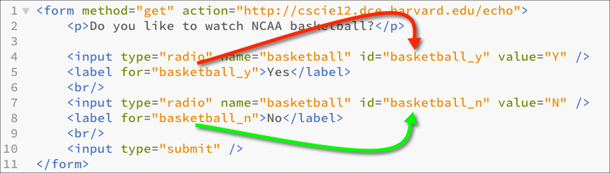
Labels
 <form method="get" action="https://cs12.net/form/submit.php">
   <div>What ice cream do you like?
     <br/>

     <input type="checkbox" name="icecream" id="icecream_chocolate" value="chocolate"/>

     <label for="icecream_chocolate">Chocolate     </label>
     <br/>

     <input type="checkbox" name="icecream" id="icecream_cpb" value="chocolate peanut butter"/>

     <label for="icecream_cpb">Chocolate Peanut Butter     </label>
     <br/>

     <input type="checkbox" name="icecream" id="icecream_vanilla" value="vanilla"/>

     <label for="icecream_vanilla">Vanilla     </label>
     <br/>

     <input type="checkbox" name="icecream" id="icecream_strawberry" value="strawberry"/>

     <label for="icecream_strawberry">Strawberry     </label>
     <br/>

     <button type="submit">Submit Information     </button>
   </div>
</form>fieldset and legend
Used to group related choices and even sets.
fieldset and legend elements can further help group related input fields.
 <form method="get" action="https://cs12.net/form/submit.php">
   <div>
     <fieldset>
       <legend>Name       </legend>
       <label for="fname">First Name       </label>
       <input type="text" name="fname" id="fname" size="30"/>

       <br/>

       <label for="lname">Last Name       </label>
       <input type="text" name="lname" id="lname" size="30"/>

       <br/>
     </fieldset>
     <fieldset>
       <legend>Sports       </legend>
       <fieldset>
         <legend>Do you like basketball?         </legend>
         <input type="radio" name="basketball" id="basketball_yes" value="Y"/>

         <label for="basketball_yes">Yes         </label>
         <br/>

         <input type="radio" name="basketball" id="basketball_no" value="N"/>

         <label for="basketball_no">No         </label>       </fieldset>
       <fieldset>
         <legend>Do you like baseball?         </legend>
         <input type="radio" name="baseball" id="baseball_yes" value="Y"/>

         <label for="baseball_yes">Yes         </label>
         <br/>

         <input type="radio" name="baseball" id="baseball_no" value="N"/>

         <label for="baseball_no">No         </label>       </fieldset>     </fieldset>
     <input type="submit" value="Submit"/>

   </div>
</form>optgroup
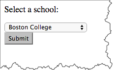
The optgroup element allows you to group a long select list.
 <p>Select a school:
 </p>
 <form method="get" action="https://cs12.net/form/submit.php">
   <select name="school">
     <optgroup label="ACC">
       <option>Boston College       </option>
       <option>Clemson       </option>
       <option>Duke       </option>
       <option>Florida State       </option>
       <option>Georgia Tech       </option>
       <option>Louiville       </option>
       <option>Miami       </option>
       <option>North Carolina       </option>
       <option>North Carolina State       </option>
       <option>Notre Dame       </option>
       <option>Pitt       </option>
       <option>Syracuse       </option>
       <option>Virginia       </option>
       <option>Virginia Tech       </option>
       <option>Wake Forest       </option>     </optgroup>
     <optgroup label="Big 10">
       <option>Illinois       </option>
       <option>Indiana       </option>
       <option>Iowa       </option>
       <option>Maryland       </option>
       <option>Michigan       </option>
       <option>Michigan State       </option>
       <option>Minnesota       </option>
       <option>Nebraska       </option>
       <option>Northwestern       </option>
       <option>Ohio State       </option>
       <option>Penn State       </option>
       <option>Purdue       </option>
       <option>Rutgers       </option>
       <option>Wisconsin       </option>     </optgroup>
     <optgroup label="Big XII">
       <option>Baylor       </option>
       <option>Iowa State       </option>
       <option>Kansas       </option>
       <option>Kansas State       </option>
       <option>Oklahoma       </option>
       <option>Oklahoma State       </option>
       <option>Texas       </option>
       <option>Texas Christian       </option>
       <option>Texas Tech       </option>
       <option>West Virginia       </option>     </optgroup>
     <optgroup label="Ivy League">
       <option>Brown       </option>
       <option>Columbia       </option>
       <option>Cornell       </option>
       <option>Dartmouth       </option>
       <option>Harvard       </option>
       <option>Penn       </option>
       <option>Princeton       </option>
       <option>Yale       </option>     </optgroup>
     <optgroup label="Pac 12">
       <option>Arizona       </option>
       <option>Arizona State       </option>
       <option>California       </option>
       <option>Colorado       </option>
       <option>Oregon       </option>
       <option>Oregon State       </option>
       <option>Stanford       </option>
       <option>UCLA       </option>
       <option>USC       </option>
       <option>Utah       </option>
       <option>Washington       </option>
       <option>Washington State       </option>     </optgroup>   </select>
   <div>
     <button type="submit">Submit     </button>
   </div>
 </form>
Select a school:
HTML5 forms
- HTML5 - Forms (HTML Living Standard)
- MDN: The form <input> element
HTML5 forms - placeholder, autofocus, and specific input types
- HTML5 Form Example
- placeholder text
- autofocus
- input types for
- url
- number
- range
- date and time
HTML5: Placeholder

Placeholder text can:
- Provide instructions
- Show format
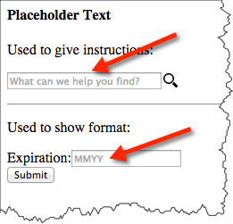
 <h4>Placeholder Text </h4>
 <p>Used to give instructions:
 </p>
 <form action="https://cs12.net/form/submit.php" method="post">
   <input size="30" name="search" type="text" placeholder="What can we help you find?"/>

   <input class="searchSubmit" value="Search" type="submit"/>

 </form>
 <hr/>

 <p>Used to show format:
 </p>
 <form action="https://cs12.net/form/submit.php" method="post">
   <p>
     <label for="expiration">Expiration:     </label>
     <input id="expiration" name="expiration" type="text" placeholder="MMYY"/>

     <br/>

     <button type="submit">Submit     </button>
   </p>
 </form>
In style
element
(<style>) within head element:
input.searchSubmit {
    background: url('./images/magnifier12.png') no-repeat;
    width: 16px;
    height: 16px;
    border: none;
    margin-left: 2px;
    text-indent: -9999em;}
Placeholder Text
Used to give instructions:
Used to show format:
HTML5: Autofocus
Autofocus will bring the "focus" of the cursor to that field when the page loads. Typically, you would bring focus to the first input field of the form.
<input type="text" autofocus name="q">
 <form action="https://cs12.net/form/submit.php" method="post">
   <fieldset>
     <legend>Autofocus     </legend>
     <p>The following field should "autofocus":
     </p>
     <p>Name:
       <input size="50" name="name" type="text" autofocus="autofocus"/>

     </p>   </fieldset>
   <p>
     <button type="submit">Submit     </button>
   </p>
 </form>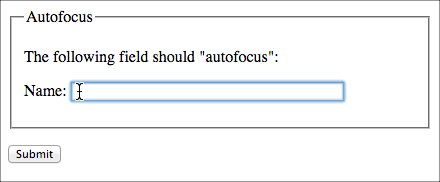
HTML5: email and url
On handheld devices, screen keyboard is optimized for input.
type="email"
 <form action="https://cs12.net/form/submit.php" method="post">
   <fieldset>
     <legend>Email     </legend>
     <p>Email:
       <input type="email" name="email_address" size="50"/>

     </p>   </fieldset>
   <p>
     <button type="submit">Submit     </button>
   </p>
 </form>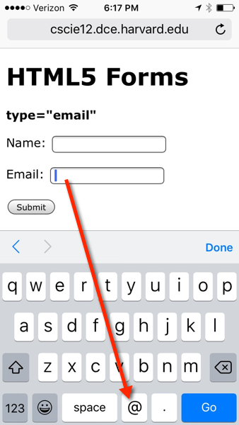
type="url"
 <form action="https://cs12.net/form/submit.php" method="post">
   <fieldset>
     <legend>URL     </legend>
     <p>URL:
       <input type="url" name="url" size="50"/>

     </p>   </fieldset>
   <p>
     <button type="submit">Submit     </button>
   </p>
 </form>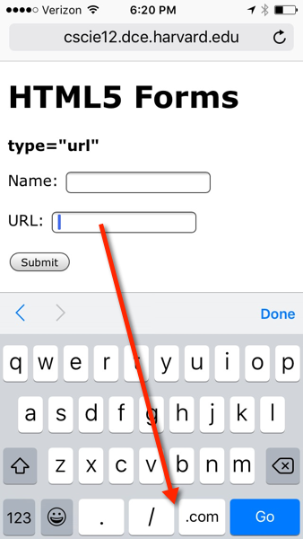
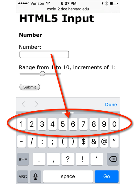
HTML5: number and range
 <form action="https://cs12.net/form/submit.php" method="post">
   <p>Number:
     <br/>

     <input type="number" name="n"/>

   </p>
   <p>Range from 1 to 10, increments of 1:
     <br/>

     <input type="range" min="1" max="10" step="1" name="r"/>

   </p>
   <p>
     <button type="submit">Submit     </button>
   </p>
 </form>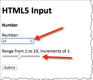
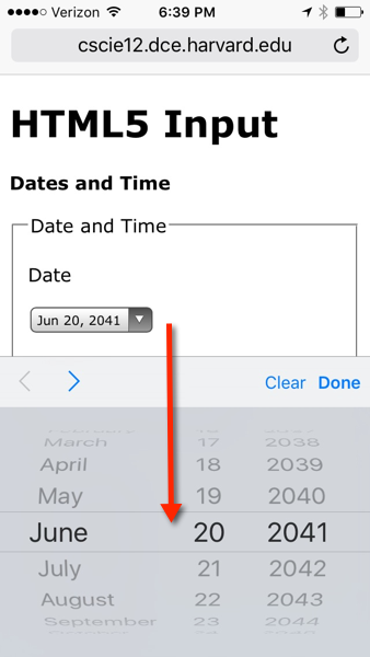
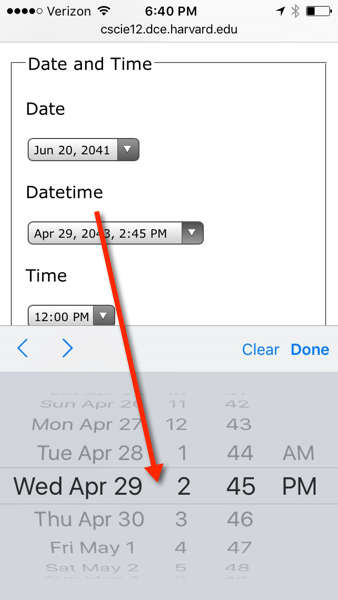
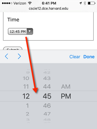
HTML5: date and time
 <form action="https://cs12.net/form/submit.php" method="post">
   <fieldset>
     <legend>Date and Time     </legend>
     <p>Date
     </p>
     <p>
       <input type="date" name="my_date"/>

     </p>
     <p>Datetime-local
     </p>
     <p>
       <input type="datetime-local" name="my_datetime"/>

     </p>
     <p>Time
     </p>
     <p>15 minute steps:
       <input type="time" name="my_time_15" step="900" value="12:00"/>

     </p>
     <p>1 minute steps:
       <input type="time" name="my_time_1" step="60" value="12:00"/>

     </p>
     <p>1 second steps:
       <input type="time" name="my_time_1s" step="1" value="12:00"/>

     </p>   </fieldset>
   <p>
     <button type="submit">Submit     </button>
   </p>
 </form>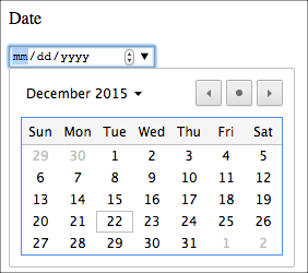
submit.php -- it can do more!
Tables
See: Tabular Data from HTML5 Specification
Uses of Tables
- Data
- Layout
Table Elements
table ,
caption ,
colgroup ,
col ,
tbody ,
thead ,
tfoot ,
tr ,
td ,
th
 <table>
   <caption>A table   </caption>
   <tr>
     <th>Column 1     </th>
     <th>Column 2     </th>
     <th>Column 3     </th>   </tr>
   <tr>
     <td>row 1 column 1     </td>
     <td>row 1 column 2     </td>
     <td>row 1 column 3     </td>   </tr>
   <tr>
     <td>row 2 column 1     </td>
     <td>row 2 column 2     </td>
     <td>row 2 column 3     </td>   </tr>
   <tr>
     <td>row 3 column 1     </td>
     <td>row 3 column 2     </td>
     <td>row 3 column 3     </td>   </tr>
</table>| Column 1 | Column 2 | Column 3 |
|---|---|---|
| row 1 column 1 | row 1 column 2 | row 1 column 3 |
| row 2 column 1 | row 2 column 2 | row 2 column 3 |
| row 3 column 1 | row 3 column 2 | row 3 column 3 |
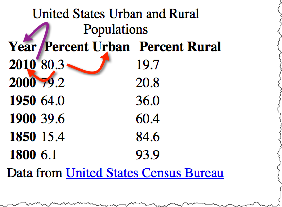
A Simple Table
Data from the US Census Bureau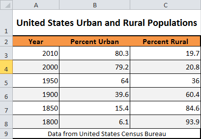
 <p>United States Urban and Rural Populations
 </p>
 <table>
   <tr>
     <td>Year     </td>
     <td>Percent Urban     </td>
     <td>Percent Rural     </td>   </tr>
   <tr>
     <th>2010     </th>
     <td>80.3     </td>
     <td>19.7     </td>   </tr>
   <tr>
     <th>2000     </th>
     <td>79.2     </td>
     <td>20.8     </td>   </tr>
   <tr>
     <th>1950     </th>
     <td>64.0     </td>
     <td>36.0     </td>   </tr>
   <tr>
     <th>1900     </th>
     <td>39.6     </td>
     <td>60.4     </td>   </tr>
   <tr>
     <th>1850     </th>
     <td>15.4     </td>
     <td>84.6     </td>   </tr>
   <tr>
     <th>1800     </th>
     <td>6.1     </td>
     <td>93.9     </td>   </tr>
 </table>
 <p>Data from
   <a href="http://www.census.gov/">United States Census Bureau   </a>
 </p>
United States Urban and Rural Populations
| Year | Percent Urban | Percent Rural |
| 2010 | 80.3 | 19.7 |
|---|---|---|
| 2000 | 79.2 | 20.8 |
| 1950 | 64.0 | 36.0 |
| 1900 | 39.6 | 60.4 |
| 1850 | 15.4 | 84.6 |
| 1800 | 6.1 | 93.9 |
Data from United States Census Bureau
Adding thead, tfoot, tbody, caption, and summary
 <table summary="This table shows the percentage of the United States population that lived in urban and rural areas from 1800 to 2000.">
   <caption>United States Urban and Rural Populations   </caption>
   <thead>
     <tr>
       <th>Year       </th>
       <th>Percent Urban       </th>
       <th>Percent Rural       </th>     </tr>   </thead>
   <tfoot>
     <tr>
       <td colspan="3">Data from
         <a href="http://www.census.gov/">United States Census Bureau         </a>       </td>     </tr>   </tfoot>
   <tbody>
     <tr>
       <th>2010       </th>
       <td>80.3       </td>
       <td>19.7       </td>     </tr>
     <tr>
       <th>2000       </th>
       <td>79.2       </td>
       <td>20.8       </td>     </tr>
     <tr>
       <th>1950       </th>
       <td>64.0       </td>
       <td>36.0       </td>     </tr>
     <tr>
       <th>1900       </th>
       <td>39.6       </td>
       <td>60.4       </td>     </tr>
     <tr>
       <th>1850       </th>
       <td>15.4       </td>
       <td>84.6       </td>     </tr>
     <tr>
       <th>1800       </th>
       <td>6.1       </td>
       <td>93.9       </td>     </tr>   </tbody>
</table>| Year | Percent Urban | Percent Rural |
|---|---|---|
| Data from United States Census Bureau | ||
| 2010 | 80.3 | 19.7 |
| 2000 | 79.2 | 20.8 |
| 1950 | 64.0 | 36.0 |
| 1900 | 39.6 | 60.4 |
| 1850 | 15.4 | 84.6 |
| 1800 | 6.1 | 93.9 |
Benefits of Semantics
Semantics lets us selectively manipulate parts of the table -- whether for style or function.
Using "col" and "colgroup"
col and colgroup elements can be used to as a way to apply styles (style or class attribute) to columns.
 <table>
   <caption>United States Urban and Rural Populations   </caption>
   <colgroup span="1">
     <col span="1" style="background-color: lightsalmon;"/>

     <col span="2" style="background-color: wheat;"/>
   </colgroup>
   <thead>
     <tr>
       <th scope="col">Year       </th>
       <th scope="col">Percent Urban       </th>
       <th scope="col">Percent Rural       </th>     </tr>   </thead>
   <tbody>
     <tr>
       <th scope="row">2010       </th>
       <td>80.3       </td>
       <td>19.7       </td>     </tr>
     <tr>
       <th scope="row">2000       </th>
       <td>79.2       </td>
       <td>20.8       </td>     </tr>
     <tr>
       <th scope="row">1950       </th>
       <td>64.0       </td>
       <td>36.0       </td>     </tr>
     <tr>
       <th scope="row">1900       </th>
       <td>39.6       </td>
       <td>60.4       </td>     </tr>
     <tr>
       <th scope="row">1850       </th>
       <td>15.4       </td>
       <td>84.6       </td>     </tr>
     <tr>
       <th scope="row">1800       </th>
       <td>6.1       </td>
       <td>93.9       </td>     </tr>   </tbody>
</table>| Year | Percent Urban | Percent Rural |
|---|---|---|
| 2010 | 80.3 | 19.7 |
| 2000 | 79.2 | 20.8 |
| 1950 | 64.0 | 36.0 |
| 1900 | 39.6 | 60.4 |
| 1850 | 15.4 | 84.6 |
| 1800 | 6.1 | 93.9 |
Accessibilty of Tables
Using "scope"
The "scope" attribute can be used to associate header information with columns and rows (and also column groups and row groups).
 <table>
   <caption>United States Urban and Rural Populations   </caption>
   <thead>
     <tr>
       <th scope="col">Year       </th>
       <th scope="col">Percent Urban       </th>
       <th scope="col">Percent Rural       </th>     </tr>   </thead>
   <tfoot>
     <tr>
       <td colspan="3">Data from
         <a href="http://www.census.gov/">United States Census Bureau         </a>       </td>     </tr>   </tfoot>
   <tbody>
     <tr>
       <th scope="row">2010       </th>
       <td>80.3       </td>
       <td>19.7       </td>     </tr>
     <tr>
       <th scope="row">2000       </th>
       <td>79.2       </td>
       <td>20.8       </td>     </tr>
     <tr>
       <th scope="row">1950       </th>
       <td>64.0       </td>
       <td>36.0       </td>     </tr>
     <tr>
       <th scope="row">1900       </th>
       <td>39.6       </td>
       <td>60.4       </td>     </tr>
     <tr>
       <th scope="row">1850       </th>
       <td>15.4       </td>
       <td>84.6       </td>     </tr>
     <tr>
       <th scope="row">1800       </th>
       <td>6.1       </td>
       <td>93.9       </td>     </tr>   </tbody>
</table>| Year | Percent Urban | Percent Rural |
|---|---|---|
| Data from United States Census Bureau | ||
| 2010 | 80.3 | 19.7 |
| 2000 | 79.2 | 20.8 |
| 1950 | 64.0 | 36.0 |
| 1900 | 39.6 | 60.4 |
| 1850 | 15.4 | 84.6 |
| 1800 | 6.1 | 93.9 |
Accessibility using "headers"
The "headers" attribute can also be used to associate header information with columns and rows. This is typically used in more complicated tables.
id attribute. Note the use of the "id" attribute. This is an attribute that can be applied to most any HTML element. Values for "id" must be unique throughout the document.
The value of "headers" is a space-separated list of IDREFS (references to "id" names in the document).
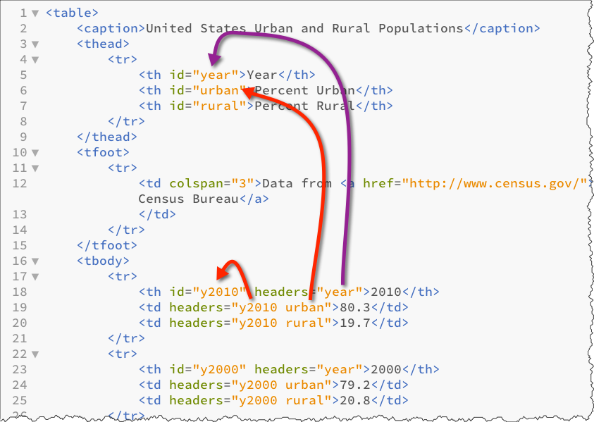
 <table>
   <caption>United States Urban and Rural Populations   </caption>
   <thead>
     <tr>
       <th id="year">Year       </th>
       <th id="urban">Percent Urban       </th>
       <th id="rural">Percent Rural       </th>     </tr>   </thead>
   <tfoot>
     <tr>
       <td colspan="3">Data from
         <a href="http://www.census.gov/">United States Census Bureau         </a>       </td>     </tr>   </tfoot>
   <tbody>
     <tr>
       <th id="y2010" headers="year">2010       </th>
       <td headers="y2010 urban">80.3       </td>
       <td headers="y2010 rural">19.7       </td>     </tr>
     <tr>
       <th id="y2000" headers="year">2000       </th>
       <td headers="y2000 urban">79.2       </td>
       <td headers="y2000 rural">20.8       </td>     </tr>
     <tr>
       <th id="y1950" headers="year">1950       </th>
       <td headers="y1950 urban">64.0       </td>
       <td headers="y1950 ruran">36.0       </td>     </tr>
     <tr>
       <th id="y1900" headers="year">1900       </th>
       <td headers="y1900 urban">39.6       </td>
       <td headers="y1900 rural">60.4       </td>     </tr>
     <tr>
       <th id="y1850" headers="year">1850       </th>
       <td headers="y1850 urban">15.4       </td>
       <td headers="y1850 rural">84.6       </td>     </tr>
     <tr>
       <th id="y1800" headers="year">1800       </th>
       <td headers="y1800 urban">6.1       </td>
       <td headers="y1800 rural">93.9       </td>     </tr>   </tbody>
</table>| Year | Percent Urban | Percent Rural |
|---|---|---|
| Data from United States Census Bureau | ||
| 2010 | 80.3 | 19.7 |
| 2000 | 79.2 | 20.8 |
| 1950 | 64.0 | 36.0 |
| 1900 | 39.6 | 60.4 |
| 1850 | 15.4 | 84.6 |
| 1800 | 6.1 | 93.9 |
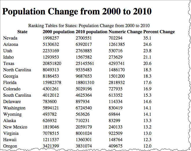
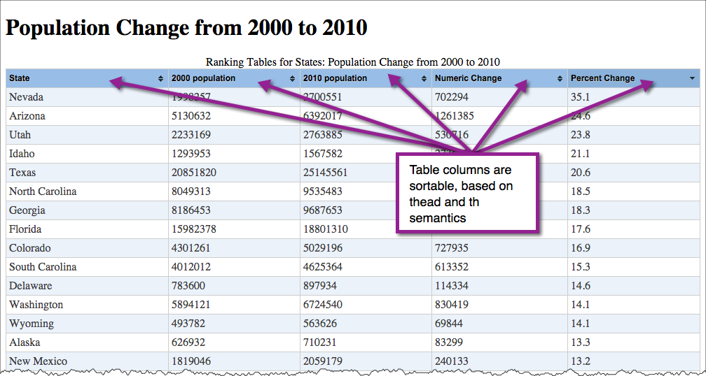
What can we do now that relationship is clear?
Once semantic markup is in place, adding function with JavaScript becomes much easier. For example, we can write some JavaScript to highlight the column/row headings based on the presence of scope or headers attributes.
Live Example of Table Highlighting
Presentation - Cascading Style Sheets (CSS)
Markup, Presentation, Function
Styles
The markup page references an external stylesheet document.
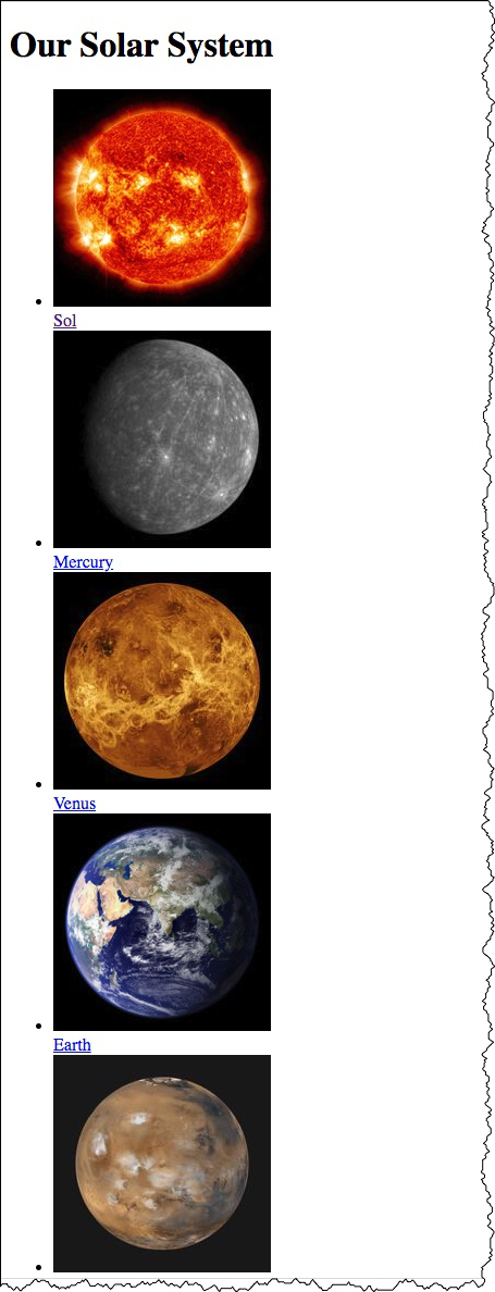
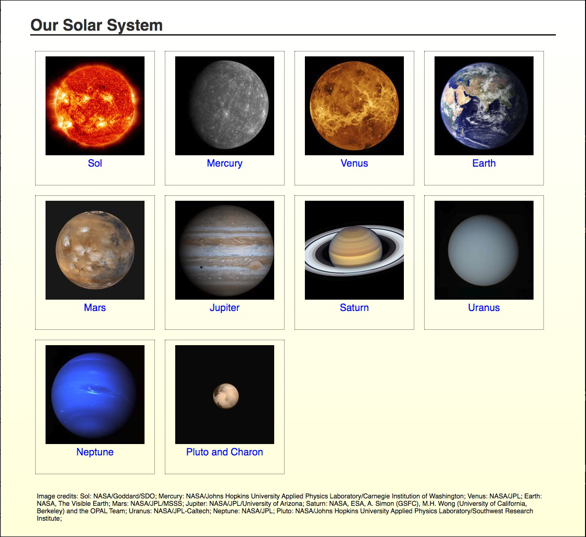
<!DOCTYPE html>
<html>
  <head>
    <title>Our Solar System</title>
    <!-- the link element is used to reference a stylesheet -->
    <link rel="stylesheet" href="styles/solarsystem.css" />
    ...cut...
The CSS file contains style rules for the document (solarsystem.css)
body {
margin-left: 5%;
margin-top: 2em;
margin-right: 5%;
background-image: linear-gradient(white, #ffffdd);
background-color: #ffffdd;
font-family: Calibri, Arial, sans-serif;
height: 100vh;
}
h1 {
font-family: Calibri, Arial, sans-serif;
color: #333333;
border-bottom: 3px solid #333333;
}
ul.gallery {
list-style: none;
padding: 0;
margin: 0;
display: flex;
flex-wrap: wrap;
justify-content: flex-start;
}
ul.gallery li {
margin-top: 1em;
font-size: 1.25em;
height: 250px;
width: 220px;
flex-basis: 1 0 auto;
text-align: center;
border: thin dotted #333333;
margin: 10px;
padding: 10px;
}
ul.gallery li img {
border: none;
}
footer {
clear: both;
margin-top: 2rem;
padding: 1em;
font-size: smaller;
}
a:link, a:visited {
text-decoration: none;
color: blue;
}
a:hover {
text-decoration: underline;
}
a:active {
border: none;
text-decoration: none;
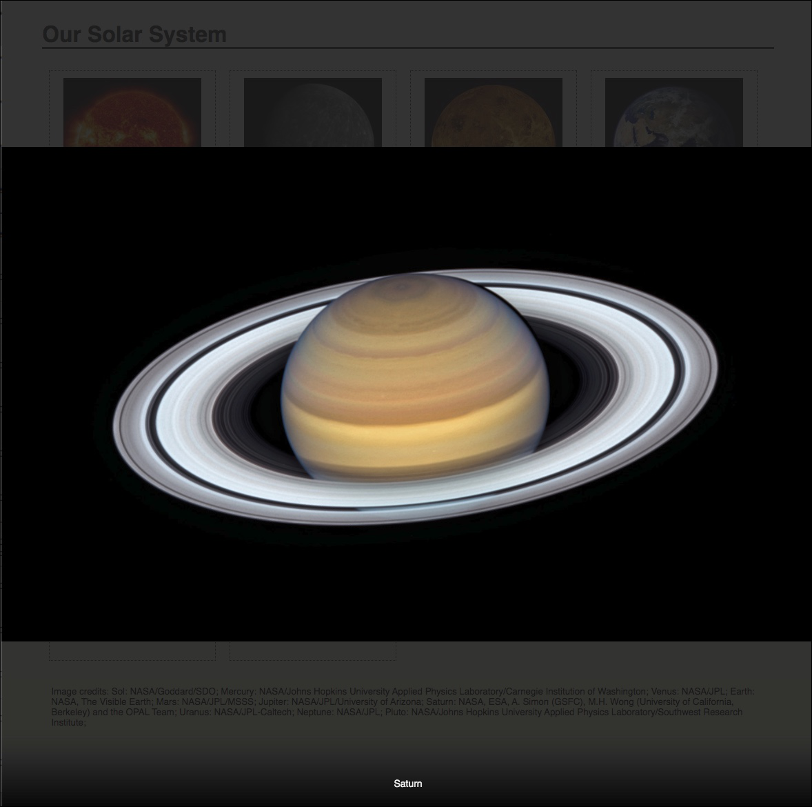
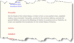
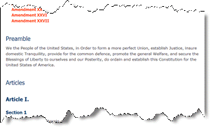
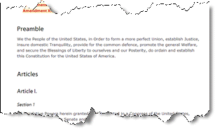
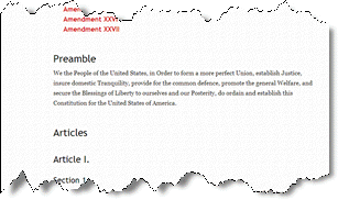
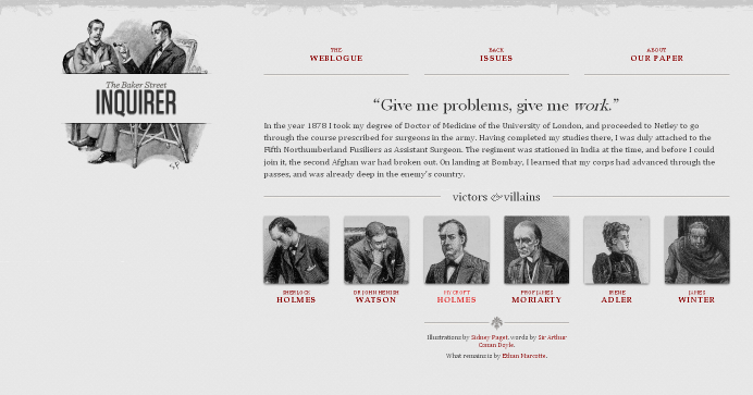
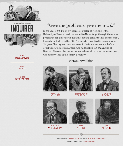
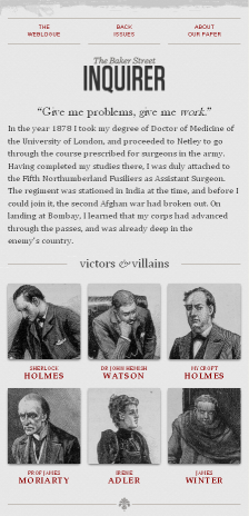
}Different Styles for The United States Constitution
- Chocolate Stylesheet
- Midnight Stylesheet
- Modernist Stylesheet
- Oldstyle Stylesheet
- Steely Stylesheet
- Swiss Stylesheet
- Traditional Stylesheet
- Ultramarine Stylesheet


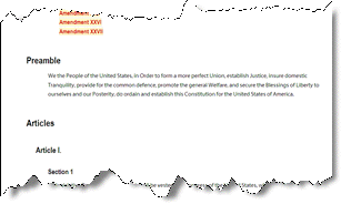

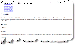
Harvard Summer School
Harvard Summer School 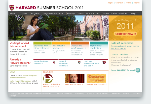 | With CSS disabled: 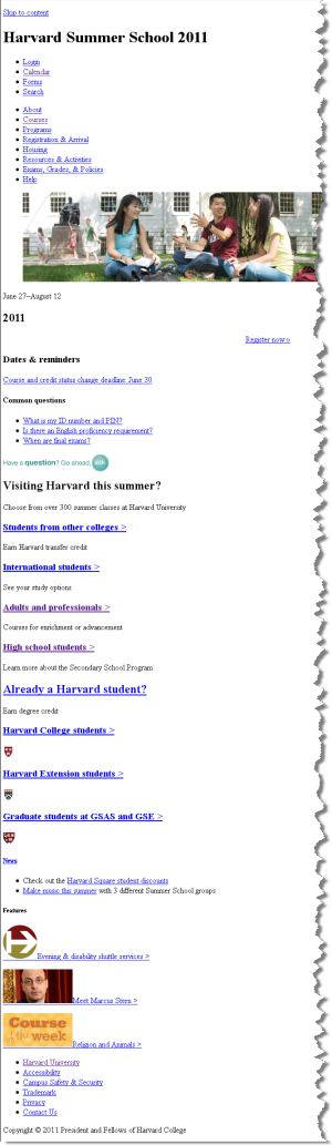 |
Responsive Web Design
CSS Recommendations from the W3C
Current CSS
- CSS Current Work (CSS level 3)
CSS Validator
Historical
CSS Mechanics - rules and selectors
- Rules
- Selectors
Anatomy of a CSS Rule
CSS Rule
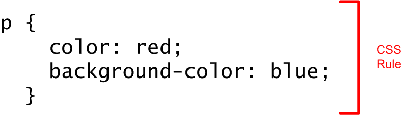
Selector and Declarations
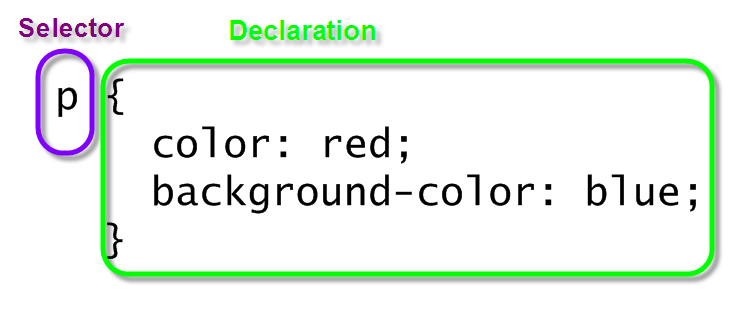
Properties and Values
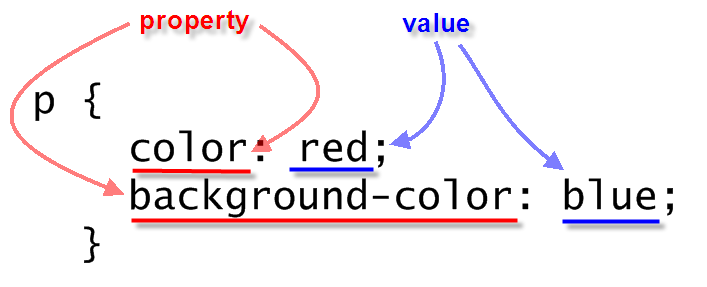
Simple CSS Example
 <p>Lorem ipsum dolor sit amet, consectetuer adipiscing elit. Cras sollicitudin, orci nec facilisis vehicula, neque urna porta risus, ut sagittis enim velit at orci. Fusce velit. Integer sapien enim, rhoncus vitae, cursus non, commodo vitae, felis. Nulla convallis ante sit amet urna. Maecenas condimentum hendrerit turpis.
 </p>
In style
element
(<style>) within head element:
p {
    color: red;
    background-color: blue;
  }
CSS Mechanics - Binding Styles to Markup
Three ways to bind CSS rules to HTML markup:
styleattribute in element<style>element in HTML head- External CSS document, through the
<link>element in HTML head
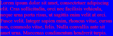
style attribute
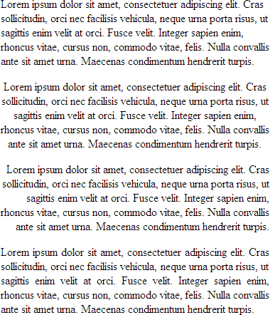
 <p style="color: black; background-color: teal; padding: 1em; font-family: helvetica, sans-serif; text-align: justify; margin: 2em;">Lorem ipsum dolor sit amet, consectetuer adipiscing elit. Cras sollicitudin, orci nec facilisis vehicula, neque urna porta risus, ut sagittis enim velit at orci. Fusce velit. Integer sapien enim, rhoncus vitae, cursus non, commodo vitae, felis. Nulla convallis ante sit amet urna. Maecenas condimentum hendrerit turpis.
 </p>
Lorem ipsum dolor sit amet, consectetuer adipiscing elit. Cras sollicitudin, orci nec facilisis vehicula, neque urna porta risus, ut sagittis enim velit at orci. Fusce velit. Integer sapien enim, rhoncus vitae, cursus non, commodo vitae, felis. Nulla convallis ante sit amet urna. Maecenas condimentum hendrerit turpis.
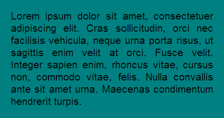
style element
 <p>Lorem ipsum dolor sit amet, consectetuer adipiscing elit. Cras sollicitudin, orci nec facilisis vehicula, neque urna porta risus, ut sagittis enim velit at orci. Fusce velit. Integer sapien enim, rhoncus vitae, cursus non, commodo vitae, felis. Nulla convallis ante sit amet urna. Maecenas condimentum hendrerit turpis.
 </p>
In style
element
(<style>) within head element:
p {
    color: black;
    background-color: teal;
    padding: 1em;
    font-family: helvetica, sans-serif;
    text-align: justify;
    margin: 2em;
  }
So the full page looks like:
 <html>
   <head>
     <title>CSCIE-12 CSS Example</title>
     <style>
      p {
         color: black;
         background-color: teal;
         padding: 1em;
         font-family: helvetica, sans-serif;
         text-align: justify;
         margin: 2em;
      }
     </style>
   </head>
   <body>
     <p>
      Lorem ipsum dolor sit amet, consectetuer adipiscing elit. Cras sollicitudin, orci nec
      facilisis vehicula, neque urna porta risus, ut sagittis enim velit at orci. Fusce velit.
      Integer sapien enim, rhoncus vitae, cursus non, commodo vitae, felis. Nulla convallis ante
      sit amet urna. Maecenas condimentum hendrerit turpis.
     </p>
  </body>
</html>
link element
 <p>Lorem ipsum dolor sit amet, consectetuer adipiscing elit. Cras sollicitudin, orci nec facilisis vehicula, neque urna porta risus, ut sagittis enim velit at orci. Fusce velit. Integer sapien enim, rhoncus vitae, cursus non, commodo vitae, felis. Nulla convallis ante sit amet urna. Maecenas condimentum hendrerit turpis.
 </p>
In
head element:
<link rel="stylesheet" href="example30.css"/>p {
color: black;
background-color: teal;
padding: 1em;
font-family: helvetica, sans-serif;
text-align: justify;
margin: 2em;
}

The full source:
<html>
   <head>
     <title>CSCIE-12 CSS Example</title>
     <link href="example37.css" rel="stylesheet"/>
   </head>
   <body>
     <p>
      Lorem ipsum dolor sit amet, consectetuer adipiscing elit. Cras sollicitudin, orci nec
      facilisis vehicula, neque urna porta risus, ut sagittis enim velit at orci. Fusce velit.
      Integer sapien enim, rhoncus vitae, cursus non, commodo vitae, felis. Nulla convallis ante
      sit amet urna. Maecenas condimentum hendrerit turpis.
     </p>
  </body>
</html>
Combining Rules
Rules can be combined. The following two sets of style rules would produce identical results. Rules can be listed separately:
p {color: black;}
p {background-color: teal;}
p {padding: 1em;}
p {margin: 1em;}
p {font-family: helvetica, sans-serif;}
p {text-align: justify;}
Or, rules can be grouped. Property:Value pairs need to be separated by a semicolon.
p {
     color: black;
     background-color: teal;
     padding: 1em;
     margin: 1em;
     font-family: helvetica, sans-serif;
     text-align: justify;
}
Combining Selectors
h1 { color: maroon; }
h2 { color: maroon; }
h3 { color: maroon; }
h4 { color: maroon; }
h5 { color: maroon; }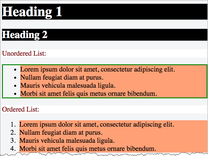
h6 { color: maroon; }h1, h2, h3, h4, h5, h6 { color: maroon; }Basic Selectors - elements, class, id
- elements
- class/id
element selectors
p {
  background-color: white;
  color: maroon;
}

ul {
  border: medium solid green;
}

li {
  background-color: lightsalmon;
}

h1,
h2,
h3 {
  background-color: black;
  color: white;
}
class selectors
The class and id attributes of HTML elements can be used in conjunction with styles.
Class names are referenced in CSS as .classname, and may or may not have an element name preceding the period (.classname or element.classname.
Likewise, id names are referenced in CSS as #idref, and may or may not have an element name preceding the period (#idref or element#idref.
 <div>Lorem ipsum dolor sit amet, consectetuer adipiscing elit. Cras sollicitudin, orci nec facilisis vehicula, neque urna porta risus, ut sagittis enim velit at orci.
 </div>
 <div class="withstyle">Fusce velit. Integer sapien enim, rhoncus vitae, cursus non, commodo vitae, felis. Nulla convallis ante sit amet urna. Maecenas condimentum hendrerit turpis.
 </div>
 <div class="warn">Lorem ipsum dolor sit amet, consectetuer adipiscing elit. Cras sollicitudin, orci nec facilisis vehicula, neque urna porta risus, ut sagittis enim velit at orci.
 </div>
 <div>Lorem ipsum dolor sit amet,
   <span class="warn">consectetuer adipiscing elit   </span>. Cras sollicitudin, orci nec facilisis vehicula, neque urna porta risus, ut sagittis enim velit at orci.
 </div>
 <div id="legalese">Lorem ipsum dolor sit amet, consectetuer adipiscing elit. Cras sollicitudin, orci nec facilisis vehicula, neque urna porta risus, ut sagittis enim velit at orci.
 </div>
In style
element
(<style>) within head element:
div
{
  background-color: white;
  color: black;
  font-family: times;
  margin: 0.5em;
  padding: 0.5em;
}
div.withstyle
{
  background-color: olive;
  color: navy;
  font-family: sans-serif;
  margin: 0.5em;
  padding: 0.5em;
}
.warn
{
  background-color: yellow;
  color: red;
  font-weight: bold;
}
#legalese
{
  color: #cccccc;
  font-size: 0.6em;
}
id selectors
id names are referenced in CSS as #idref, and may or may not have an element name preceding the period (#idref or element#idref.
 <header>
   <h1>Lorem Ipsum   </h1> </header>
 <main><!-- main content -->
   <section id="bigidea">Lorem ipsum dolor sit amet, consectetuer adipiscing elit. Cras sollicitudin, orci nec facilisis vehicula, neque urna porta risus, ut sagittis enim velit at orci. Fusce velit. Integer sapien enim, rhoncus vitae, cursus non, commodo vitae, felis. Nulla convallis ante sit amet urna. Maecenas condimentum hendrerit turpis.   </section>
   <section>Fusce velit. Integer sapien enim, rhoncus vitae, cursus non, commodo vitae, felis. Nulla convallis ante sit amet urna.   </section> </main>
 <footer>Maecenas condimentum hendrerit turpis. </footer>
In style
element
(<style>) within head element:
h1 { text-align: center; }
section { margin: 1rem; }
footer { margin: 1rem;
padding: 1rem;
border-top: thin solid black;
background-color: #f0f0f0;
}
#bigidea {
background-color: blue;
color: white;
border-color: green;
border-width: thick;
border-style: solid;
line-height: 1.5;
padding: 1rem;
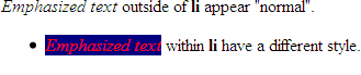
} Contextual Selectors
selector1 selector2 { ...rules... }
 <div>
   <em>Emphasized text   </em>outside of
   <strong>li   </strong>appear "normal".
   <ul>
     <li>
       <em>Emphasized text       </em>within
       <strong>li       </strong>have a different style.
     </li>   </ul>
 </div>
In style
element
(<style>) within head element:
li em { color: red; background-color: navy;}
CSS Properties and Values
CSS Level 1 lists 53 properties that let you style properties of:
- font
- color
- text
- boxes (border, padding, margins)
- classification (inline, block, list)
CSS Level 2.1 lists 115 properties.
CSS Properties
CSS Level 1 lists 53 properties.
| CSS Level 2.1 lists 115 properties.
|
Inheritance
 <div>Lorem ipsum dolor sit amet,
   <em>consectetuer adipiscing elit   </em>. Cras sollicitudin, orci nec facilisis vehicula, neque urna porta risus, ut sagittis enim velit at orci. Fusce velit. Integer sapien enim, rhoncus vitae, cursus non, commodo vitae, felis. Nulla convallis ante sit amet urna. Maecenas condimentum hendrerit turpis.
   <ul>
     <li>Lorem
     </li>
     <li>Ipsum
     </li>
     <li>Dolor
     </li>   </ul>
 </div>
 <p>Lorem ipsum dolor sit amet, consectetuer adipiscing elit. Cras sollicitudin, orci nec facilisis vehicula, neque urna porta risus, ut sagittis enim velit at orci. Fusce velit. Integer sapien enim, rhoncus vitae, cursus non, commodo vitae, felis. Nulla convallis ante sit amet urna. Maecenas condimentum hendrerit turpis.
 </p>
 <ul>
   <li>Lorem
   </li>
   <li>Ipsum
   </li>
   <li>Dolor
   </li> </ul>
In style
element
(<style>) within head element:
body { color: navy; }
em { color: red; }
div { color: green; }
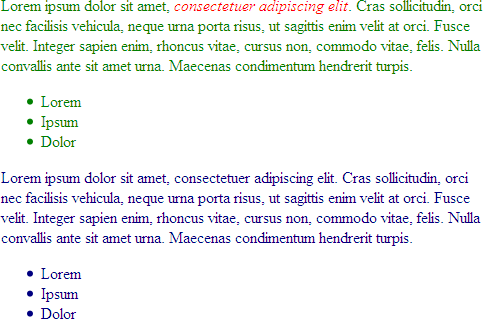
Sample "UA" default stylesheets for HTML 2.0 and HTML 4.0
UA = User-Agent = HTTP Client = Web Browser
HTML 4 Sample default CSS
html, address,
blockquote,
body, dd, div,
dl, dt, fieldset, form,
frame, frameset,
h1, h2, h3, h4,
h5, h6, noframes,
ol, p, ul, center,
dir, hr, menu, pre   { display: block }
li              { display: list-item }
head            { display: none }
table           { display: table }
tr              { display: table-row }
thead           { display: table-header-group }
tbody           { display: table-row-group }
tfoot           { display: table-footer-group }
col             { display: table-column }
colgroup        { display: table-column-group }
td, th          { display: table-cell; }
caption         { display: table-caption }
th              { font-weight: bolder; text-align: center }
caption         { text-align: center }
body            { margin: 8px; line-height: 1.12 }
h1              { font-size: 2em; margin: .67em 0 }
h2              { font-size: 1.5em; margin: .75em 0 }
h3              { font-size: 1.17em; margin: .83em 0 }
h4, p,
blockquote, ul,
fieldset, form,
ol, dl, dir,
menu            { margin: 1.12em 0 }
h5              { font-size: .83em; margin: 1.5em 0 }
h6              { font-size: .75em; margin: 1.67em 0 }
h1, h2, h3, h4,
h5, h6, b,
strong          { font-weight: bolder }
blockquote      { margin-left: 40px; margin-right: 40px }
i, cite, em,
var, address    { font-style: italic }
pre, tt, code,
kbd, samp       { font-family: monospace }
pre             { white-space: pre }
button, pre,
input, object,
select          { display:inline-block; }
big             { font-size: 1.17em }
small, sub, sup { font-size: .83em }
sub             { vertical-align: sub }
sup             { vertical-align: super }
table           { border-spacing: 2px; }
thead, tbody,
tfoot           { vertical-align: middle }
td, th          { vertical-align: inherit }
s, strike, del  { text-decoration: line-through }
hr              { border: 1px inset }
ol, ul, dir,
menu, dd        { margin-left: 40px }
ol              { list-style-type: decimal }
ol ul, ul ol,
ul ul, ol ol    { margin-top: 0; margin-bottom: 0 }
u, ins          { text-decoration: underline }
br:before       { content: "\A" }
:before, :after { white-space: pre-line }
center          { text-align: center }
abbr, acronym   { font-variant: small-caps; letter-spacing: 0.1em }
:link, :visited { text-decoration: underline }
:focus          { outline: thin dotted invert }

/* Begin bidirectionality settings (do not change) */
BDO[DIR="ltr"]  { direction: ltr; unicode-bidi: bidi-override }
BDO[DIR="rtl"]  { direction: rtl; unicode-bidi: bidi-override }

*[DIR="ltr"]    { direction: ltr; unicode-bidi: embed }
*[DIR="rtl"]    { direction: rtl; unicode-bidi: embed }

@media print {
  h1            { page-break-before: always }
  h1, h2, h3,
  h4, h5, h6    { page-break-after: avoid }
  ul, ol, dl    { page-break-before: avoid }
}
HTML 2 Sample default CSS
BODY {
  margin: 1em;
  font-family: serif;
  line-height: 1.1;
  background: white;
  color: black;
}

H1, H2, H3, H4, H5, H6, P, UL, OL, DIR, MENU, DIV,
DT, DD, ADDRESS, BLOCKQUOTE, PRE, BR, HR, FORM, DL {
  display: block }

B, STRONG, I, EM, CITE, VAR, TT, CODE, KBD, SAMP,
IMG, SPAN { display: inline }

LI { display: list-item }

H1, H2, H3, H4 { margin-top: 1em; margin-bottom: 1em }
H5, H6 { margin-top: 1em }
H1 { text-align: center }
H1, H2, H4, H6 { font-weight: bold }
H3, H5 { font-style: italic }

H1 { font-size: xx-large }
H2 { font-size: x-large }
H3 { font-size: large }

B, STRONG { font-weight: bolder }  /* relative to the parent */
I, CITE, EM, VAR, ADDRESS, BLOCKQUOTE { font-style: italic }
PRE, TT, CODE, KBD, SAMP { font-family: monospace }

PRE { white-space: pre }

ADDRESS { margin-left: 3em }
BLOCKQUOTE { margin-left: 3em; margin-right: 3em }

UL, DIR { list-style: disc }
OL { list-style: decimal }
MENU { margin: 0 }              /* tight formatting */
LI { margin-left: 3em }

DT { margin-bottom: 0 }
DD { margin-top: 0; margin-left: 3em }

HR { border-top: solid }        /* 'border-bottom' could also have been used */

A:link { color: blue }          /* unvisited link */
A:visited { color: red }        /* visited links */
A:active { color: lime }        /* active links */

/* setting the anchor border around IMG elements
   requires contextual selectors */

A:link IMG { border: 2px solid blue }
A:visited IMG { border: 2px solid red }
A:active IMG { border: 2px solid lime }
font properties
- font-family
- font-style
- font-variant
- font-weight
- font-size
- font
font-family
body {
  font-family: garamond, times, serif;
}
 <div style="font-family: garamond, times, serif;">Garamond, Times, or serif (generic family)
 </div>
 <div style="font-family: calibri, arial, helvetica, sans-serif;">Calibri, Arial, Helvetica or sans-serif (generic family)
 </div>
 <div style="font-family: lucida console, courier, monospace;">Lucida Console, Courier or monospace (generic family)
 </div>
 <div style="font-family: fantasy;">Fantasy (generic family)
 </div>
 <div style="font-family: cursive;">Cursive (generic family)
 </div>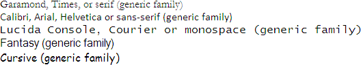
font-style
em {
  font-style: italic;
}
 <div style="font-style: normal;">Normal font-style
 </div>
 <div style="font-style: italic;">Italic font-style
 </div>
 <div style="font-style: oblique;">Oblique font-style
</div>font-variant and font-weight
font-variant
 <div style="font-variant: small-caps;">This should be rendered in small-caps.
   <div style="font-variant: normal;">Here we revert to "normal".
   </div>
</div>font-weight
strong {
  font-weight: bold;
}
 <div>font-weight can be used to make
   <span style="font-weight: bold">text appear bold   </span>.
</div>font-size
 <div style="font-size: 8pt;">Lorem ipsum dolor sit amet, consectetuer adipiscing elit. Cras sollicitudin, orci nec facilisis vehicula, neque urna porta risus, ut sagittis enim velit at orci.
 </div>
 <div style="font-size: 120%;">Lorem ipsum dolor sit amet, consectetuer adipiscing elit. Cras sollicitudin, orci nec facilisis vehicula, neque urna porta risus, ut sagittis enim velit at orci.
 </div>
 <div style="font-size: 1.5em;">Lorem ipsum dolor sit amet, consectetuer adipiscing elit. Cras sollicitudin, orci nec facilisis vehicula, neque urna porta risus, ut sagittis enim velit at orci.
 </div>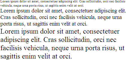
Font Sizes: Relative vs. Absolute
As a general guideline with CSS, relative measurements are better than absolute measurements.
- Relative
- Relative to UA settings:
xx-small | x-small | small | medium | large | x-large | xx-large rem- relative to the html em (root em)- Relative to context:
larger | smaller - Percentage (%)
- "em" units
- "rem" units
- Relative to UA settings:
- Absolute
- "pt" sizes (8pt, 10pt, 12pt)
font
The font shorthand property allows you to set:[font-style | font-variant | font-weight ]? font-size[/line-height]? font-family
 <div>Lorem ipsum dolor sit amet, consectetuer adipiscing elit. Cras sollicitudin, orci nec facilisis vehicula, neque urna porta risus, ut sagittis enim velit at orci. Fusce velit. Integer sapien enim, rhoncus vitae, cursus non, commodo vitae, felis. Nulla convallis ante sit amet urna. Maecenas condimentum hendrerit turpis.
 </div>
In style
element
(<style>) within head element:
body {
      font: normal normal normal x-large/200% arial, helvetica, sans-serif;
}
text properties
- word-spacing
- letter-spacing
- text-decoration
- vertical-align
- text-transform
- text-align
- text-indent
- line-height
Align blocks of text left, right, center, and justified.
 <div style="margin-left: 30%; margin-right: 30%;">
   <p style="text-align: left">Lorem ipsum dolor sit amet, consectetuer adipiscing elit. Cras sollicitudin, orci nec facilisis vehicula, neque urna porta risus, ut sagittis enim velit at orci. Fusce velit. Integer sapien enim, rhoncus vitae, cursus non, commodo vitae, felis. Nulla convallis ante sit amet urna. Maecenas condimentum hendrerit turpis.
   </p>
   <p style="text-align: center">Lorem ipsum dolor sit amet, consectetuer adipiscing elit. Cras sollicitudin, orci nec facilisis vehicula, neque urna porta risus, ut sagittis enim velit at orci. Fusce velit. Integer sapien enim, rhoncus vitae, cursus non, commodo vitae, felis. Nulla convallis ante sit amet urna. Maecenas condimentum hendrerit turpis.
   </p>
   <p style="text-align: right">Lorem ipsum dolor sit amet, consectetuer adipiscing elit. Cras sollicitudin, orci nec facilisis vehicula, neque urna porta risus, ut sagittis enim velit at orci. Fusce velit. Integer sapien enim, rhoncus vitae, cursus non, commodo vitae, felis. Nulla convallis ante sit amet urna. Maecenas condimentum hendrerit turpis.
   </p>
   <p style="text-align: justify">Lorem ipsum dolor sit amet, consectetuer adipiscing elit. Cras sollicitudin, orci nec facilisis vehicula, neque urna porta risus, ut sagittis enim velit at orci. Fusce velit. Integer sapien enim, rhoncus vitae, cursus non, commodo vitae, felis. Nulla convallis ante sit amet urna. Maecenas condimentum hendrerit turpis.
   </p>
 </div>
Lorem ipsum dolor sit amet, consectetuer adipiscing elit. Cras sollicitudin, orci nec facilisis vehicula, neque urna porta risus, ut sagittis enim velit at orci. Fusce velit. Integer sapien enim, rhoncus vitae, cursus non, commodo vitae, felis. Nulla convallis ante sit amet urna. Maecenas condimentum hendrerit turpis.
Lorem ipsum dolor sit amet, consectetuer adipiscing elit. Cras sollicitudin, orci nec facilisis vehicula, neque urna porta risus, ut sagittis enim velit at orci. Fusce velit. Integer sapien enim, rhoncus vitae, cursus non, commodo vitae, felis. Nulla convallis ante sit amet urna. Maecenas condimentum hendrerit turpis.
Lorem ipsum dolor sit amet, consectetuer adipiscing elit. Cras sollicitudin, orci nec facilisis vehicula, neque urna porta risus, ut sagittis enim velit at orci. Fusce velit. Integer sapien enim, rhoncus vitae, cursus non, commodo vitae, felis. Nulla convallis ante sit amet urna. Maecenas condimentum hendrerit turpis.
Lorem ipsum dolor sit amet, consectetuer adipiscing elit. Cras sollicitudin, orci nec facilisis vehicula, neque urna porta risus, ut sagittis enim velit at orci. Fusce velit. Integer sapien enim, rhoncus vitae, cursus non, commodo vitae, felis. Nulla convallis ante sit amet urna. Maecenas condimentum hendrerit turpis.
CSS Values and Units
- Length
em, pt, ex, mm, cm, in, px
e.g.1.0em - Percentage
e.g.10% - URL
url(url goes here)
e.g.url('../images/banner.png') - Color
name, hexadecimal, rgb value
e.g.- name
aqua
- hexadecimal
#ffffdd#60ae9f
- rgb (percent or numeric)
rgb(24,50,255)rgb(5%,20%,75%)
- name
Color Units
Name
RGB Color Space
- decimal numbers (0 to 255)
- hexadecimal numbers (00 to ff)
- percentages (0 to 100%)
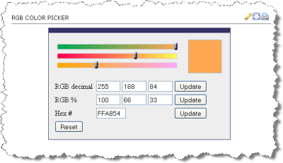
The following are all equivalent ways of defining a shade of orange:
|
 <div style="background-color: rgb(100%,66%,33%); padding: 1em; ; margin: 1em;">Lorem ipsum dolor sit amet, consectetuer adipiscing elit.
   <br/>
rgb(100%,66%,33%)
 </div>
 <div style="background-color: #ffa854; padding: 1em; margin: 1em; ">Lorem ipsum dolor sit amet, consectetuer adipiscing elit.
   <br/>
#ffa854
 </div>
 <div style="background-color: rgb(255,168,84); padding: 1em; ; margin: 1em;">Lorem ipsum dolor sit amet, consectetuer adipiscing elit.
   <br/>
rgb(255,168,84)
</div>rgb(100%,66%,33%)
#ffa854
rgb(255,168,84)
Colorpicker
- HTML Color Picker from W3Schools
- DIY -
<input type="color" />
Color Picker
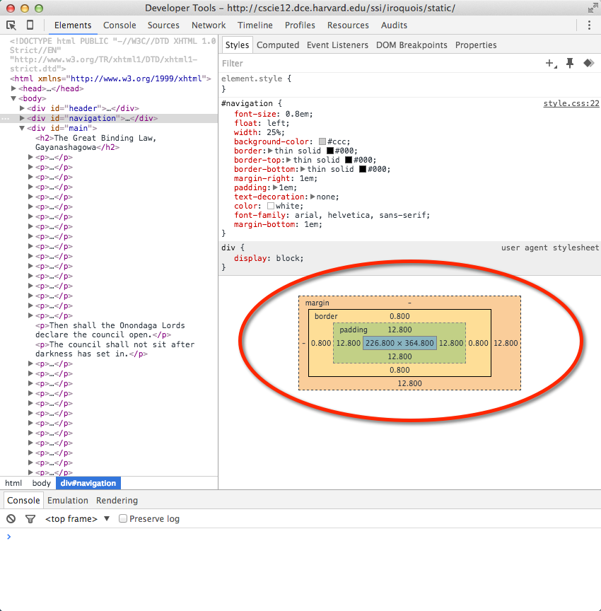
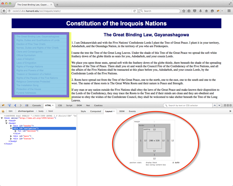
Box Model or Block Model
- margin
- border
- padding
- content
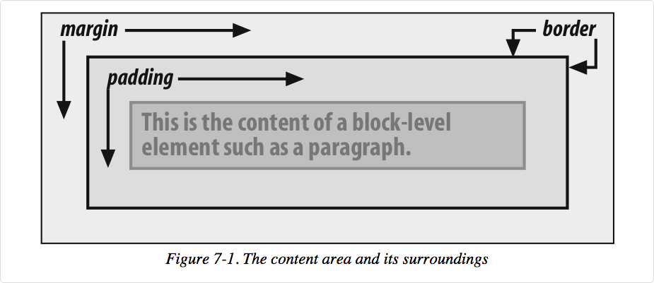
A more detailed look:
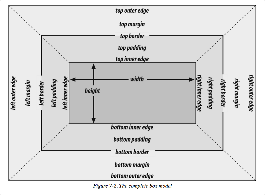
Image from Cascading Style Sheets: The Definitive Guide, 3rd ed by Eric Meyer, published by O'Reilly
In your browser
margin, padding, border
- margin
- margin-top
- margin-right
- margin-bottom
- margin-left
- margin (shorthand)
- padding
- padding-top
- padding-right
- padding-bottom
- padding-left
- padding (shorthand)
- border
- border-top-width
- border-right-width
- border-bottom-width
- border-left-width
- border-width
- border-color
- border-style
- border-top
- border-right
- border-bottom
- border-left
- border
border-style
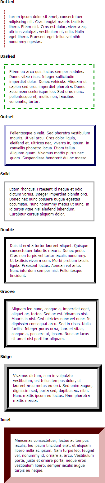
 <h4>Dotted </h4>
 <p class="border1">Lorem ipsum dolor sit amet, consectetuer adipiscing elit. Cras feugiat mauris facilisis libero. Etiam nisl. Cras est dolor, viverra ac, ultrices volutpat, vestibulum et, odio. Nulla eget libero. Praesent eget tellus vel nibh nonummy egestas.
 </p>
 <h4>Dashed </h4>
 <p class="border2">Etiam eu arcu quis lectus semper sodales. Donec vitae risus. Integer sollicitudin imperdiet dolor. Donec vehicula. Aliquam ut sapien sed eros imperdiet pharetra. Donec accumsan scelerisque leo. Sed eros nunc, pellentesque et, mollis non, faucibus venenatis, tortor.
 </p>
 <h4>Outset </h4>
 <p class="border3">Pellentesque a velit. Sed pharetra vestibulum mauris. Ut vel arcu. Cras dolor ligula, eleifend et, ultrices nec, viverra in, ipsum. In convallis pharetra lacus. Etiam tellus. Aliquam quam. Vivamus mattis purus nec quam. Suspendisse hendrerit dui ac massa.
 </p>
 <h4>Solid </h4>
 <p class="border4">Etiam rhoncus. Praesent id neque et odio dictum varius. Integer imperdiet blandit orci. Donec nec nunc posuere augue egestas accumsan. Nunc nonummy metus ut nunc. In id turpis vitae nisl eleifend bibendum. Curabitur cursus aliquam dolor.
 </p>
 <h4>Double </h4>
 <p class="border5">Duis id erat a tortor laoreet aliquet. Quisque consectetuer lobortis mauris. Donec pede. Cras non turpis vel tortor iaculis nonummy. Ut facilisis viverra sem. Morbi pretium iaculis ligula. Praesent lectus. Aenean vel ante. Nunc interdum semper nisl. Pellentesque tincidunt.
 </p>
 <h4>Groove </h4>
 <p class="border6">Aliquam leo nunc, congue a, imperdiet eget, aliquet ac, tortor. Sed ac est. Vivamus nisi. Mauris in nisl. Sed ultricies nunc vel nunc. In dignissim consequat arcu. Sed in risus. Nulla facilisi. Integer purus urna, laoreet vitae, congue a, posuere ut, ipsum. Nunc ac lacus sit amet nisi porttitor aliquam.
 </p>
 <h4>Ridge </h4>
 <p class="border7">Vivamus dictum, sem in vulputate vestibulum, est tellus tempus dolor, ut laoreet arcu metus eu orci. Sed enim augue, dignissim sed, porta sed, dapibus ac, nibh. Nunc mattis ipsum eu lectus. Nam pharetra mattis massa.
 </p>
 <h4>Inset </h4>
 <p class="border8">Maecenas consectetuer, lectus ac tempus iaculis, leo ipsum tincidunt erat, et aliquam libero nulla ac ipsum. Nam turpis leo, feugiat vel, nonummy id, ornare a, arcu. Vestibulum porta, justo et ornare porta, neque eros vestibulum libero, semper iaculis augue turpis eu neque.
 </p>
In style
element
(<style>) within head element:
body {
font-family: tahoma,arial,sans-serif;
font-size: small;
}
p {
margin: 1em;
padding: 1em;
width: 50%;
}
.border1 {
border: thin dotted #900;
}
.border2 {
border: medium dashed #090;
}
.border3 {
border: thick outset #009;
}
.border4 {
border: 3px solid #999;
}
.border5 {
border: 5px double #000;
}
.border6 {
border: 10px groove black;
}
.border7 {
border: 15px ridge black;
}
.border8 {
border: 20px inset #900;
}
TRBL for padding and margin shorthand
Stay out of "TRBL" (top right bottom left) for padding and margin shorthand.
Values that are present are used to fill in for values that are not:
padding: 1px 2px 3px 4px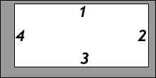
T = 1px; R = 2px; B = 3px; L = 4pxpadding: 1px 2px 3px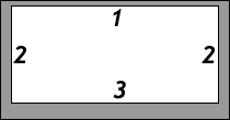
T = 1px; R = L = 2px; B = 3px;padding: 1px 2px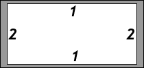
T = B = 1px; R = L = 2px;padding: 1px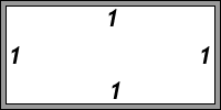
T = R = B = L = 1px
Margin, Padding, Border Example
 <aside>Drafted by Thomas Jefferson between June 11 and June 28, 1776, the Declaration of Independence is at once the nation's most cherished symbol of liberty and Jefferson's most enduring monument. </aside>
 <p>We hold these truths to be self-evident, that all men are created equal, that they are endowed by their Creator with certain unalienable Rights, that among these are Life, Liberty, and the pursuit of Happiness. That to secure these rights, Governments are instituted among Men, deriving their just powers from the consent of the governed. That whenever any Form of Government becomes destructive of these ends, it is the Right of the People to alter or to abolish it, and to institute new Government, laying its foundation on such principles and organizing its powers in such form, as to them shall seem most likely to effect their Safety and Happiness.
 </p>
In style
element
(<style>) within head element:
aside {
      text-align: left;
      font-size: 1.1rem;
      color: #003300;
      background-color: rgb(250,250,200);
      padding: 1rem;
      margin: 0.5rem;
      border-width: 2px;
      border-style: dashed;
      border-color: #990000;
     }
p {
     font-size: large;
     line-height: 1.5;
   }
display property
You can make "inline" elements into "block" by setting the display property!
label {
  display: block;
}
 <form method="post" action="https://cs12.net/form/submit.php">
   <label>Name:
     <input type="text" name="name"/>
   </label>
   <label>Email Address:
     <input type="email" name="email"/>
   </label>
   <button type="submit">Submit   </button>
 </form>
In style
element
(<style>) within head element:
  label { display: block; margin-top: 1rem;}
  input { display: block;}
  button { display: block; margin-top: 1rem;}
Tools: Your Browser
And a few that aren't listed at BrowseHappy.com:
Web Browsers and Layout Engines
| Web Browser | Layout Engine |
|---|---|
| Google Chrome | Blink (fork of Webkit) |
| Apple Safari | Webkit |
| Mozilla Firefox | Gecko |
| Microsoft Edge | Chromium |
| Opera | Blink (fork of Webkit) |
Testdrive Your Browser
 <h1>Lorem Ipsum Dolor </h1>
 <p>Lorem ipsum dolor sit amet, consectetuer adipiscing elit. Cras sollicitudin, orci nec facilisis vehicula, neque urna porta risus, ut sagittis enim velit at orci. Fusce velit. Integer sapien enim, rhoncus vitae, cursus non, commodo vitae, felis. Nulla convallis ante sit amet urna. Maecenas condimentum hendrerit turpis.
 </p>
 <ul>
   <li>Lorem
   </li>
   <li>Ipsum
   </li>
   <li>Dolor
   </li> </ul>
In style
element
(<style>) within head element:
body {
  background-color: silver;
  font-family: calibri, arial, helvetica, sans-serif;
}
p {
  line-height: 200%;
  border: thin solid black;
  padding: 1em;
  margin: 2em;
  background-color: teal;
  }
ul {
  border: medium dotted red;
  background-color: yellow;
  font-family: Times New Roman, Times, serif;
}
h1 {
  color: purple;
  background-color: white;
  font-variant: small-caps;
}