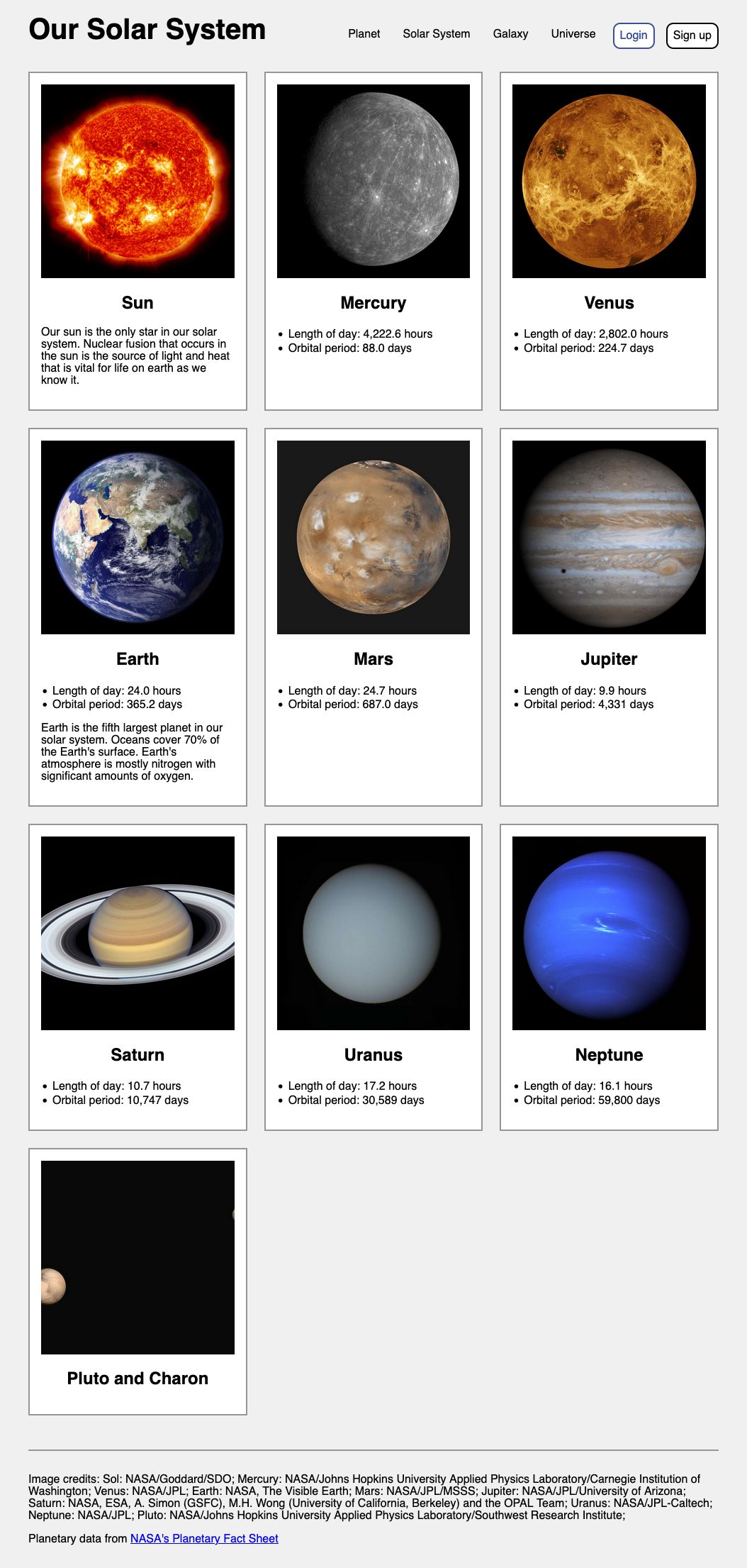
Session 04 - CSS, Part 2 - including Flexbox
Harvard Extension School
Fall 2024
Course Web Site: https://cscie12.dce.harvard.edu/
Topics
- CSS Review
- CSS Specificity
- Box Model
- CSS Flexbox
- CSS Flexbox and Grid
- CSS Flexbox
- Lists as Navigation
- Two approaches - border or content?
- Working an Example
- Flex and Simple Layouts
- CSS remedy, normalize, and reset
Presentation contains 26 slides
CSS Review
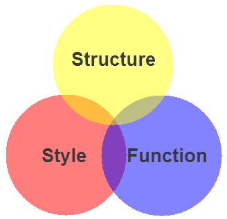
- Structure / Markup (HTML)
- Structure
- Content
- Style / Presentation (CSS)
- Style
- Presentation
- Appearance
- Function (JavaScript)
- Actions
- Manipulations
CSS Guides and Reference and Tools
- CSS: Cascading Style Sheets | MDN
- CSS reference | MDN
- Learning Web Design, Part III, CSS For Presentation
Chapters 11, 12, 13, 14, 16
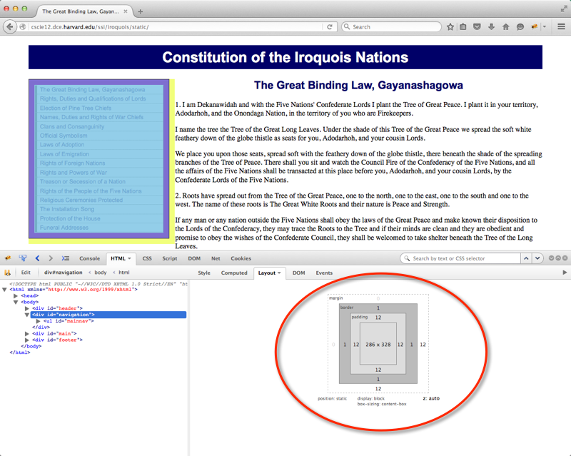
Your Browser's "Inspect" function!
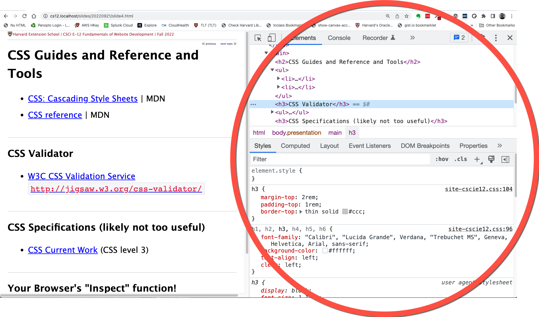
CSS Validator
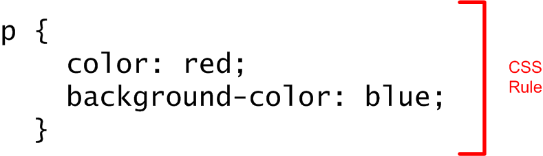
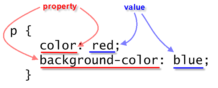
Anatomy of a CSS Rule
CSS Rule
Selector and Declarations
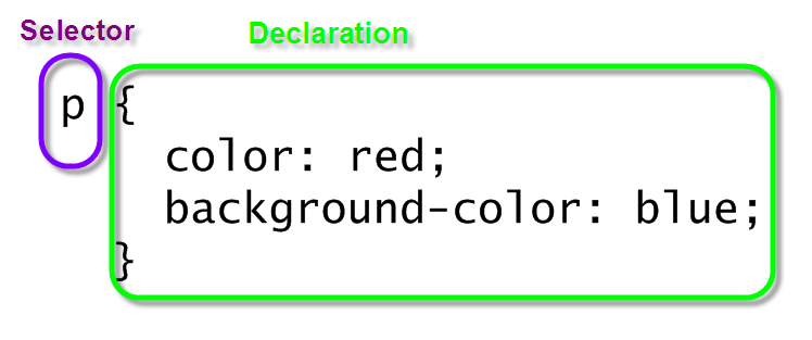
Properties and Values
CSS selectors - elements, class, id, and contextual
- elements
- class / id
element selectors
p {
background-color: white;
color: maroon;
}
ul {
border: medium solid green;
}
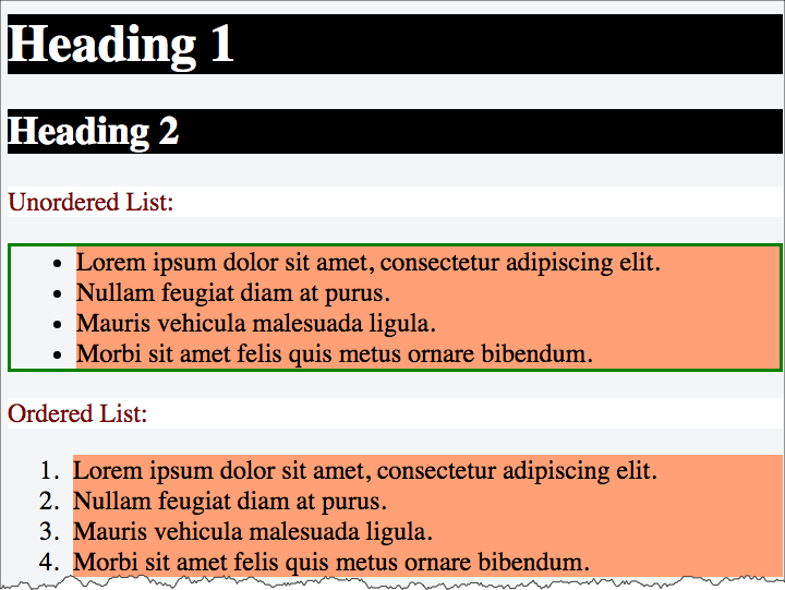
li {
background-color: lightsalmon;
}
h1,
h2,
h3 {
background-color: black;
color: white;
}
class selectors
When to use classes?
- Within a page, there are elements that are the "same" from a markup perspective, but need to be styled differently.
- Within a site, there is content that has the "same" markup, but needs to be styled differently.
section  {
    background-repeat: no-repeat;
    background-size: 80px;
    padding-left: 100px;
    padding-bottom: 1.5rem;
}
section h2 {
   color: rgb(163,28,48);

}
section.html {
    background-image: url(../images/logo-html5.png);
}
section.css {
    background-image: url(../images/logo-css3.png);
}
section.javascript {
    background-image: url(../images/logo-js.png);
}
Contextual Selectors
selector1 selector2 { ...rules... }
Often you'll see this as ways to apply different rules in header,
main, and footer
main p {
/* rules for p inside of main */
}
footer p {
/* rules for p inside of main */
}
h2 {
/* rules for h2 everywhere*/
}
section h2 {
/* rules for h2 inside of section */
}
nav a:link,
nav a:visited,
nav a:hover,
nav a:active {
  /* rules for nav links */
}
footer a:link,
footer a:visited,
footer a:hover,
footer a:active {
  /* rules for nav links */
}
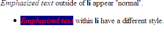
Example of "li em" selector
 <div>
   <em>Emphasized text   </em>outside of
   <strong>li   </strong>appear "normal".
   <ul>
     <li>
       <em>Emphasized text       </em>within
       <strong>li       </strong>have a different style.
     </li>   </ul>
 </div>
In style
element
(<style>) within head element:
li em { color: red; background-color: navy;}
CSS Specificity
See: Calculating a selector's specificity.
Stylesheet Origin
- author stylesheet
- reader (user) stylesheet
- browser (user agent) stylesheet
Specificity of Selector
- style attribute
- count "id" attributes
- count number of other attributes ("class")
- count element names
Order
- last occurence has higher specificity
@import-ed stylesheets come before rules in the importing sheet.
CSS Selector Specificity
Specificity is expressed in a form of a list of four numbers: (a,b,c,d)
- inline style
- id
- class, pseudo-class and attributes
- element and pseudo-elements
Start comparing at "a", if equal go to "b", etc.
nav li {...}                     /* (0,0,0,2) */
nav.primary {...}                /* (0,0,1,1) */
nav.primary li {...}             /* (0,0,1,2) */
nav.primary li:first-child {...} /* (0,0,2,2) */
nav.primary li.getinfo {...}     /* (0,0,2,2) */
#globalnav {...}                 /* (0,1,0,0) */
#globalnav >nav.primary li.getinfo >nav.primary li:first-child >nav.primary li >nav.primary >nav li
Specificity
And for a fun take on CSS Specificity, take a look at CSS SpeciFISHity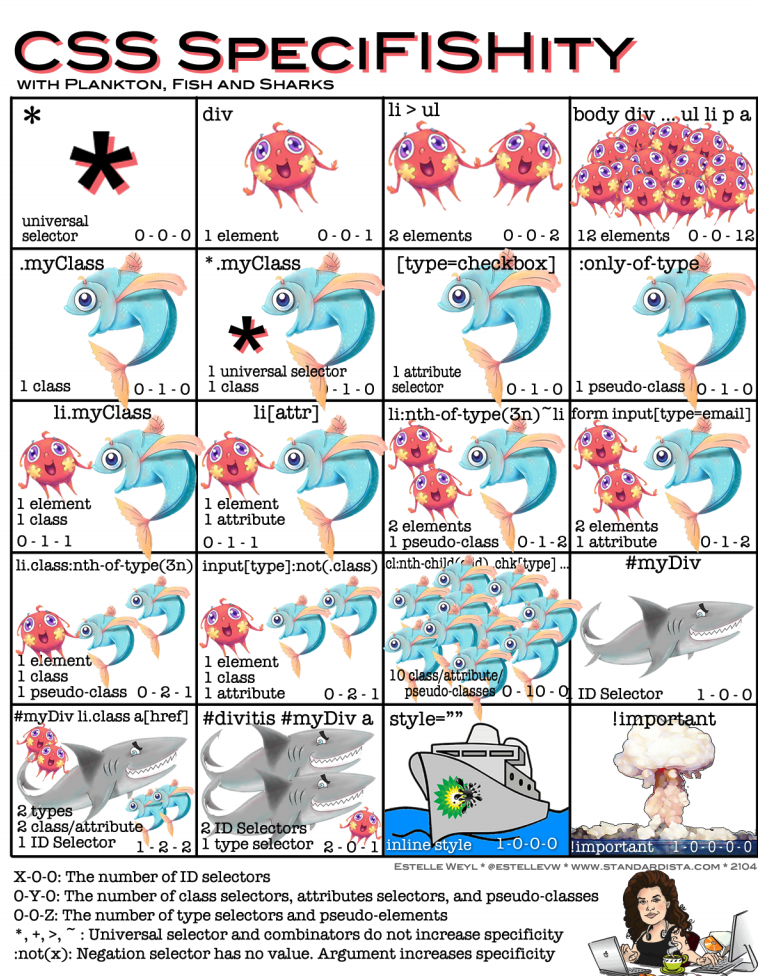
Box Model
- margin
- border
- padding
- content
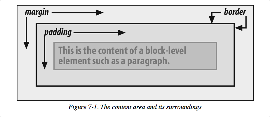
A more detailed look:
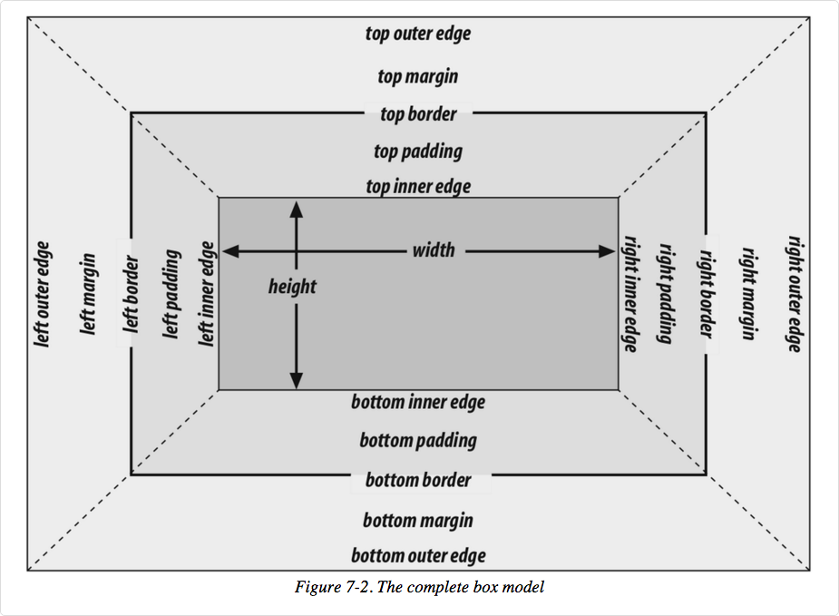
Image from Cascading Style Sheets: The Definitive Guide, 3rd ed by Eric Meyer, published by O'Reilly
In your browser
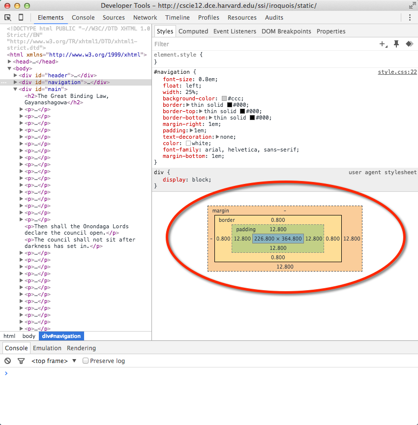
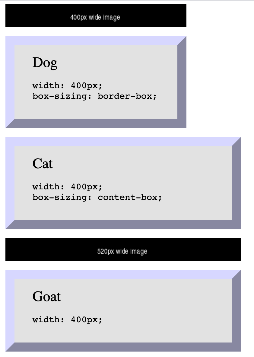
Box Sizing - How do you measure width?
By default, box sizing (width or height) is measured in terms of the "content-box". So any padding or border is "in addition to" the width set in CSS.
Use box-sizing property to make box widths
behave more like what you expect.
 <img src="https://via.placeholder.com/400x50/000000/ffffff.png?text=400px+wide+image"/>

 <div class="dog sizing">Dog
   <pre>width: 400px; box-sizing: border-box;   </pre>
 </div>
 <div class="cat">Cat
   <pre>width: 400px; box-sizing: content-box;   </pre>
 </div>
 <img src="https://via.placeholder.com/520x50/000000/ffffff.png?text=520px+wide+image"/>

 <div class="goat">Goat
   <pre>width: 400px; /* default box-sizing, which is content-box */   </pre>
 </div>
In style
element
(<style>) within head element:
  .dog {
    box-sizing: border-box;
  }
  .cat {
    box-sizing: content-box;
  }
  .goat {
    box-sizing: unset;
  }
  div {
    margin: 20px;
    font-size: xx-large;
    background-color: rgb(230,230,230);
    padding: 20px 40px;
    text-align: left;
    width: 400px;
    border: 20px outset rgb(220,220,255);
  }
  div pre { font-size: x-large;}

  img { margin-left: 20px;}
When 25% is not 1/4 of the screen
 <div class="full">
   <p>Container - 100%
   </p>
   <div class="quarter">One (25%)
   </div>
   <div class="quarter">Two (25%)
   </div>
   <div class="quarter">Three (25%)
   </div>
   <div class="quarter">Four (25%)
   </div>
 </div>
In style
element
(<style>) within head element:
  div.quarter {
    width: 25%;
    border: 2px dashed purple;
    background-color: rgb(240, 200, 240);
    float: left;
    overflow: auto;
    text-align: center;
    padding-top: 1rem;
    padding-bottom: 1rem;
  }
  div.full {
    width: 100%;
    border: 2px solid black;
    overflow: auto;
  }
 <div class="full">
   <p>Container - 100%
   </p>
   <div class="quarter">One (25%)
   </div>
   <div class="quarter">Two (25%)
   </div>
   <div class="quarter">Three (25%)
   </div>
   <div class="quarter">Four (25%)
   </div>
 </div>
In style
element
(<style>) within head element:
  div.quarter {
    width: 25%;
    box-sizing: border-box;
    border: 2px dashed purple;
    background-color: rgb(240, 200, 240);
    float: left;
    overflow: auto;
    text-align: center;
    padding-top: 1rem;
    padding-bottom: 1rem;
  }
  div.full {
    width: 100%;
    border: 2px solid black;
    overflow: auto;
  }
* {
  box-sizing: border-box;
}
It is a common practice to set box-sizing property to "border-box" for all elements
* {
box-sizing: border-box;
}
Or, you will likely see this in order to get the CSS pseudo elements ::before and ::after
/* Box sizing rules */
*,
*::before,
*::after {
  box-sizing: border-box;
}
CSS Flexbox
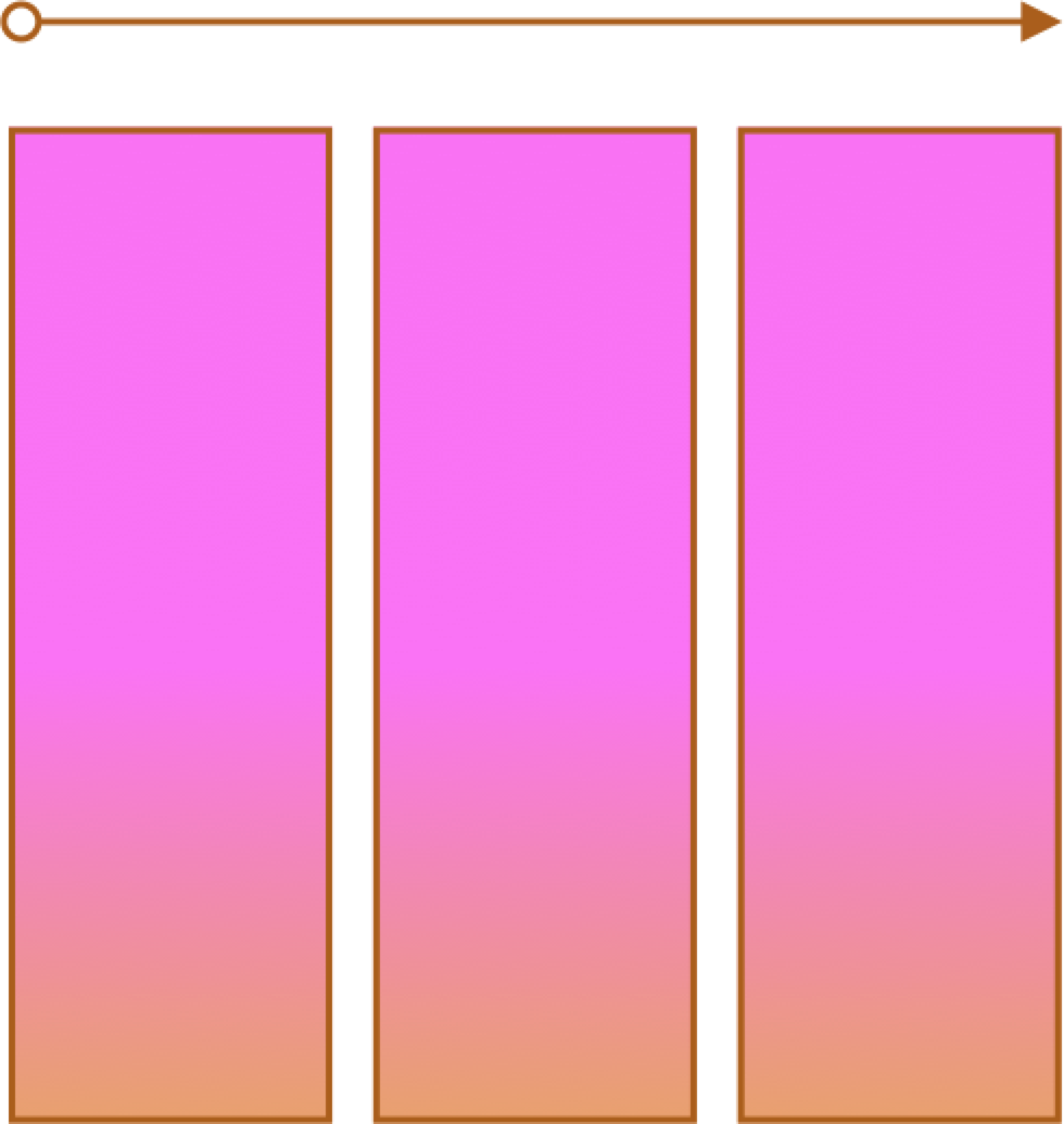
Flexbox is a one-dimensional layout method for arranging items in rows or columns. Items flex (expand) to fill additional space or shrink to fit into smaller spaces.
When to use it: Building simple page or content layouts without
having use float or positioning.
CSS Flexbox and Grid
Flexbox
- One primary axis
- Basic layouts for pages and content
- Easier then "grid" (?)
Grid
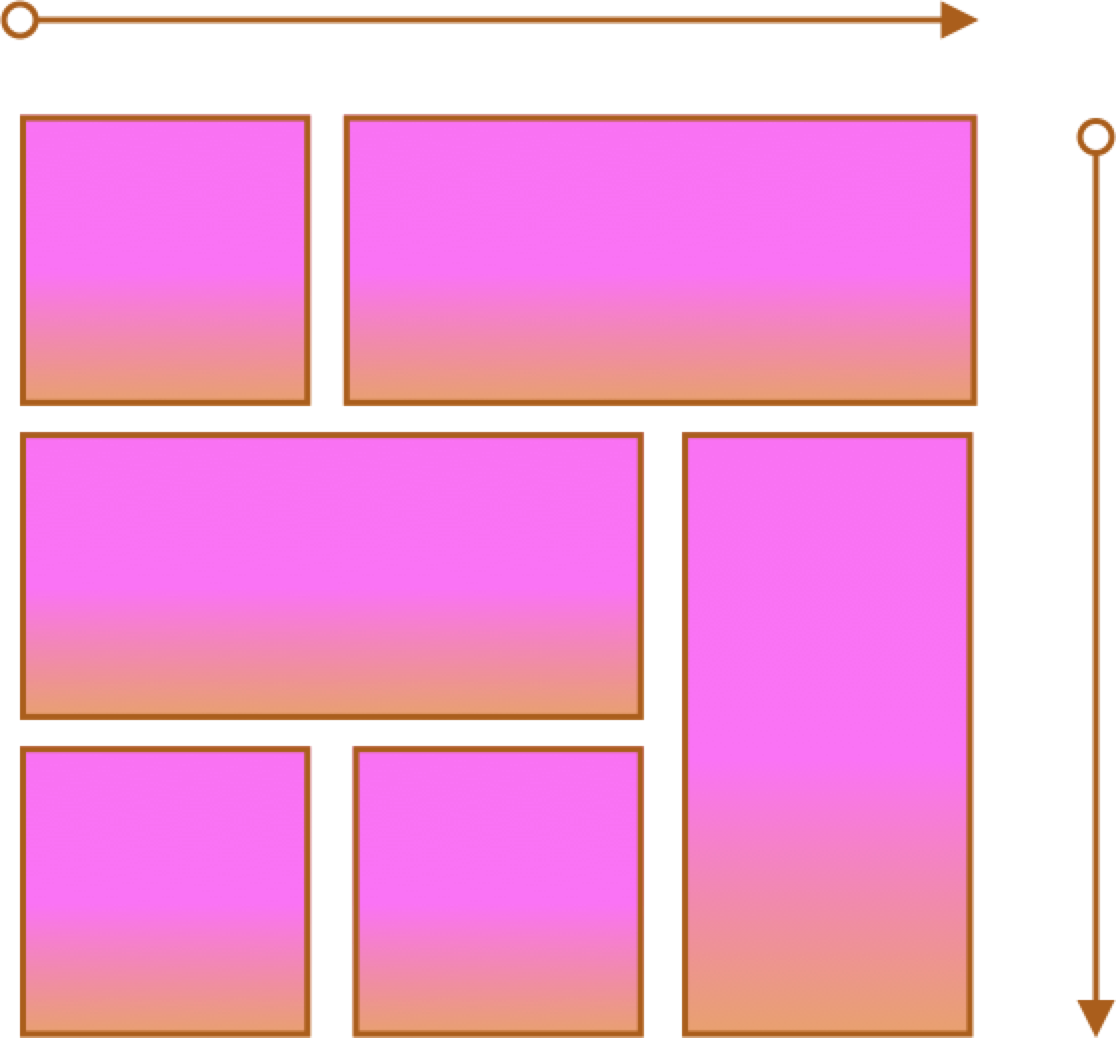
- Two axes
- More complex layouts
- Overlapping items
CSS Flexbox
- MDN: Basic Concepts of Flexbox
- CSS Tricks: A complete Guide to Flexbox and a fantastic poster!
Container and Items
- Set up your flex container and properties of the container.
- Set the "flex" properties on the items within your container.
 <div id="f3container">
   <div class="box box1">1
   </div>
   <div class="box box2">2
   </div>
   <div class="box box3">3
   </div>
   <div class="box box4">4
   </div>
   <div class="box box5">5
   </div>
 </div>
In style
element
(<style>) within head element:
#f3container {
  display: flex;
}
.box1, .box2, .box3, .box4, .box5 {
  flex-grow: 0;
  flex-shrink: 0;
  flex-basis: 5em;
}
.box1 { background-color: lightpink;}
.box2 { background-color: lightsteelblue;}
.box3 { background-color: wheat;}
.box4 { background-color: plum;}
.box5 { background-color: palegreen;}
.box {
  padding: 2em;
  border: medium solid black;
  width: 3em;
}
flex-basis
Controls the initial size of the flex item
 <div id="f4container">
   <div class="box box1">1
   </div>
   <div class="box box2">2
   </div>
   <div class="box box3">3
   </div>
 </div>
In style
element
(<style>) within head element:
#f4container {
  display: flex;
}
.box1 {
  flex-basis: 15%;
  background-color: lightpink;
}
.box2 {
  flex-basis: 25%;
  background-color: lightsteelblue;
}
.box3 {
  flex-basis: 50%;
  background-color: wheat;
}
.box {
  padding: 2em;
  border: medium solid black;
  width: 3em;
}
flex-grow and flex-shrink
Controls if and how the flex item will grow or shrink from its original flex-basis size.
 <div id="f5container">
   <div class="box box1">1
   </div>
   <div class="box box2">2
   </div>
   <div class="box box3">3
   </div>
 </div>
In style
element
(<style>) within head element:
#f5container {
  display: flex;
}
.box1 {
  flex-grow: 1;
  flex-shrink: 1;
  flex-basis: 200px;
  background-color: lightpink;
}
.box2 {
  flex-grow: 1;
  flex-shrink: 1;
  flex-basis: 100px;
  background-color: lightsteelblue;
}
.box3 {
  flex-grow: 1;
  flex-shrink: 1;
  flex-basis: 500px;
  background-color: wheat;
}
.box {
  padding: 2em;
  border: medium solid black;
  width: 3em;
}
Flex and Wrap
Controls whether flex items will "line wrap" — by default flex items do not wrap!
 <div id="f6container">
   <div class="box box1">1
   </div>
   <div class="box box2">2
   </div>
   <div class="box box3">3
   </div>
   <div class="box box4">4
   </div>
   <div class="box box5">5
   </div>
   <div class="box box6">6
   </div>
 </div>
In style
element
(<style>) within head element:
#f6container {
  display: flex;
  flex-wrap: wrap;
  justify-content: space-evenly;
  background-color: linen;
  border: thin solid black;
}
.box1, .box2, .box3, .box4, .box5, .box6 {
  flex-grow: 0;
  flex-shrink: 0;
  flex-basis: 28%;
  box-sizing: border-box;
  margin: 1rem 0;
}
.box1 { background-color: lightpink;}
.box2 { background-color: lightsteelblue;}
.box3 { background-color: wheat;}
.box4 { background-color: plum;}
.box5 { background-color: palegreen;}
.box6 { background-color: turquoise;}
.box {
  padding: 2em;
  border: medium solid black;
}
Lists as Navigation
Commonly use nav and ul, with
ul being the flex container.
 <nav>
   <ul>
     <li>
       <a href="#">Planet       </a>
     </li>
     <li>
       <a href="#">Solar System       </a>
     </li>
     <li>
       <a href="#">Galaxy       </a>
     </li>
     <li>
       <a href="#">Universe       </a>
     </li>   </ul> </nav>
In
head element:
<link rel="stylesheet" href="example9.css"/>In example9.css
nav ul { display: flex; }
nav ul { list-style: none;
}
nav ul li { margin-left: 1em; }
Two approaches - border or content?
When doing navigation, how about a "border" or "content" property?
Border
See the Pen Navigation - horizontal with border by David Heitmeyer (@dpheitmeyer) on CodePen.
Content
See the Pen Navigation - horizontal with border by David Heitmeyer (@dpheitmeyer) on CodePen.
Working an Example
Some Notes about the Example
- Adding class attributes may be helpful
- anchor (a elements) with display of block for navigation
- :first-child and :last-child pseudo-class
- sometimes flex parent containers will be there, sometimes you have to add them
Flex and Simple Layouts
CSS remedy, normalize, and reset
Sometimes default browser behavior helps, sometimes it gets in the way. Three approaches are:
- remedy (CSS starts how we wish it would be)
- normalize across browsers
- blank slate (reset)
Three approaches:
- CSS Remedy / Sensible Defaults: free yourself from
history and provide a remedy for CSS legacy 'mistakes'; provide yourself with sensible starting point and defaults.
A good example of this is: Andy Bell's "A Modern CSS Reset" - CSS Reset: give yourself a "blank slate" to build upon; that is, effectively remove all browser default styles.
- CSS Normalize: give yourself consistency across browsers.