Session 05 - CSS and Layouts
Harvard Extension School
Fall 2020
Course Web Site: https://cscie12.dce.harvard.edu/
Topics
Presentation contains 20 slides
Fonts
font-family
CSS font-family property takes a comma-separated list of fonts,
and should always end with a generic font-family (e.g. serif, sans-serif, monospace).
body {
  font-family: 'Merriweather Regular', 'Times New Roman', serif;
}
How are fonts defined?
Two approaches with fonts:
- Rely on system fonts
- Use web fonts to deliver font definition as part of the resources loaded by a page
- load the font definition
- use in "font-family" CSS property
Note:
- hosted fonts or our fonts
- multiple ways of loading fonts
linkelement inheadof HTML@importor@font-facein CSS
Font - @font-face
@import url('https://fonts.googleapis.com/css2?family=Montserrat:ital@1&display=swap');

h1,h2,h3,h4,h5,h6 {
  font-family: Montserrat, sans-serif;
}

h1 {
  font-size: 5em;
}

h2 {
  font-size: 3em;
}

body {
  font-family: Georgia, serif;
}
Font - Include through link element
Using a link element to include CSS with @font-face definitions is how some font hosting services recommend including their fonts. Google Fonts does this.
The server delivering the fonts does browser detection and delivers the CSS file with the appropriate font format.
Note that we are having using two Google Fonts -- Cabin Sketch and Cabin.
<link href="https://fonts.googleapis.com/css2?family=Cabin+Sketch:wght@400;700&family=Cabin:wght@400;700&display=swap"
rel="stylesheet">Our CSS:
h1,h2,h3,h4,h5,h6 {
  font-family:"Cabin Sketch", sans-serif;
}

h1 {
  font-size: 3em;
}

h2 {
  font-size: 2em;
}

body {
  font-family: Cabin, serif;
}
Note that nothing magical is going on here -- Google is simply returning CSS that uses @font-face with the font format appropriate for the browser making the request.
/* latin */
@font-face {
  font-family: 'Cabin Sketch';
  font-style: normal;
  font-weight: 400;
  font-display: swap;
  src: local('Cabin Sketch Regular'), local('CabinSketch-Regular'), url(https://fonts.gstatic.com/s/cabinsketch/v14/QGYpz_kZZAGCONcK2A4bGOj8mNhNy_r-Kw.woff2) format('woff2');
  unicode-range: U+0000-00FF, U+0131, U+0152-0153, U+02BB-02BC, U+02C6, U+02DA, U+02DC, U+2000-206F, U+2074, U+20AC, U+2122, U+2191, U+2193, U+2212, U+2215, U+FEFF, U+FFFD;
}
/* latin */
@font-face {
  font-family: 'Cabin Sketch';
  font-style: normal;
  font-weight: 700;
  font-display: swap;
  src: local('Cabin Sketch Bold'), local('CabinSketch-Bold'), url(https://fonts.gstatic.com/s/cabinsketch/v14/QGY2z_kZZAGCONcK2A4bGOj0I_1Y5tjzAYOcFg.woff2) format('woff2');
  unicode-range: U+0000-00FF, U+0131, U+0152-0153, U+02BB-02BC, U+02C6, U+02DA, U+02DC, U+2000-206F, U+2074, U+20AC, U+2122, U+2191, U+2193, U+2212, U+2215, U+FEFF, U+FFFD;
}
Font Resources
Finding or exploring fonts:
CSS Normalize and Reset
Two approaches:
- CSS Reset: give yourself a "blank slate" to build upon; that is, effectively remove all browser default styles.
- CSS Normalize: give yourself consistency across browsers.
CSS "Reset"
Sometimes it is useful to use a CSS stylesheet to "reset" styling for all elements. This attempts to start your styling with a "blank slate" instead of the browser defaults.
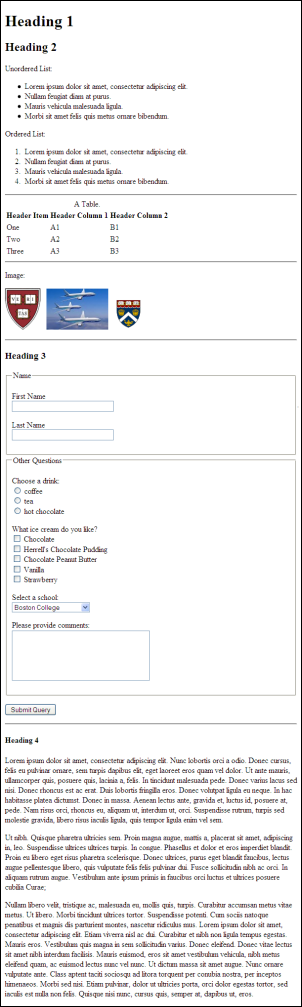
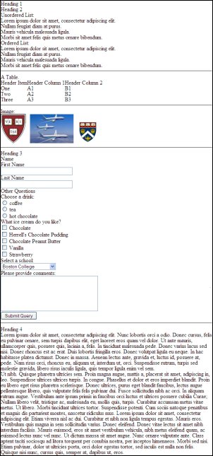
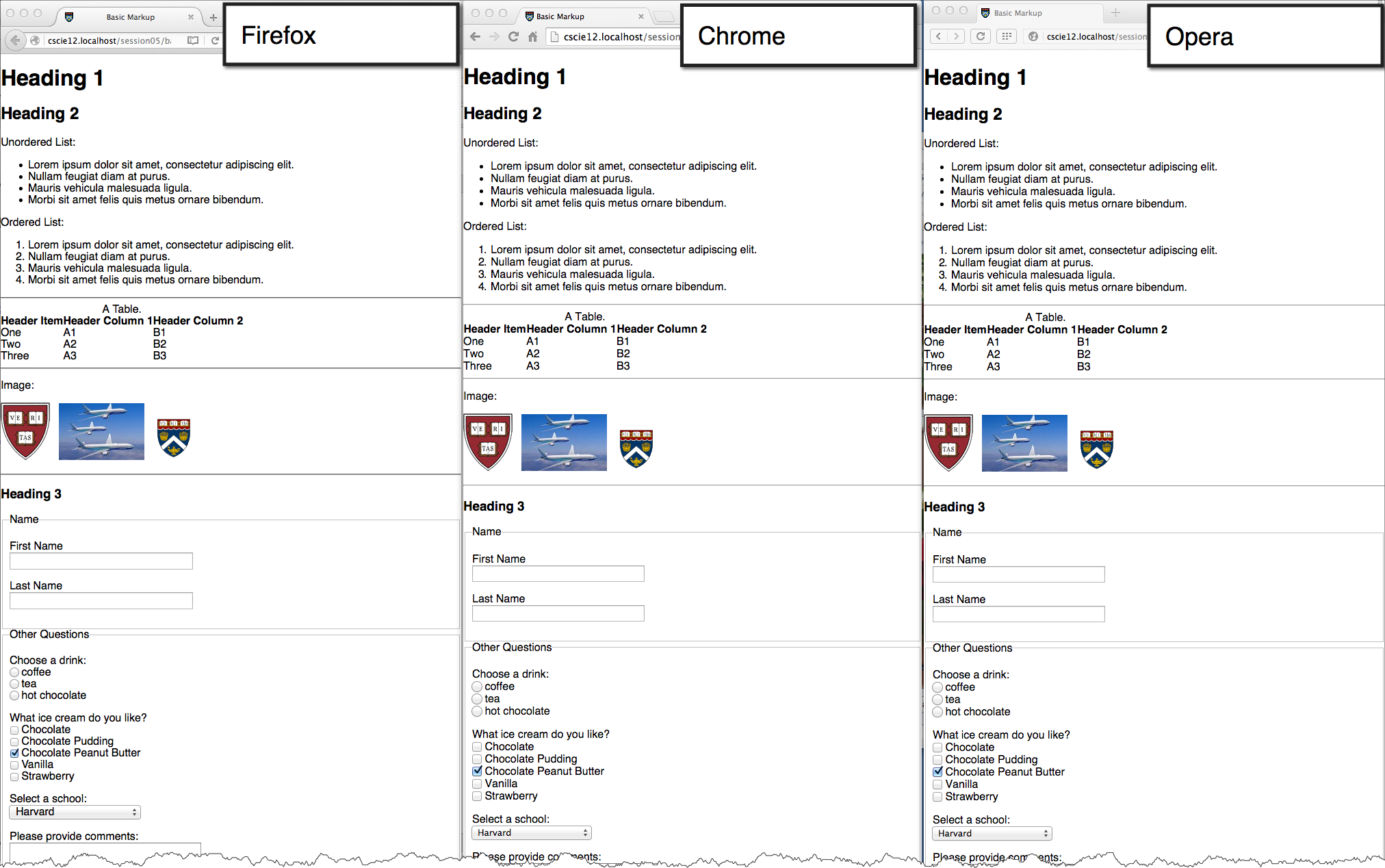
Basic Markup: | With CSS Reset: |
CSS from Eric Meyer for "Reset"
/* https://meyerweb.com/eric/tools/css/reset/
   v2.0 | 20110126
   License: none (public domain)
*/
html, body, div, span, applet, object, iframe,
h1, h2, h3, h4, h5, h6, p, blockquote, pre,
a, abbr, acronym, address, big, cite, code,
del, dfn, em, img, ins, kbd, q, s, samp,
small, strike, strong, sub, sup, tt, var,
b, u, i, center,
dl, dt, dd, ol, ul, li,
fieldset, form, label, legend,
table, caption, tbody, tfoot, thead, tr, th, td,
article, aside, canvas, details, embed,
figure, figcaption, footer, header, hgroup,
menu, nav, output, ruby, section, summary,
time, mark, audio, video {
  margin: 0;
  padding: 0;
  border: 0;
  font-size: 100%;
  font: inherit;
  vertical-align: baseline;
}
/* HTML5 display-role reset for older browsers */
article, aside, details, figcaption, figure,
footer, header, hgroup, menu, nav, section {
  display: block;
}
body {
  line-height: 1;
}
ol, ul {
  list-style: none;
}
blockquote, q {
  quotes: none;
}
blockquote:before, blockquote:after,
q:before, q:after {
  content: '';
  content: none;
}
table {
  border-collapse: collapse;
  border-spacing: 0;
}
CSS Normalize
CSS and Layouts
- Fixed Width
define width in pixels - Fluid or Elastic
define widths in relative units (e.g. percentages) - Responsive
apply different styles based upon browser window size
CSS for Page Layout: Fixed Width
Define region widths based upon fixed sizes (pixels).
Use "div" elements to define areas and CSS to arrange them on the page.
<div id="wrapper">
  <header> ... </header>
  <main>
    ...
  </main>
  <nav>
    ...
  </nav>
  <footer> ... </footer>
</div>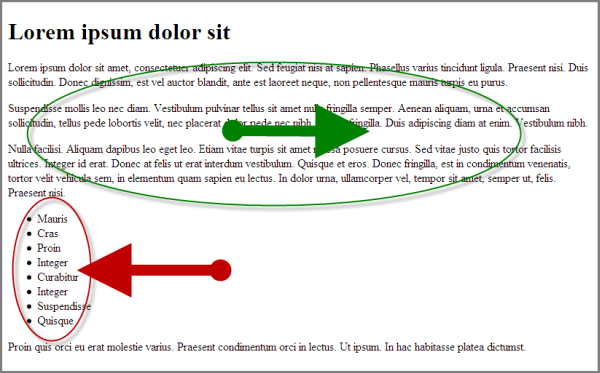
 <div id="wrapper">
   <header>
     <h1>Lorem ipsum dolor sit     </h1>   </header>
   <main>
     <p>Lorem ipsum dolor sit amet, consectetuer adipiscing elit. Sed feugiat nisi at sapien. Phasellus varius tincidunt ligula. Praesent nisi. Duis sollicitudin. Donec dignissim, est vel auctor blandit, ante est laoreet neque, non pellentesque mauris turpis eu purus.
     </p>
     <p>Suspendisse mollis leo nec diam. Vestibulum pulvinar tellus sit amet nulla fringilla semper. Aenean aliquam, urna et accumsan sollicitudin, tellus pede lobortis velit, nec placerat dolor pede nec nibh. Donec fringilla. Duis adipiscing diam at enim. Vestibulum nibh.
     </p>
     <p>Nulla facilisi. Aliquam dapibus leo eget leo. Etiam vitae turpis sit amet massa posuere cursus. Sed vitae justo quis tortor facilisis ultrices. Integer id erat. Donec at felis ut erat interdum vestibulum. Quisque et eros. Donec fringilla, est in condimentum venenatis, tortor velit vehicula sem, in elementum quam sapien eu lectus. In dolor urna, ullamcorper vel, tempor sit amet, semper ut, felis. Praesent nisi.
     </p>   </main>
   <nav>
     <ul>
       <li>Mauris
       </li>
       <li>Cras
       </li>
       <li>Proin
       </li>
       <li>Integer
       </li>
       <li>Curabitur
       </li>
       <li>Integer
       </li>
       <li>Suspendisse
       </li>
       <li>Quisque
       </li>     </ul>   </nav>
   <footer>Proin quis orci eu erat molestie varius. Praesent condimentum orci in lectus. Ut ipsum. In hac habitasse platea dictumst.   </footer>
 </div>
In style
element
(<style>) within head element:
#wrapper {
    width: 750px;
    margin: 0 auto;
    }
header {
    width: 100%;
    background-color: #ccc;
    }
footer {
    clear: both;
    background-color: #ccf;
    }
nav {
    width: 160px;
    float: left;
    background-color: #fcc;
    }
main {
    width: 540px;
    float: right;
    background-color: #cfc;
}
Fluid / Liquid Layouts
Define region width based on percentages (relative to browser window width).
  <header> ... </header>
  <main>
    ...
  </main>
  <nav>
    ...
  </nav>
  <footer> ... </footer>
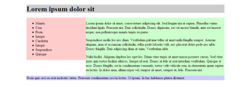
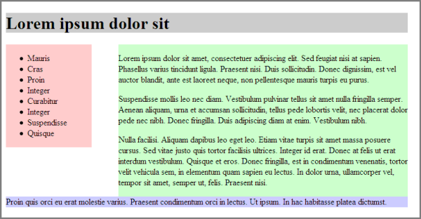
 <header>
   <h1>Lorem ipsum dolor sit   </h1> </header>
 <main>
   <p>Lorem ipsum dolor sit amet, consectetuer adipiscing elit. Sed feugiat nisi at sapien. Phasellus varius tincidunt ligula. Praesent nisi. Duis sollicitudin. Donec dignissim, est vel auctor blandit, ante est laoreet neque, non pellentesque mauris turpis eu purus.
   </p>
   <p>Suspendisse mollis leo nec diam. Vestibulum pulvinar tellus sit amet nulla fringilla semper. Aenean aliquam, urna et accumsan sollicitudin, tellus pede lobortis velit, nec placerat dolor pede nec nibh. Donec fringilla. Duis adipiscing diam at enim. Vestibulum nibh.
   </p>
   <p>Nulla facilisi. Aliquam dapibus leo eget leo. Etiam vitae turpis sit amet massa posuere cursus. Sed vitae justo quis tortor facilisis ultrices. Integer id erat. Donec at felis ut erat interdum vestibulum. Quisque et eros. Donec fringilla, est in condimentum venenatis, tortor velit vehicula sem, in elementum quam sapien eu lectus. In dolor urna, ullamcorper vel, tempor sit amet, semper ut, felis. Praesent nisi.
   </p> </main>
 <nav>
   <ul>
     <li>Mauris
     </li>
     <li>Cras
     </li>
     <li>Proin
     </li>
     <li>Integer
     </li>
     <li>Curabitur
     </li>
     <li>Integer
     </li>
     <li>Suspendisse
     </li>
     <li>Quisque
     </li>   </ul> </nav>
 <footer>Proin quis orci eu erat molestie varius. Praesent condimentum orci in lectus. Ut ipsum. In hac habitasse platea dictumst. </footer>
In style
element
(<style>) within head element:
header {
    width: 100%;
    background-color: #ccc;
    }
footer {
    clear: both;
    background-color: #ccf;
    }
nav {
    width: 30%;
    float: left;
    background-color: #fcc;
    }
main {
    width: 70%;
    float: right;
    background-color: #cfc;
}
More complex layouts
header, footer, navigation, primary content, secondary content
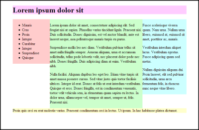
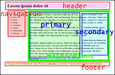
 <div id="wrapper">
   <div id="header">
     <h1>Lorem ipsum dolor sit     </h1>
   </div>
   <div id="maincontent">
     <div id="primary">
       <p>Lorem ipsum dolor sit amet, consectetuer adipiscing elit. Sed feugiat nisi at sapien. Phasellus varius tincidunt ligula. Praesent nisi. Duis sollicitudin. Donec dignissim, est vel auctor blandit, ante est laoreet neque, non pellentesque mauris turpis eu purus.
       </p>
       <p>Suspendisse mollis leo nec diam. Vestibulum pulvinar tellus sit amet nulla fringilla semper. Aenean aliquam, urna et accumsan sollicitudin, tellus pede lobortis velit, nec placerat dolor pede nec nibh. Donec fringilla. Duis adipiscing diam at enim. Vestibulum nibh.
       </p>
       <p>Nulla facilisi. Aliquam dapibus leo eget leo. Etiam vitae turpis sit amet massa posuere cursus. Sed vitae justo quis tortor facilisis ultrices. Integer id erat. Donec at felis ut erat interdum vestibulum. Quisque et eros. Donec fringilla, est in condimentum venenatis, tortor velit vehicula sem, in elementum quam sapien eu lectus. In dolor urna, ullamcorper vel, tempor sit amet, semper ut, felis. Praesent nisi.
       </p>
     </div>
     <div id="secondary">
       <p>Fusce scelerisque viverra quam. Nam urna. Nullam urna libero, euismod at, euismod sit amet, porttitor ac, mauris.
       </p>
       <p>Vestibulum interdum aliquet lacus. Vestibulum egestas. Fusce adipiscing quam sed metus.
       </p>
       <p>Nullam dignissim aliquam dui. Proin laoreet, elit sed pulvinar sollicitudin, urna arcu fermentum felis, in rhoncus nunc neque vitae libero.
       </p>
     </div>
   </div>
   <div id="navigation">
     <ul>
       <li>Mauris
       </li>
       <li>Cras
       </li>
       <li>Proin
       </li>
       <li>Integer
       </li>
       <li>Curabitur
       </li>
       <li>Integer
       </li>
       <li>Suspendisse
       </li>
       <li>Quisque
       </li>     </ul>
   </div>
   <div id="footer">Proin quis orci eu erat molestie varius. Praesent condimentum orci in lectus. Ut ipsum. In hac habitasse platea dictumst.
   </div>
 </div>
In style
element
(<style>) within head element:
#wrapper {
    width: 750px;
    margin: 0 auto;
    }
#header {
    width: 100%;
    background-color: #fcf;
    }
#footer {
    clear: both;
    background-color: #ffc;
    }
#navigation {
    width: 160px;
    float: left;
    background-color: #fcc;
    }
#maincontent {
    width: 590px;
    float: right;
        }
#primary {
    width: 400px;
    float: left;
    background-color: #cfc;
}
#secondary {
   width: 190px;
   float: right;
   background-color: #cff;
}
CSS Flex
MDN: Basic Concepts of Flexbox
- Set up your flex container
- Set the "flex" properties on things within your container
 <div id="f1container">
   <div class="box box1">1
   </div>
   <div class="box box2">2
   </div>
   <div class="box box3">3
   </div>
   <div class="box box4">4
   </div>
   <div class="box box5">5
   </div>
 </div>
In style
element
(<style>) within head element:
#f1container {
  display: flex;
}
.box {
  padding: 2em;
  border: medium solid black;
  width: 3em;
}
.box1, .box2, .box3, .box4, .box5 {
  flex: 0 0 5em; /* flex-grow flex-shrink flex-basis */
}
flex-basis
 <div id="f1container">
   <div class="box box1">1
   </div>
   <div class="box box2">2
   </div>
   <div class="box box3">3
   </div>
 </div>
In style
element
(<style>) within head element:
.box {
  padding: 2em;
  border: medium solid black;
  width: 3em;
}
#f1container {
  display: flex;
}
.box1 {
  flex-basis: 15%;
}
.box2 {
  flex-basis: 25%;
}
.box3 {
  flex-basis: 50%;
}
flex-grow and flex-shrink
 <div id="f1container">
   <div class="box box1">1
   </div>
   <div class="box box2">2
   </div>
   <div class="box box3">3
   </div>
 </div>
In style
element
(<style>) within head element:
.box {
  padding: 2em;
  border: medium solid black;
  width: 3em;
}
#f1container {
  display: flex;
}
.box1 {
  flex-grow: 1;
  flex-shrink: 1;
  flex-basis: 200px;
}
.box2 {
  flex-grow: 1;
  flex-shrink: 1;
  flex-basis: 100px;
}
.box3 {
  flex-grow: 1;
  flex-shrink: 1;
  flex-basis: 500px;
}
Flex
Responsive Layouts
Site is "responsive" to different devices.

CSS media query:
/* Larger than mobile */
@media (min-width: 400px) { /* specific rules go here */ }

/* Larger than phablet (also point when grid becomes active) */
@media (min-width: 550px) { /* specific rules go here */ }

/* Larger than tablet */
@media (min-width: 750px) { /* specific rules go here */ }

/* Larger than desktop */
@media (min-width: 1000px) { /* specific rules go here */ }

/* Larger than Desktop HD */
@media (min-width: 1200px) { /* specific rules go here */ }
Responsive Web Design: CSS Media Query
Media queries can be used to include style sheets (media attribute) or in CSS rules (@media rule) or @import statement
Link to stylesheet
<link rel="stylesheet" type="text/css"
  media="screen and (max-device-width: 480px)"
  href="smallscreen.css" />
CSS rule
@media screen and (max-device-width: 480px) {
  /* rules for small screens */
  .column { float: none; }
}
@import statement
@import url('smallscreen.css') screen and (max-device-width: 480px);


Responsive Web Design
- A Book Apart: Responsive Web Design
- Article: Responsive Web Design by Ethan Marcotte on A List Apart
- A List Apart: Responsive Design Articles
