Session 06 - CSS, Part 4 - including Grid
Harvard Extension School
Fall 2024
Course Web Site: https://cscie12.dce.harvard.edu/
Topics
- CSS Grid
- Responsive Page Layouts
- Responsive Page Layouts
- Responsive Images
- CSS Custom Properties
- Other CSS expressions
- HTML5 Boilerplate
Presentation contains 20 slides
Main topics
- CSS Grid
- CSS responsive sites with media queries
- Responsive images
- Other cool CSS things we haven't touched on
- CSS custom properties - aka "variables"!
- Other CSS expressions - <, [], .has()
- HTML + CSS Boilerplate for consideration
Contrasting CSS Grid and CSS Flex
Grid
- Two axes
- More complex layouts
- Overlapping items
Flex
- One primary axis
- Basic layouts for pages and content
- Easier then "grid" (?)
CSS Grid
- CSS Grid Layout (MDN)
- Basic Concepts of Grid Layout
- Getting Started with CSS Grid (CSS-Tricks)
- Complete Guide to Grid (CSS-Tricks)
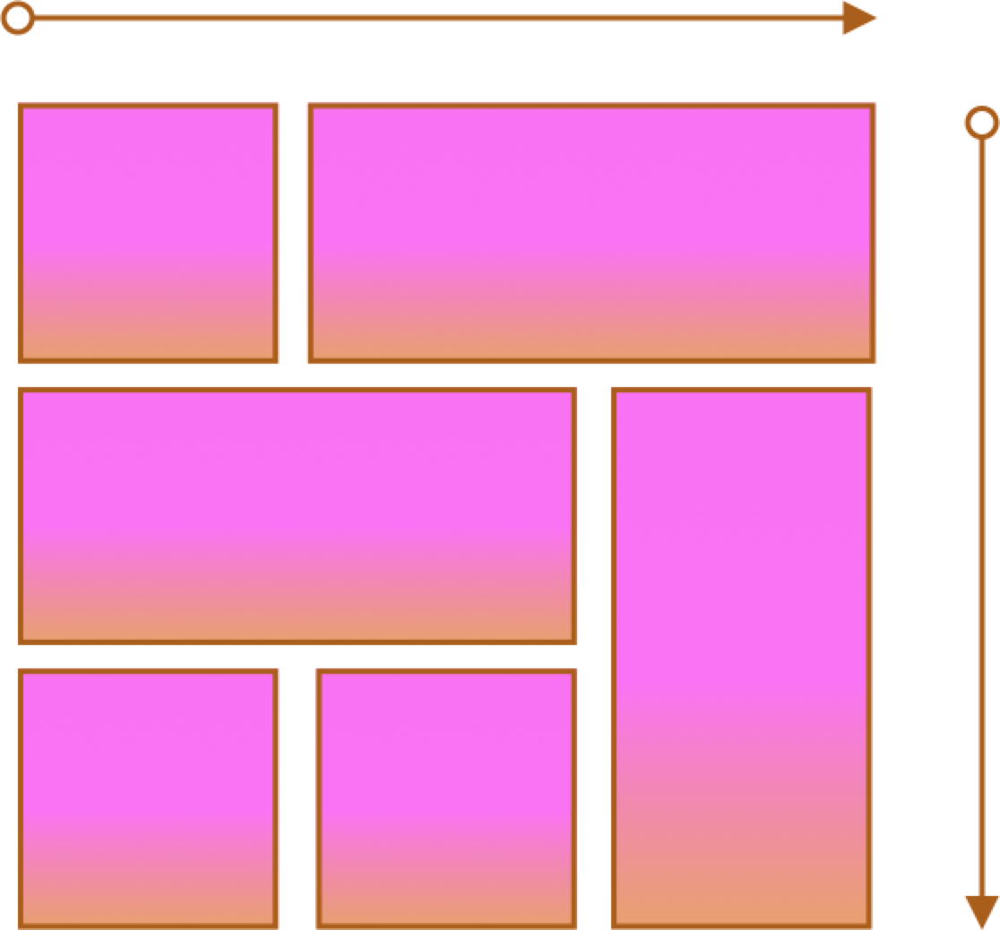
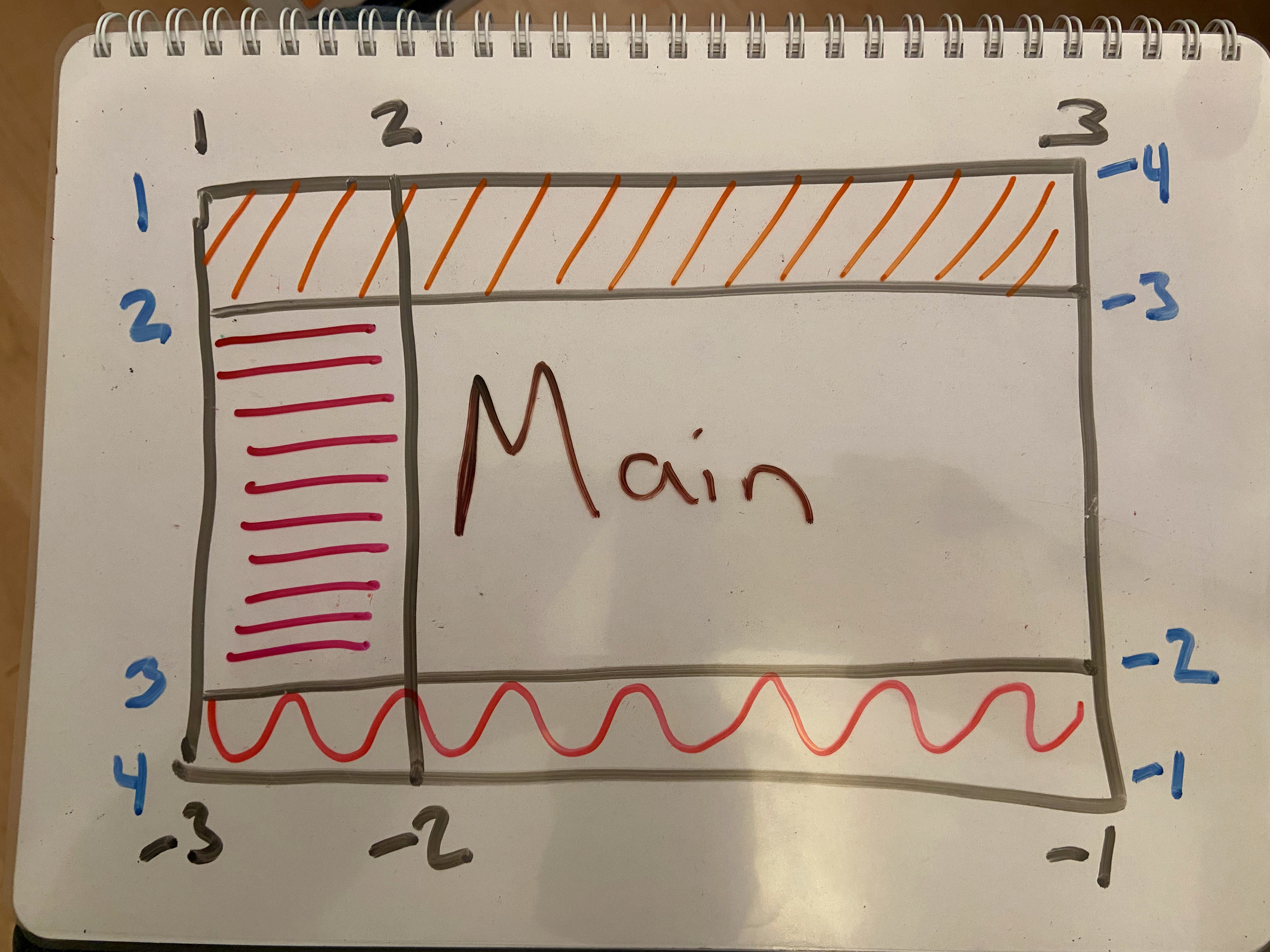
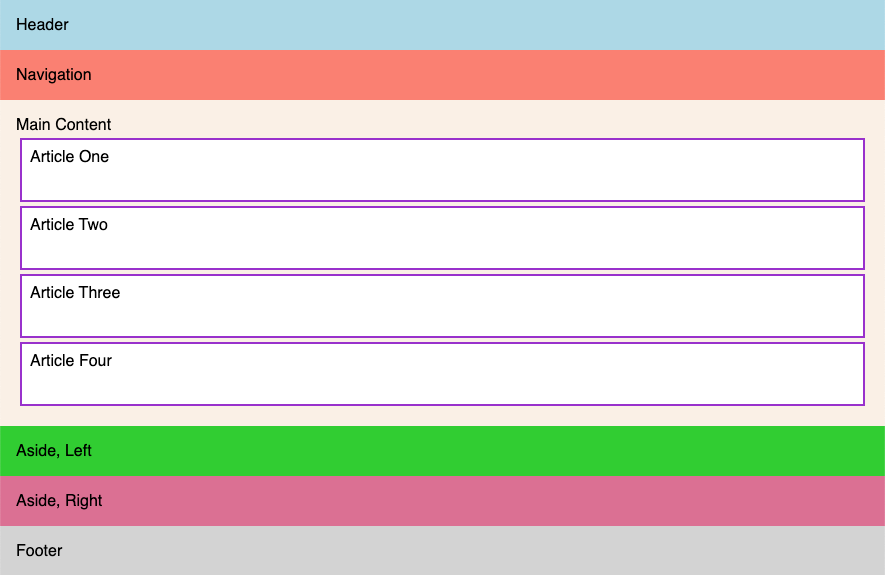
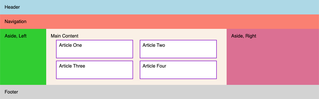
Grid Terms - Lines, Cells, Areas
Lines
Cells
Areas
Column and Row Line Numbers
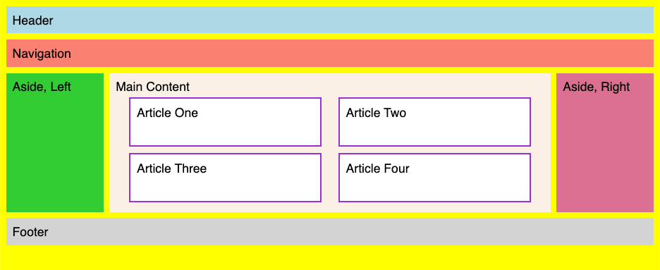
Grid Examples
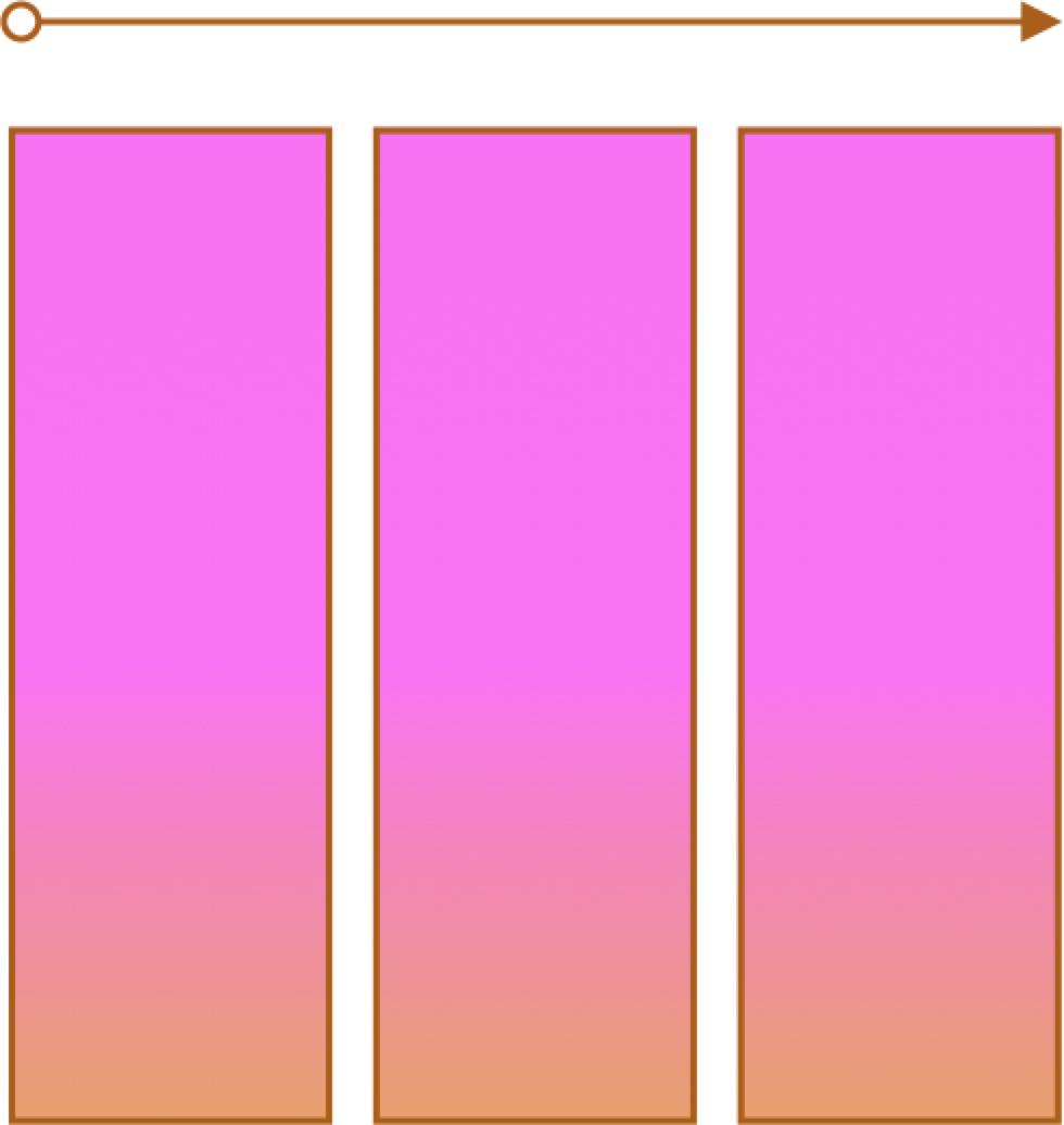
- 2 column layout
- 3 column layout
- Content
- Responsive
Grid Examples
- Two columns
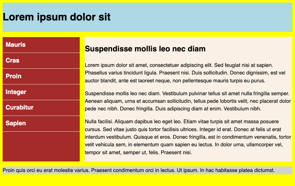
Grid - Lines and Areas

Grid Example
- Three columns
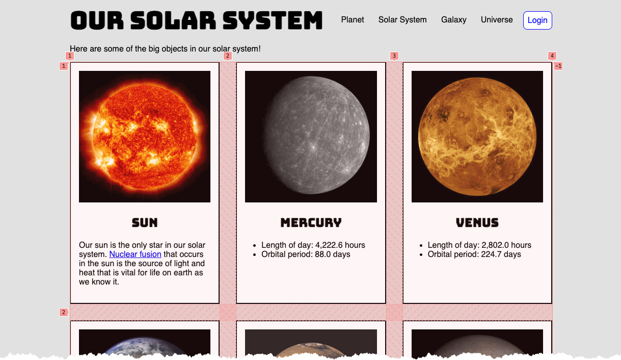
Grid Content Example - Solar System
main div.container {
  display: grid;
  grid-template-columns: repeat(3, 1fr);
  column-gap: 2rem;
  row-gap: 2rem;
}
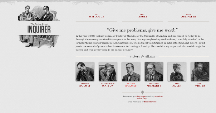
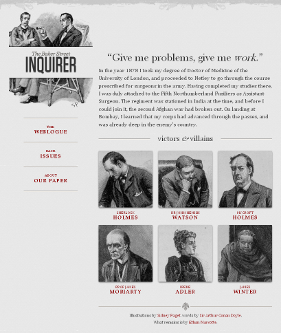
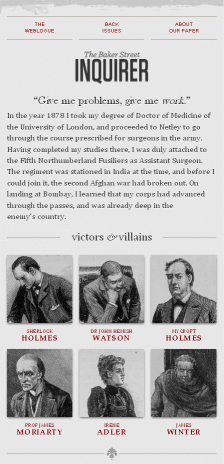
Responsive Page Layouts
Site is "responsive" to different devices.

Classic Responsive Design Example
Breakpoints and CSS Media Queries
@media CSS Media Query
/* rules for small screens and all screens */
body {
  background-color: #005bbb;
  color: #ffd500;
  font-family: helvetica, sans-serif
}
h1 { text-align: center; font-size: 3rem;}
/* only for widths of 768px and wider
   yes, we could have used 48em as a unit
*/
@media (min-width: 768px) {
  /* specific rules go here */
  body {
    background-color: #ffd500;
    color: #005bbb;
  }
}
What about breakpoints?
- Pay attention to design, not devices (there are simply too many)
- Start with a single breakpoint; introduce others only as needed.
Put another way, you don't have to have a half dozen different layouts just because you see some definition lists of XS, S, M, L, XL, XXL sizes defined.
With that said....
Breakpoints defined in certain approaches are:
- 576px, 768px, 992px, 1200px, and 1400px (Bootstrap)
- 600px, 840px, 1200px, and 1600px (Material Design)
Responsive Page Layouts
CSS media query:
/* "compact" (no query needed) */


/* "medium" screens */
@media (min-width: 600px) { /* specific rules go here */ }

/* "expanded" screens */
@media (min-width: 840px) { /* specific rules go here */ }

/* "large" screens */
@media (min-width: 1200px) { /* specific rules go here */ }

/* "extra large" screens */
@media (min-width: 1600px) { /* specific rules go here */ }
A Responsive Example
Small
Large
Responsive Images
Deliver the appropriately sized image using srcset and sizes attributes in the img element.
- Guide to the Responsive Images Syntax In HTML | CSS-Tricks
- Responsive Images | MDN
- Responsive Images with srcset | imgix
srcset and sizes
<img src="images/gnp.jpg"
alt="Glacier National Park"
srcset="images/gnp-600.jpg 600w,
images/gnp-900.jpg 900w,
images/gnp-1200.jpg 1200w,
images/gnp-1500.jpg 1500w"
sizes="(min-width: 1500px) 1400px,
       (min-width: 1200px) 1100px,
       (min-width: 900px) 800px,
       (min-width: 600px) 500px,
       900px"/>
Demos
CSS Custom Properties
The problem: keeping "DRY" (don't repeat yourself) in CSS can be hard impossible.
CSS Custom Properties provides a way forward!
section {
    --spacing: 1.2rem;
    padding: var(--spacing);
    margin-bottom: var(--spacing);
}
Steps:
- Define the property
--spacing: 1.2rem; - Use the property
    padding: var(--spacing);
    margin-bottom: var(--spacing);
Custom Properties
Properties cascade too -- so properties defined in "html" will be available throughout, but they can be overriden by redefining at another level (e.g. "footer")
Sometimes you see ":root" selector used for global custom properties, but that is essentially the same as "html"
See the Pen First @media query by David Heitmeyer (@dpheitmeyer) on CodePen.
Other CSS expressions
- Children:
>to select direct children (CSS combinators)nav > ulvsnav ul
Child vs Descendent - Attributes:
[ ]for attribute and attribute value selectors - Sibling:
+img + p(Next-sibling combinator)
Apwhose immediate previous sibling is animg - Selector for children with :has() pseudo-class.
:has()
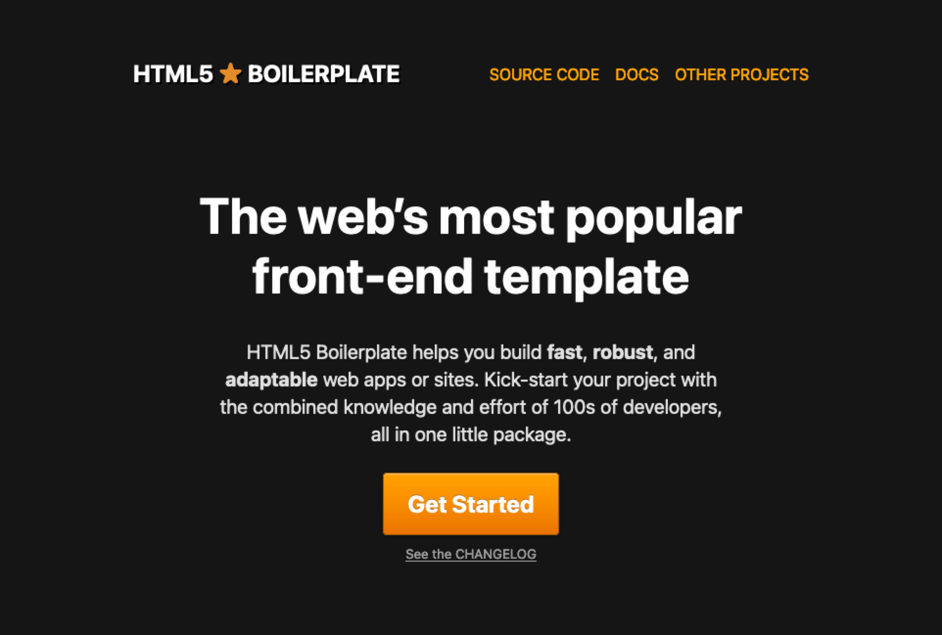
HTML5 Boilerplate
HTML5 Boilerplate -- this isn't a full-fledged endorsement to use this always for every project, but it is worth considering what's part of this boilerplate and why it is there. And, it very well might be directly helpful!