Session 05 - CSS, Part 3
Harvard Extension School
Fall 2024
Course Web Site: https://cscie12.dce.harvard.edu/
Topics
- CSS Flexbox
- CSS Flexbox
- CSS Flexbox
- Working an Example
- Continuing an Example - Solar System
- A new example: WebAIM
- Fonts
- Flex and Simple Layouts
- CSS remedy, normalize, and reset
Presentation contains 13 slides
CSS Flexbox
Flexbox is a one-dimensional layout method for arranging items in rows or columns. Items flex (expand) to fill additional space or shrink to fit into smaller spaces.
When to use it: Building simple page or content layouts without
having use float or positioning.
CSS Flexbox
Flexbox
- One primary axis
- Basic layouts for pages and content
- Easier then "grid" (?)
CSS Flexbox
- MDN: Basic Concepts of Flexbox
- CSS Tricks: A complete Guide to Flexbox and a fantastic poster!
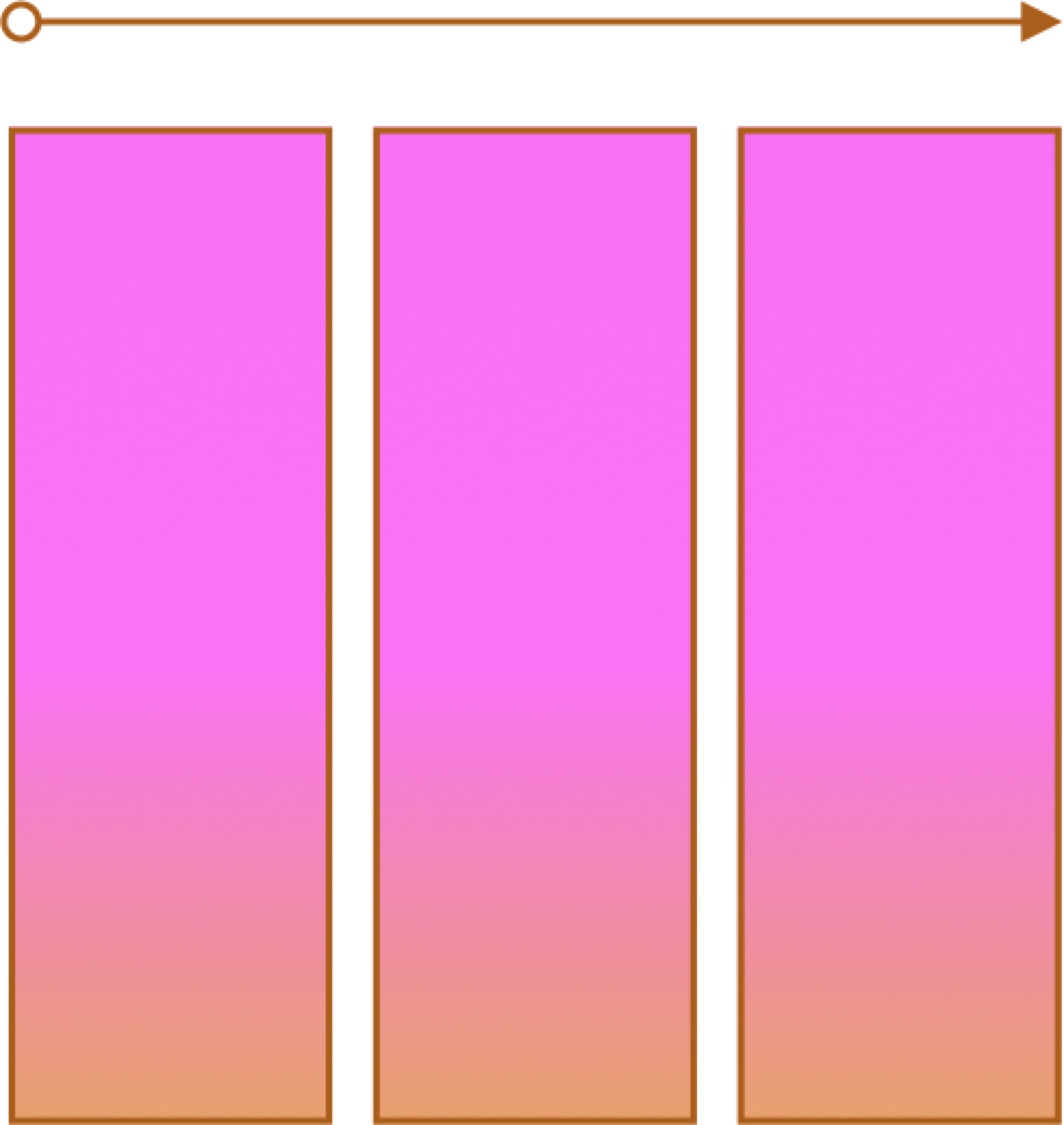
Container and Items
- Set up your flex container and properties of the container.
- Set the "flex" properties on the items within your container.
 <div id="f3container">
   <div class="box box1">1
   </div>
   <div class="box box2">2
   </div>
   <div class="box box3">3
   </div>
   <div class="box box4">4
   </div>
   <div class="box box5">5
   </div>
 </div>
In style
element
(<style>) within head element:
#f3container {
  display: flex;
}
.box1, .box2, .box3, .box4, .box5 {
  flex-grow: 0;
  flex-shrink: 0;
  flex-basis: 5em;
}
.box1 { background-color: lightpink;}
.box2 { background-color: lightsteelblue;}
.box3 { background-color: wheat;}
.box4 { background-color: plum;}
.box5 { background-color: palegreen;}
.box {
  padding: 2em;
  border: medium solid black;
  width: 3em;
}
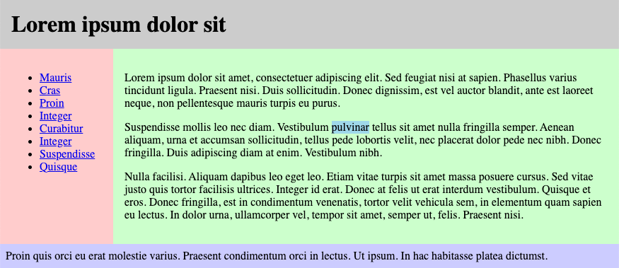
Working an Example
Some Notes about the Example
- Adding class attributes may be helpful
- anchor (a elements) with display of block for navigation
- :first-child and :last-child pseudo-class
- sometimes flex parent containers will be there, sometimes you have to add them
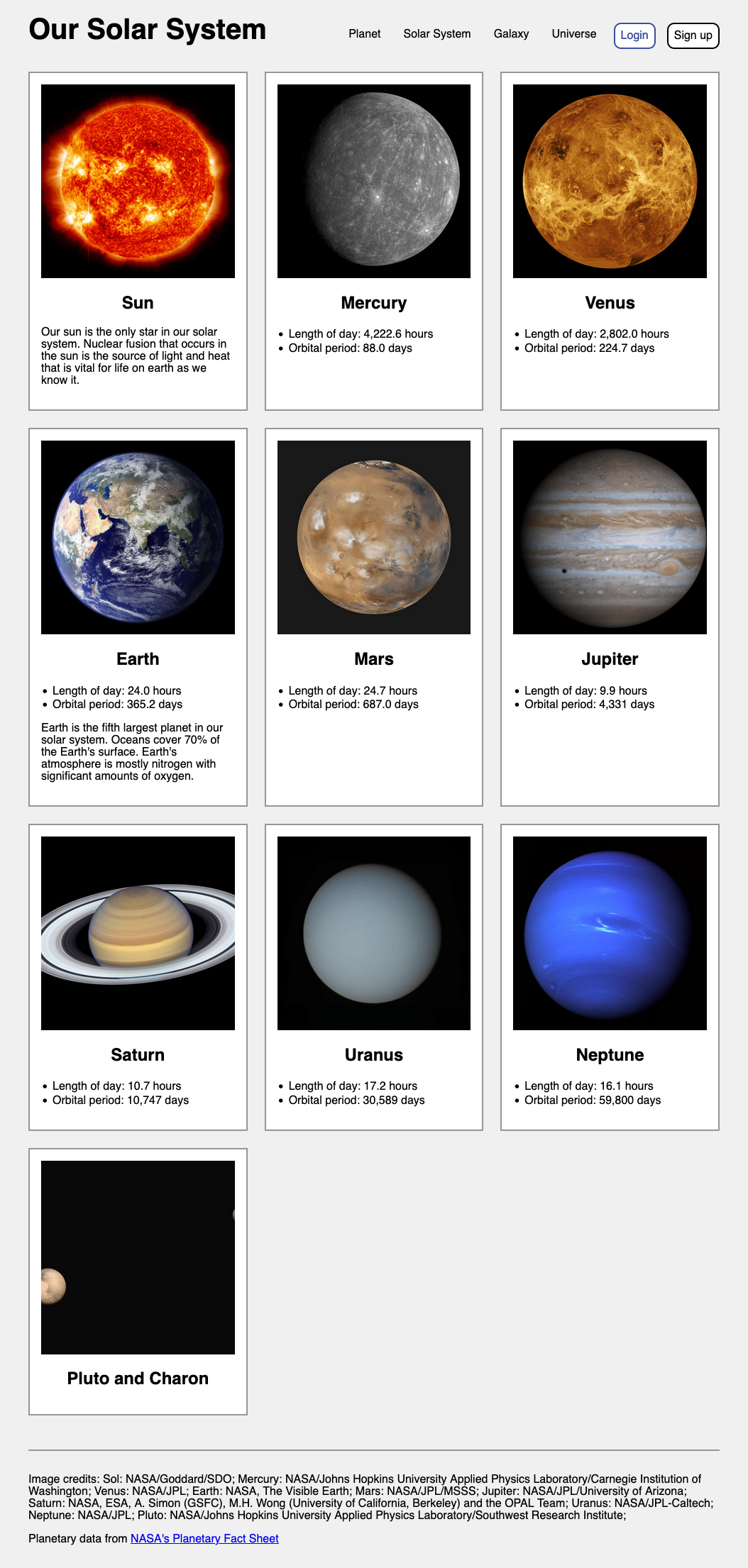
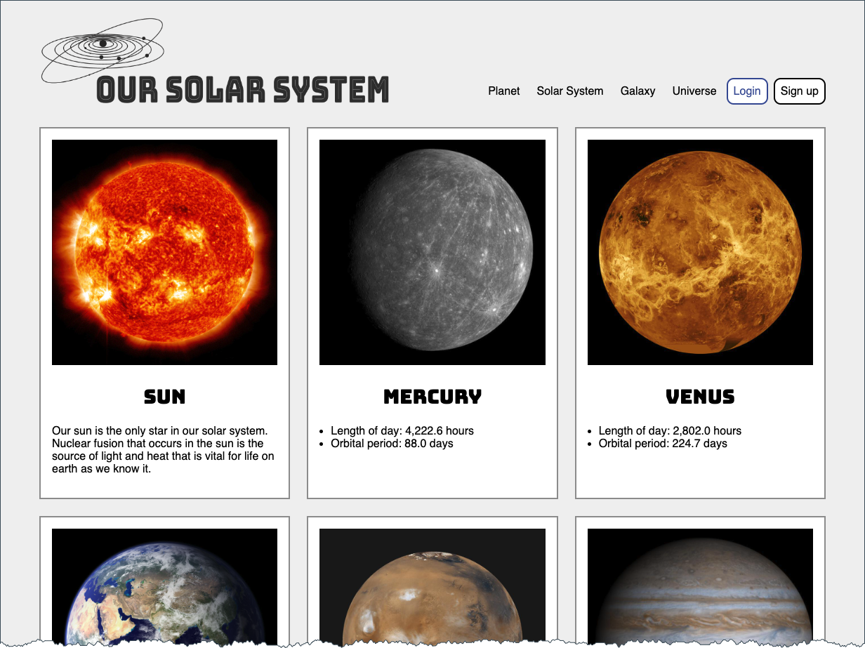
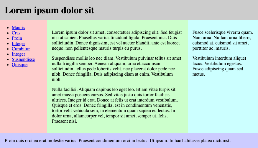
Continuing an Example - Solar System
- Worked Examples in class are with the Lecture Notes -- viewable and downloadable (zip)!
https://cscie12.dce.harvard.edu/lecture_notes/2024-fall/
Example, continued
- Use logo instead of text. See Inclusively Hidden from CSS-Tricks
- Different font for planet titles (Bungee Inline)
- Set a max-width for page content
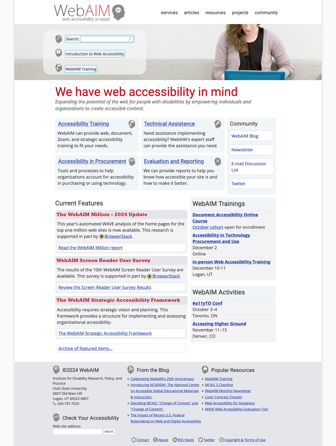
A new example: WebAIM
WebAIM - Web Accessibility in Mind
Fonts
font-family
CSS font-family property takes a comma-separated list of fonts,
and should always end with a generic font-family (e.g. serif, sans-serif, monospace).
body {
font-family: 'Merriweather Regular', 'Times New Roman', serif;
}
How are fonts defined?
Two approaches with fonts:
- Rely on system fonts
- Use web fonts to deliver font definition as part of the resources loaded by a page
- load the font definition
- use in "font-family" CSS property
Note:
- hosted fonts or our fonts
- multiple ways of loading fonts
linkelement inheadof HTML ← use this!@importor@font-facein CSS
Font - Include through link element
Using a link element to include CSS with @font-face definitions is how some font hosting services recommend including their fonts. Google Fonts does this.
The server delivering the fonts does browser detection and delivers the CSS file with the appropriate font format.
Note that we are having using two Google Fonts -- Cabin Sketch and Cabin. And we also link to our own stylesheet (demo.css).
<link href="https://fonts.googleapis.com/css2?family=Cabin+Sketch:wght@400;700&family=Cabin:wght@400;700&display=swap"
rel="stylesheet" />
<link rel="stylesheet" href="demo.css" />Our CSS in demo.css:
h1,h2,h3,h4,h5,h6 {
font-family:"Cabin Sketch", sans-serif;
}

h1 {
font-size: 3em;
}

h2 {
font-size: 2em;
}

body {
font-family: Cabin, serif;
}
Note that nothing magical is going on here -- Google is simply returning CSS that uses @font-face with the font format appropriate for the browser making the request.
/* latin */
@font-face {
font-family: 'Cabin Sketch';
font-style: normal;
font-weight: 400;
font-display: swap;
src: local('Cabin Sketch Regular'), local('CabinSketch-Regular'), url(https://fonts.gstatic.com/s/cabinsketch/v14/QGYpz_kZZAGCONcK2A4bGOj8mNhNy_r-Kw.woff2) format('woff2');
unicode-range: U+0000-00FF, U+0131, U+0152-0153, U+02BB-02BC, U+02C6, U+02DA, U+02DC, U+2000-206F, U+2074, U+20AC, U+2122, U+2191, U+2193, U+2212, U+2215, U+FEFF, U+FFFD;
}
/* latin */
@font-face {
font-family: 'Cabin Sketch';
font-style: normal;
font-weight: 700;
font-display: swap;
src: local('Cabin Sketch Bold'), local('CabinSketch-Bold'), url(https://fonts.gstatic.com/s/cabinsketch/v14/QGY2z_kZZAGCONcK2A4bGOj0I_1Y5tjzAYOcFg.woff2) format('woff2');
unicode-range: U+0000-00FF, U+0131, U+0152-0153, U+02BB-02BC, U+02C6, U+02DA, U+02DC, U+2000-206F, U+2074, U+20AC, U+2122, U+2191, U+2193, U+2212, U+2215, U+FEFF, U+FFFD;
}
Font Resources
See Typefaces page on course site: Font Deck Cards - Typefaces
Finding or exploring fonts:
Font Pairing
Try some professional advice on font pairing (a web search on "font pairing"
will get you started.)
Start with a font for headings and another font for body.
Flex and Simple Layouts
CSS remedy, normalize, and reset
Sometimes default browser behavior helps, sometimes it gets in the way. Three approaches are:
- remedy (CSS starts how we wish it would be)
- normalize across browsers
- blank slate (reset)
Three approaches:
- CSS Remedy / Sensible Defaults: free yourself from
history and provide a remedy for CSS legacy 'mistakes'; provide yourself with sensible starting point and defaults.
A good example of this is: Andy Bell's "A Modern CSS Reset" - CSS Reset: give yourself a "blank slate" to build upon; that is, effectively remove all browser default styles.
- CSS Normalize: give yourself consistency across browsers.