Session 06 - CSS, Part 4 - including Grid
Harvard Extension School
Fall 2023
Course Web Site: https://cscie12.dce.harvard.edu/
Topics
Presentation contains 16 slides
Contrasting CSS Flexbox and Grid
Flexbox
- One primary axis
- Basic layouts for pages and content
- Easier then "grid" (?)
Grid
- Two axes
- More complex layouts
- Overlapping items
CSS Grid
- CSS Grid Layout (MDN)
- Basic Concepts of Grid Layout
- Getting Started with CSS Grid (CSS-Tricks)
- Complete Guide to Grid (CSS-Tricks)
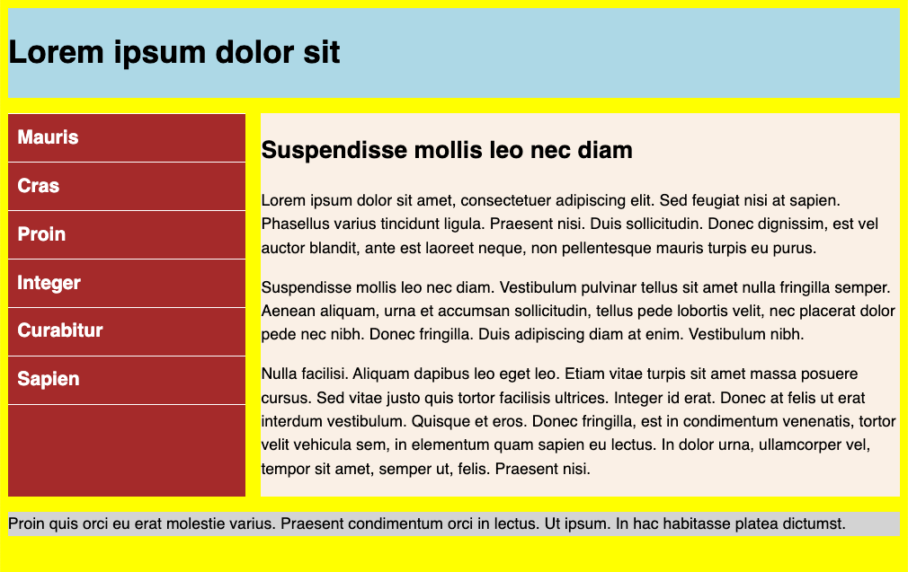
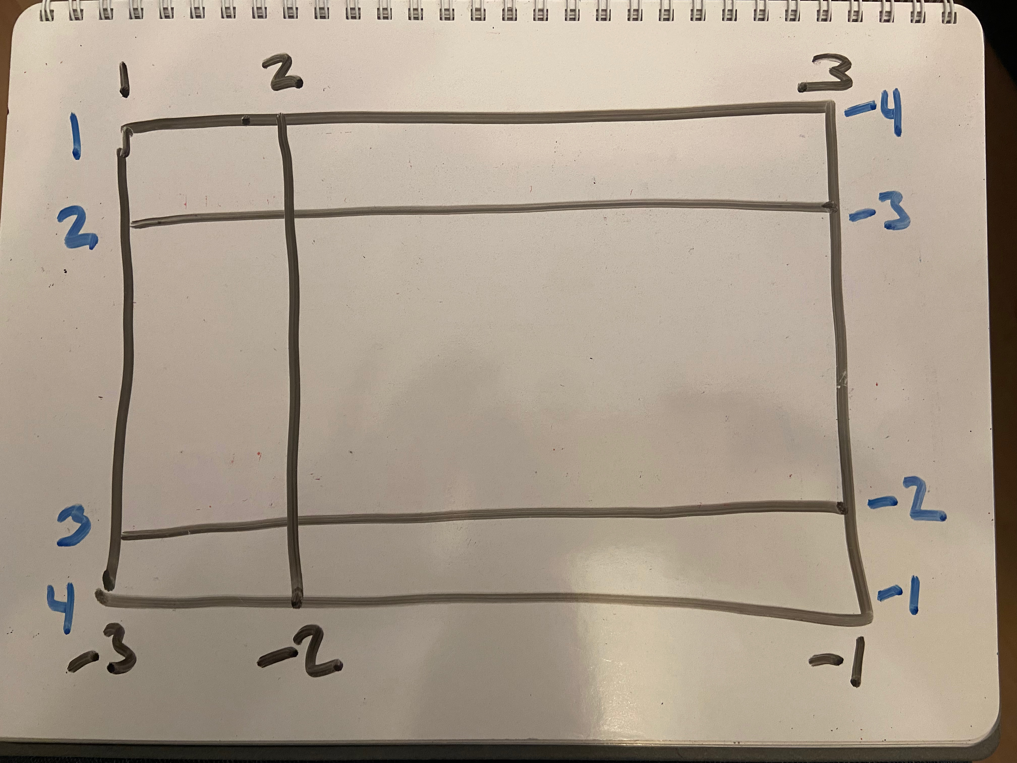
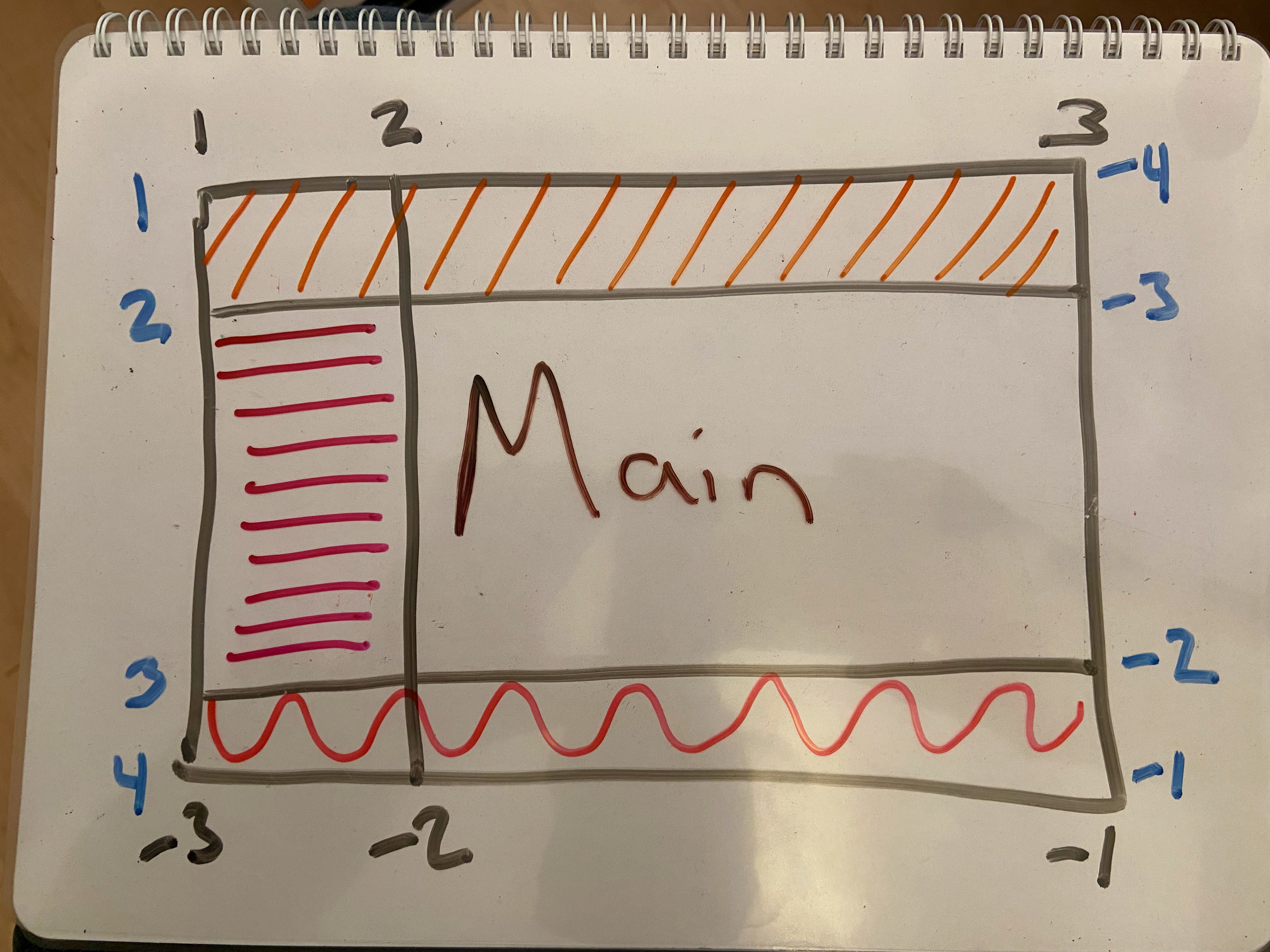
Grid Terms - Lines, Cells, Areas
Lines
Cells
Areas
Column and Row Line Numbers
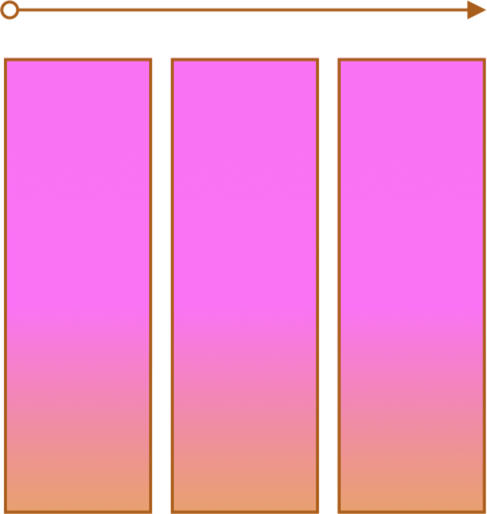
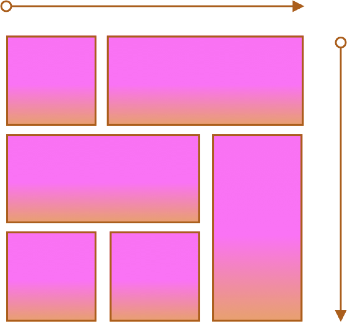
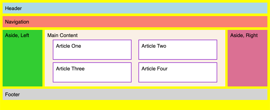
Grid Examples
- 2 column layout
- 3 column layout
- Content
- Responsive
Grid Examples
- Two columns
Grid - Lines and Areas
Grid Examples
- Three columns
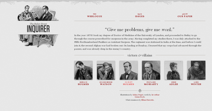
Grid Example - Solar System
Responsive Page Layouts
Site is "responsive" to different devices.

Classic Responsive Design Example
Breakpoints and CSS Media Queries
@media CSS Media Query
/* rules for small screens and all screens */
body {
  background-color: #005bbb;
  color: #ffd500;
  font-family: helvetica, sans-serif
}
h1 { text-align: center; font-size: 3rem;}
/* only for widths of 768px and wider
   yes, we could have used 48em as a unit
*/
@media (min-width: 768px) {
  /* specific rules go here */
  body {
    background-color: #ffd500;
    color: #005bbb;
  }
}
Code Pen Example of Media Query
See the Pen First @media query by David Heitmeyer (@dpheitmeyer) on CodePen.
What about breakpoints?
- Pay attention to design, not devices (there are simply too many)
- Start with a single breakpoint; introduce others only as needed.
Put another way, you don't have to have a half dozen different layouts just because you see some definition lists of XS, S, M, L, XL, XXL sizes defined.
With that said....
Breakpoints defined in certain approaches are:
- 576px, 768px, 992px, 1200px, and 1400px (Bootstrap)
- 600px, 960px, 1264px, and 1904px (Material Design)
Responsive Page Layouts
CSS media query:
/* extra small "xs" (no query needed) */


/* small "sm" screens */
@media (min-width: 600px) { /* specific rules go here */ }

/* medium "md" screens */
@media (min-width: 960px) { /* specific rules go here */ }

/* lg screens */
@media (min-width: 1264px) { /* specific rules go here */ }

/* extra large "xl" screens */
@media (min-width: 1904px) { /* specific rules go here */ }
Responsive Images
Deliver the appropriately sized image using srcset and sizes attributes in the img element.
- Guide to the Responsive Images Syntax In HTML | CSS-Tricks
- Responsive Images | MDN
srcset and sizes
<img src="images/gnp.jpg"
alt="Glacier National Park"
srcset="images/gnp-600.jpg 600w,
images/gnp-900.jpg 900w,
images/gnp-1200.jpg 1200w,
images/gnp-1500.jpg 1500w"
sizes="(min-width: 1500px) 1400px,
       (min-width: 1200px) 1100px,
       (min-width: 900px) 800px,
       (min-width: 600px) 500px,
       900px"/>
Demos
CSS Custom Properties
The problem: keeping "DRY" (don't repeat yourself) in CSS can be hard impossible.
CSS Custom Properties provides a way forward!
section {
    --spacing: 1.2rem;
    padding: var(--spacing);
    margin-bottom: var(--spacing);
}
Steps:
- Define the property
--spacing: 1.2rem; - Use the property
    padding: var(--spacing);
    margin-bottom: var(--spacing);
Custom Properties
Properties cascade too -- so properties defined in "html" will be available throughout, but they can be overriden by redefining at another level (e.g. "footer")
Sometimes you see ":root" selector used for global custom properties, but that is essentially the same as "html"
See the Pen First @media query by David Heitmeyer (@dpheitmeyer) on CodePen.