Session 05 - CSS, Part 3 (including Flexbox)
Harvard Extension School
Spring 2022
Course Web Site: https://cscie12.dce.harvard.edu/
Topics
- Two approaches - border or content?
- CSS Best Practices
- CSS Rules and Specificity
- Box Sizing - How do you measure width?
- CSS calc()
- CSS Normalize, Reset, or Remedy
- CSS Flexbox and Grid
- CSS Flexbox
- Solar System Example
Presentation contains 21 slides
Two approaches - border or content?
When doing navigation, how about a "border" or "content" property?
Border
See the Pen Navigation - horizontal with border by David Heitmeyer (@dpheitmeyer) on CodePen.
Content
See the Pen Navigation - horizontal with border by David Heitmeyer (@dpheitmeyer) on CodePen.
CSS Best Practices
- Format consistently (e.g. use the default in your text editor)
- Comment
/* || General Styles */ - Have logical sections in your CSS (e.g. General Styles, Header, Footer, content specific, etc.)
- Use semantic names
CSS Best Practices
Use semantic "class" and "id" values
You can choose class and id values when authoring your CSS and HTML. A good rule is to create
"logical" class and id values and not "descriptive" ones. Remember, you've gone to the trouble of
separating markup and presentation -- keep this separation when creating class
names.
If you can guess how the class is styled based upon the name, this should cause you to consider changing the name.
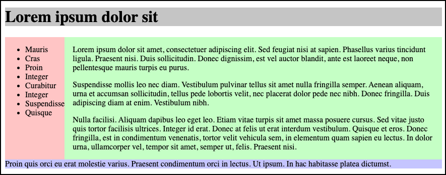
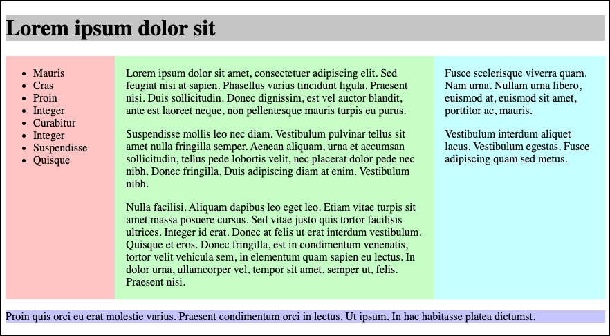
| Good Class/ID Names | Poor Class Names |
|---|---|
|
|
Choosing class and id names appropriately will help with:
- evolution
Your#rightnavmay very well become navigation positioned on the left side or the top.
Your.redboldmay very be changed to another color or background entirely. - specificity and semantics
If you have a.dottedborderclass, you may wish to change how your thumbnail images are styled, but leave presentation of other markup that you've given the same class to unchanged.
What about "utility" classes and CSS frameworks?
Yes, I know the approach of using "utility" classes.
I strongly recommend
learning the "semantic" approach first.
What do I mean by "utlity" classes? -- something that looks like:
<div class="p-6 max-w-sm mx-auto bg-white rounded-xl shadow-lg flex items-center space-x-4">
  <div class="shrink-0">
    <img class="h-12 w-12" src="/img/logo.svg" alt="ChitChat Logo">
  </div>
  <div>
    <div class="text-xl font-medium text-black">ChitChat</div>
    <p class="text-slate-500">You have a new message!</p>
  </div>
</div>
The semantic approach might look like:
<div class="chat-notification">
  <img class="chat-notification-logo" src="/img/logo.svg" alt="ChitChat Logo">
  <div class="content">
    <h4 class="title">ChitChat</h4>
    <p class="message">You have a new message!</p>
  </div>
</div>
Beware of Divitis and Classitis
- divitis
- An unhealthy markup condition characterized by the profligate use of the "div" element
- classitis
- An unhealthy markup condition characterized by the profligate use of "class" attributes
Avoid Divitis, Classitis, Tagitis, etc.
<div class="header">Our Solar System</div>or even
<div class="header"><h1>Our Solar System</h1></div><h1>Our Solar System</h1><div class="basketball">
<ul>
<li>Mark Few</li>
<li>Chris Jans</li>
<li>Bill Self</li>
<li>Mike Krzyzewski</li>
...
<ul class="basketball">
              <li>Mark Few</li>
              <li>Chris Jans</li>
              <li>Bill Self</li>
              <li>Mike Krzyzewski</li>
              ...
CSS Rules and Specificity
See: Calculating a selector's specificity.
Image from Flickr user Cayusa, used under Creative Commons license.
Stylesheet Origin
- author stylesheet
- reader (user) stylesheet
- browser (user agent) stylesheet
Specificity of Selector
- style attribute
- count "id" attributes
- count number of other attributes ("class")
- count element names
Order
- last occurence has higher specificity
@import-ed stylesheets come before rules in the importing sheet.
CSS Selector Specificity
Specificity is expressed in a form of a list of four numbers: (a,b,c,d)
- inline style
- id
- class, pseudo-class and attributes
- element and pseudo-elements
Start comparing at "a", if equal go to "b", etc.
nav li {...}                     /* (0,0,0,2) */
nav.primary {...}                /* (0,0,1,1) */
nav.primary li {...}             /* (0,0,1,2) */
nav.primary li:first-child {...} /* (0,0,2,2) */
nav.primary li.getinfo {...}     /* (0,0,2,2) */
#globalnav {...}                 /* (0,1,0,0) */
And for a fun take on CSS Specificity, take a look at CSS SpeciFISHity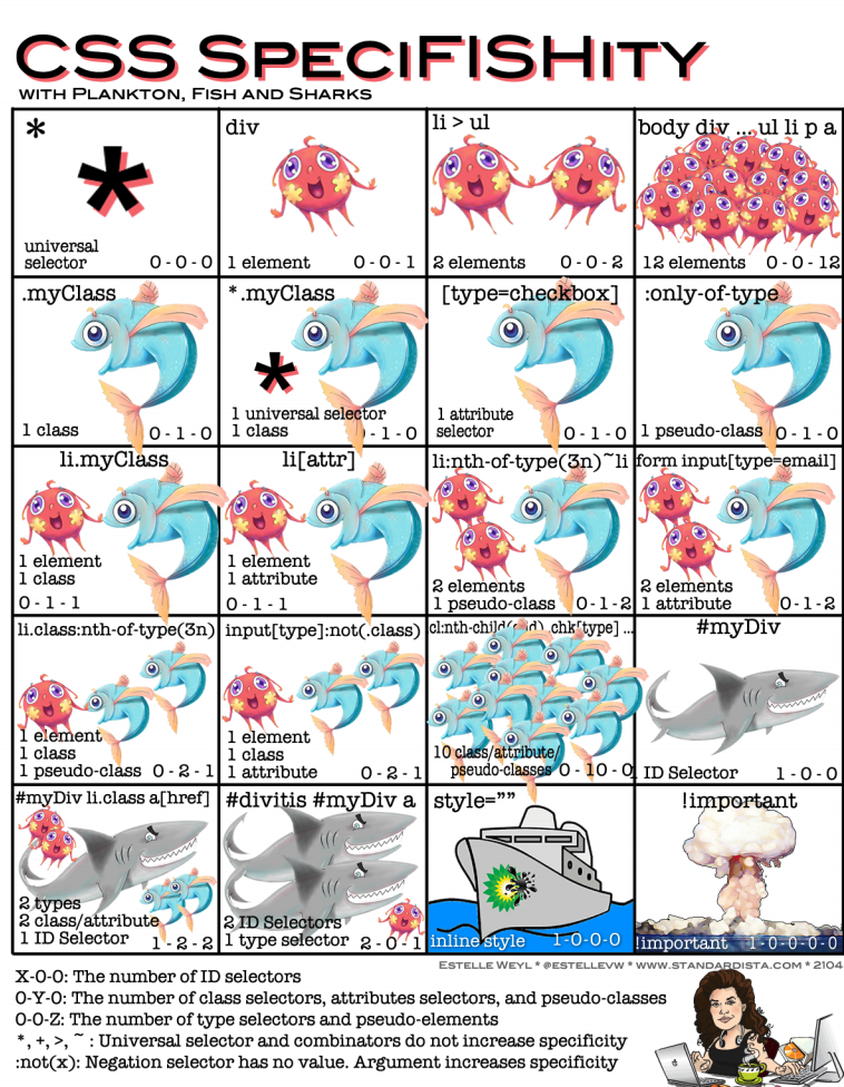
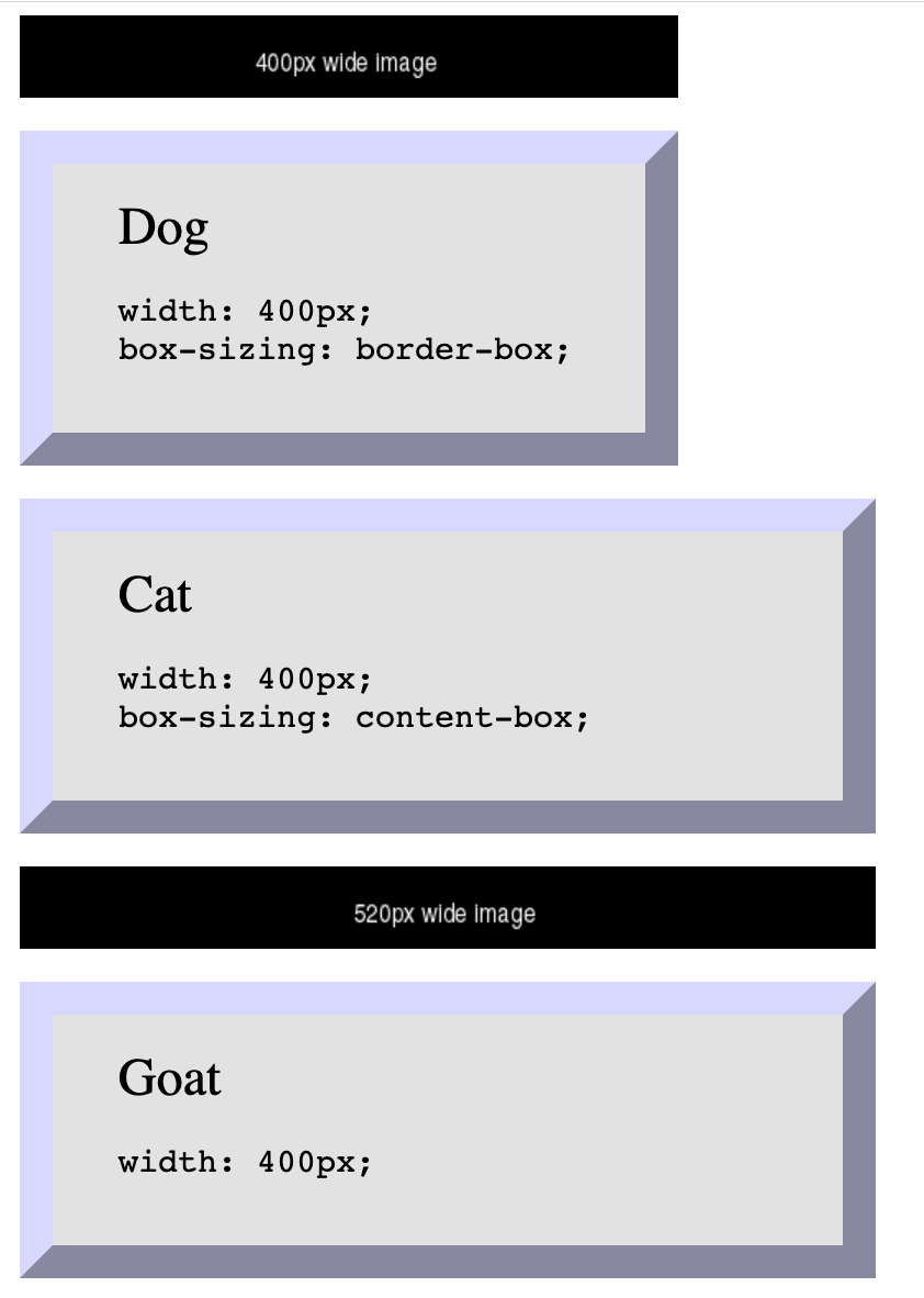
Box Sizing - How do you measure width?
By default, box sizing (width or height) is measured in terms of the "content-box". So any padding or border is "in addition to" the width set in CSS.
 <img src="https://via.placeholder.com/400x50/000000/ffffff.png?text=400px+wide+image"/>

 <div class="dog sizing">Dog
   <pre>width: 400px; box-sizing: border-box;   </pre>
 </div>
 <div class="cat">Cat
   <pre>width: 400px; box-sizing: content-box;   </pre>
 </div>
 <img src="https://via.placeholder.com/520x50/000000/ffffff.png?text=520px+wide+image"/>

 <div class="goat">Goat
   <pre>width: 400px; /* default box-sizing, which is content-box */   </pre>
 </div>
In style
element
(<style>) within head element:
  .dog {
    box-sizing: border-box;
  }
  .cat {
    box-sizing: content-box;
  }
  .goat {
    box-sizing: unset;
  }
  div {
    margin: 20px;
    font-size: xx-large;
    background-color: rgb(230,230,230);
    padding: 20px 40px;
    text-align: left;
    width: 400px;
    border: 20px outset rgb(220,220,255);
  }
  div pre { font-size: x-large;}

  img { margin-left: 20px;}
When 25% is not 1/4 of the screen
 <div class="full">
   <p>Container - 100%
   </p>
   <div class="quarter">One (25%)
   </div>
   <div class="quarter">Two (25%)
   </div>
   <div class="quarter">Three (25%)
   </div>
   <div class="quarter">Four (25%)
   </div>
 </div>
In style
element
(<style>) within head element:
  div.quarter {
    width: 25%;
    border: 2px dashed purple;
    background-color: rgb(240, 200, 240);
    float: left;
    overflow: auto;
    text-align: center;
    padding-top: 1rem;
    padding-bottom: 1rem;
  }
  div.full {
    width: 100%;
    border: 2px solid black;
    overflow: auto;
  }
 <div class="full">
   <p>Container - 100%
   </p>
   <div class="quarter">One (25%)
   </div>
   <div class="quarter">Two (25%)
   </div>
   <div class="quarter">Three (25%)
   </div>
   <div class="quarter">Four (25%)
   </div>
 </div>
In style
element
(<style>) within head element:
  div.quarter {
    width: 25%;
    box-sizing: border-box;
    border: 2px dashed purple;
    background-color: rgb(240, 200, 240);
    float: left;
    overflow: auto;
    text-align: center;
    padding-top: 1rem;
    padding-bottom: 1rem;
  }
  div.full {
    width: 100%;
    border: 2px solid black;
    overflow: auto;
  }
* { box-sizing: border-box; }
It is a common practice to set box-sizing property to "border-box" for all elements
* { box-sizing: border-box; }
CSS calc()
CSS calc() function give a way to calculate values. See: calc() function on MDN
width: calc(33.33% - 2rem);
 <ul>
   <li>Item One
   </li>
   <li>Item Two
   </li>
   <li>Item Three
   </li> </ul>
In style
element
(<style>) within head element:
  ul, li { margin-left: 0; padding-left: 0;}
  ul { list-style: none; overflow: auto; background-color: #ffffdd; border: thin solid black;}
  li { box-sizing: border-box;
    padding: 1rem; margin: 1rem; float: left;
    width: calc(33.33% - 2rem);
    font-weight: bold; text-align: center; border: 5px dotted green; }
CSS Normalize, Reset, or Remedy
Three approaches:
- CSS Reset: give yourself a "blank slate" to build upon; that is, effectively remove all browser default styles.
- CSS Normalize: give yourself consistency across browsers.
- CSS Remedy / Sensible Defaults: free yourself from history and provide a remedy for CSS legacy mistakes; provide yourself with sensible defaults.
Examples
- Basic Markup
- Eric Meyer's Reset CSS — Basic Markup with Eric Meyer CSS Reset
- normalize.css project — Basic Markup with CSS Normalize
- Andy Bell's "A Modern CSS Reset" — Basic Markup with Andy Bell's Modern CSS Reset
- Jen Simmons's "CSS Remedy" — Basic Markup with Jen Simmons's CSS Remedy
CSS Flexbox and Grid
Flexbox
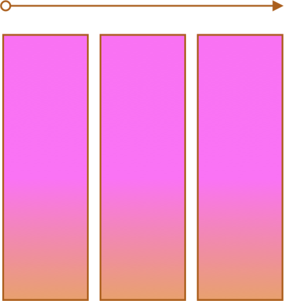
- One primary axis
- Basic layouts
- Easier than "Grid"
Grid
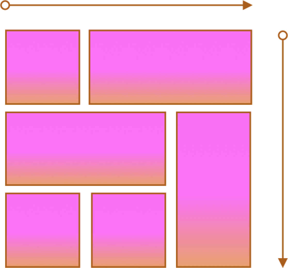
- Two axes
- Layouts and more complex layouts
- Overlapping items
CSS Flexbox
Container and Items
- Set up your flex container
- Set the "flex" properties on the items within your container
 <div id="f3container">
   <div class="box box1">1
   </div>
   <div class="box box2">2
   </div>
   <div class="box box3">3
   </div>
   <div class="box box4">4
   </div>
   <div class="box box5">5
   </div>
 </div>
In style
element
(<style>) within head element:
#f3container {
  display: flex;
}
.box1, .box2, .box3, .box4, .box5 {
  flex-grow: 0;
  flex-shrink: 0;
  flex-basis: 5em;
}
.box1 { background-color: lightpink;}
.box2 { background-color: lightsteelblue;}
.box3 { background-color: wheat;}
.box4 { background-color: plum;}
.box5 { background-color: palegreen;}
.box {
  padding: 2em;
  border: medium solid black;
  width: 3em;
}
flex-basis
Controls the initial size of the flex item
 <div id="f4container">
   <div class="box box1">1
   </div>
   <div class="box box2">2
   </div>
   <div class="box box3">3
   </div>
 </div>
In style
element
(<style>) within head element:
#f4container {
  display: flex;
}
.box1 {
  flex-basis: 15%;
  background-color: lightpink;
}
.box2 {
  flex-basis: 25%;
  background-color: lightsteelblue;
}
.box3 {
  flex-basis: 50%;
  background-color: wheat;
}
.box {
  padding: 2em;
  border: medium solid black;
  width: 3em;
}
flex-grow and flex-shrink
Controls if and how the flex item will grow or shrink from its original flex-basis size.
 <div id="f5container">
   <div class="box box1">1
   </div>
   <div class="box box2">2
   </div>
   <div class="box box3">3
   </div>
 </div>
In style
element
(<style>) within head element:
#f5container {
  display: flex;
}
.box1 {
  flex-grow: 1;
  flex-shrink: 1;
  flex-basis: 200px;
  background-color: lightpink;
}
.box2 {
  flex-grow: 1;
  flex-shrink: 1;
  flex-basis: 100px;
  background-color: lightsteelblue;
}
.box3 {
  flex-grow: 1;
  flex-shrink: 1;
  flex-basis: 500px;
  background-color: wheat;
}
.box {
  padding: 2em;
  border: medium solid black;
  width: 3em;
}
Flex and Wrap
Controls whether flex items will "line wrap" — by default flex items do not wrap!
 <div id="f6container">
   <div class="box box1">1
   </div>
   <div class="box box2">2
   </div>
   <div class="box box3">3
   </div>
   <div class="box box4">4
   </div>
   <div class="box box5">5
   </div>
   <div class="box box6">6
   </div>
 </div>
In style
element
(<style>) within head element:
#f6container {
  display: flex;
  flex-wrap: wrap;
  justify-content: space-evenly;
  background-color: linen;
  border: thin solid black;
}
.box1, .box2, .box3, .box4, .box5, .box6 {
  flex-grow: 0;
  flex-shrink: 0;
  flex-basis: 28%;
  box-sizing: border-box;
  margin: 1rem 0;
}
.box1 { background-color: lightpink;}
.box2 { background-color: lightsteelblue;}
.box3 { background-color: wheat;}
.box4 { background-color: plum;}
.box5 { background-color: palegreen;}
.box6 { background-color: turquoise;}
.box {
  padding: 2em;
  border: medium solid black;
}
When working with images, max-width is your friend!
 <div id="f6container">
   <div class="box box1">1
   </div>
   <div class="box box2">2
   </div>
   <div class="box box3">3
   </div>
   <div class="box box4">4
   </div>
   <div class="box box5">5
   </div>
   <div class="box box6">6
   </div>
 </div>
In style
element
(<style>) within head element:
#f6container {
  display: flex;
  flex-wrap: wrap;
  justify-content: space-evenly;
  background-color: linen;
  border: thin solid black;
}
.box1, .box2, .box3, .box4, .box5, .box6 {
  flex-grow: 0;
  flex-shrink: 0;
  flex-basis: 28%;
  box-sizing: border-box;
  margin: 1rem 0;
}
.box1 { background-color: lightpink;}
.box2 { background-color: lightsteelblue;}
.box3 { background-color: wheat;}
.box4 { background-color: plum;}
.box5 { background-color: palegreen;}
.box6 { background-color: turquoise;}
.box {
  padding: 2em;
  border: medium solid black;
}
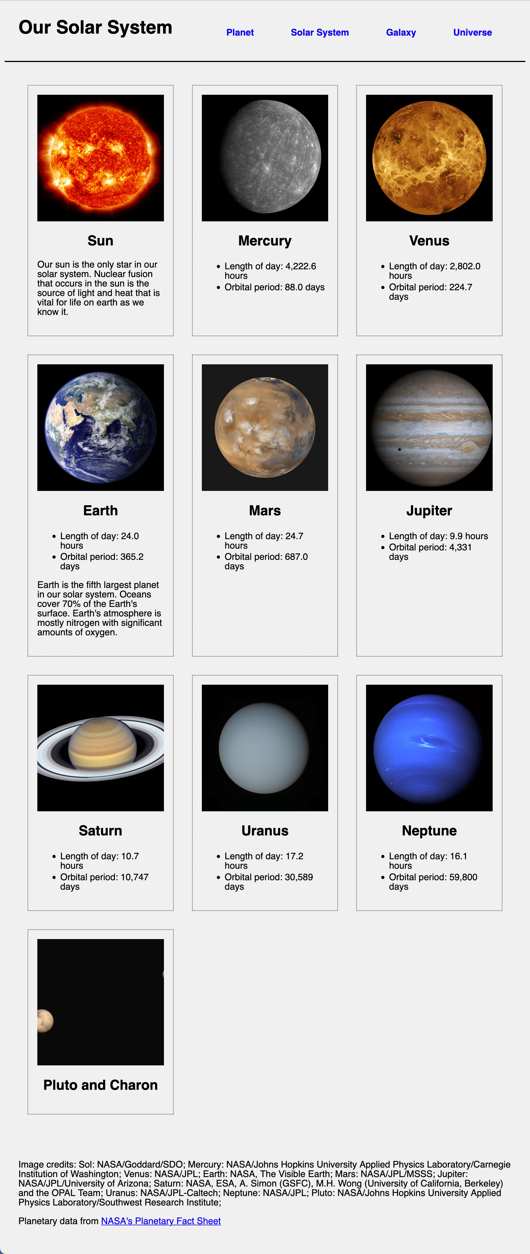
Solar System Example