Session 07 - Image and Video Essentials / User Experience and Design
Harvard Extension School
Fall 2022
Course Web Site: https://cscie12.dce.harvard.edu/
Topics
- Image Essentials
- JPEG
- GIF
- PNG
- WebP - Web Picture
- SVG
- Comparison of Image Formats
- Maintain aspect ratio for images
- Working with Images
- Video
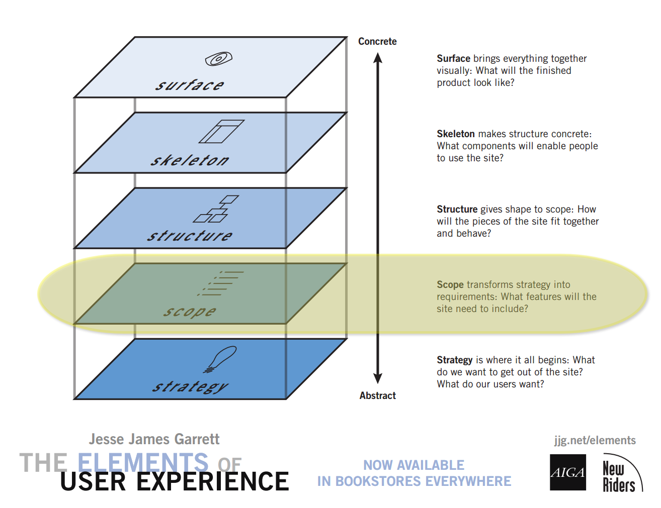
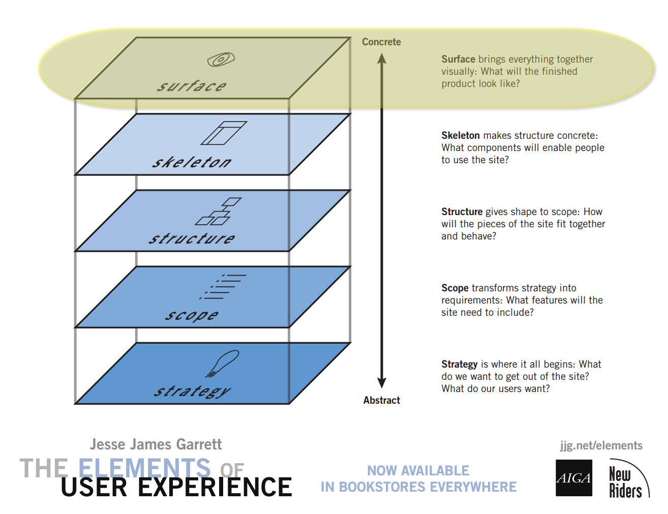
- Elements of User Experience
- Strategy
- Scope
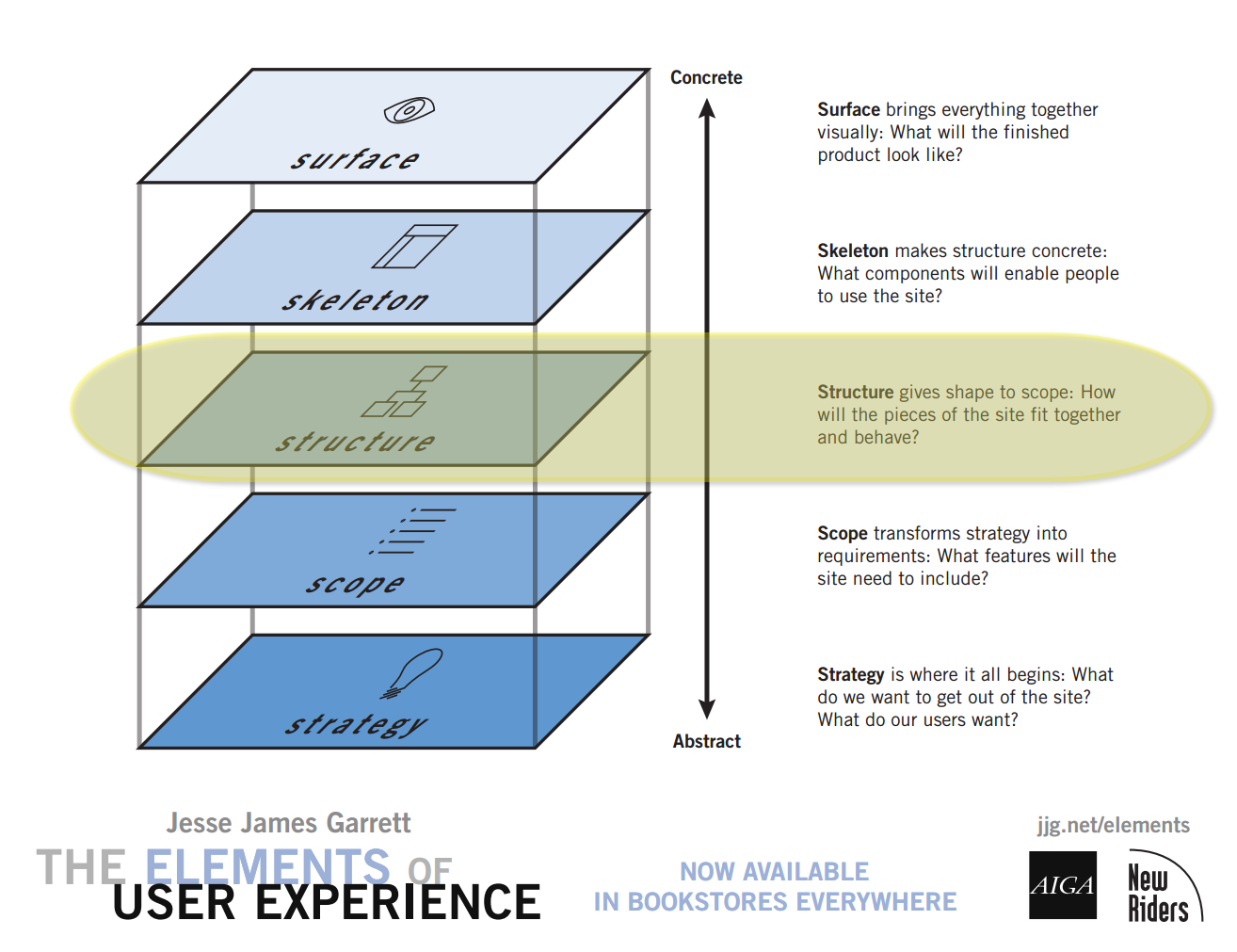
- Structure
- Skeleton
- Surface
Presentation contains 97 slides
Image Essentials
- Use an appropriate format (JPEG or WebP for photographs; PNG or WebP for wordmarks, illustrations; SVG sometimes)
- If adjusting an image, start with the highest resolution, lowest compression available!
- Set an appropriate image dimension (or resolution)
- Set an appropriate compression
- Preserve the aspect ratio
Images and the Web
- Content
- Design
Images and Markup
Two ways of including images:
- Markup:
imgelement<img src="images/widener-library.png" alt="Widener Library" > - CSS:
background-imagepropertyheader { background-image: url(images/harvard-yard.jpg); background-repeat: no-repeat; background-size: cover; }
Images and HTML - figure
Figure element is used to mainly to associate a caption with an image.
<figure>
    <img src="images/thiomargarita-magnifica.jpg"
    alt="Thiomargarita magnifica" />
    <figcaption>
    The filamentous <i>Thiomargarita magnifica</i>
    cells have more complex internal organization
    than do typical bacteria.<br/>
    Credit: Olivier Gros/Lawrence Berkeley National Laboratory
    </figcaption>
</figure>Images and HTML - picture
Picture element can be used to provide conditional image sources for content, with a fallback
<picture>
  		<source srcset="landscape.jpg" media="(min-width: 800px)">
  		<source srcset="extrawide.jpg" media="(min-width: 1200px)">
  		<img src="portrait.png"
  			 alt="placeholder image" />
</picture>Responsive Images
Two main use cases:
- Deliver same image but with different properties, e.g. resolution or format
☞ Useimgelement withsrcsetandsizesattribute - Deliver different images in different contexts
☞ Usepictureelement
srcset and sizes attributes
- Lists different resolutions/dimensions
- Use with
imgelement
srcset and sizes
srcset lists image optionssizes relates width of browser to width of image to select
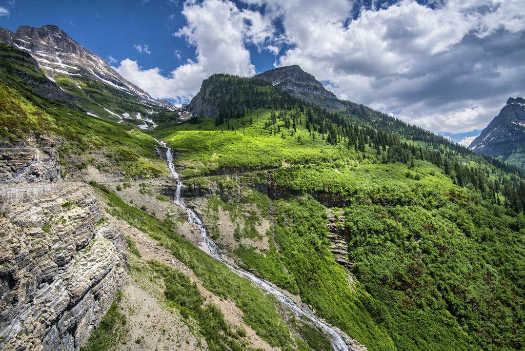
<img src="images/gnp.jpg"
  	alt="Glacier National Park"

  	srcset="images/gnp-500.jpg 500w,
  	images/gnp-600.jpg 600w,
  	images/gnp-900.jpg 900w,
  	images/gnp-1200.jpg 1200w,
  	images/gnp-1500.jpg 1500w"

  	sizes="(min-width: 550px) 90vw,
  	       500w" />
srcset and sizes examples
sizes example for multi-column image layout
<img src="images/earth.t.jpg" alt=""
  	srcset="images/earth/earth-200.jpg 200w,
  	images/earth/earth-250.jpg 250w,
  	images/earth/earth-300.jpg 300w,
  	images/earth/earth-350.jpg 350w,
  	images/earth/earth-400.jpg 400w,
  	images/earth/earth-450.jpg 450w,
  	images/earth/earth-500.jpg 500w,
  	images/earth/earth-550.jpg 550w,
  	images/earth/earth-600.jpg 600w,
  	images/earth/earth-650.jpg 650w,
  	images/earth/earth-700.jpg 700w,
  	images/earth/earth-750.jpg 750w,
  	images/earth/earth-800.jpg 800w,
  	images/earth/earth-900.jpg 900w,
  	images/earth/earth-1000.jpg 1000w"
  	sizes="(max-width: 750px) 100vw,
  		   (max-width: 1090px) 50vw,
  		   (max-width: 1425px) 33vw,
  		   (min-width: 1426px) 25vw"
  	/>
picture element
- Lists alternative “source” elements and conditions
- Different orientations (e.g. landscape or portrait) as well as image format types
picture
<picture>
  	<source srcset="images/harvard-yard-landscape.jpg"
  			media="(min-width: 800px)">
  	<img src="images/harvard-yard-portrait.jpg" alt="Harvard Yard" />
</picture>Graphics Formats for the Web
- PNG
- Portable Network Graphic
.png- JPEG
- Joint Photographic Experts Group
.jpegor.jpg- WebP
- Web Picture
- WebP is a modern image format that provides superior lossless and lossy compression for images on the web. Using WebP, webmasters and web developers can create smaller, richer images that make the web faster.
.webp- SVG
- Scalable Vector Graphic
- A vector based format that is becoming more important for the web and uses an XML-based format.
.svgand.svgz- GIF
- Graphics Interchange Format
- GIF goes back to the days of CompuServe in 1987 (remember that?!)
.gif
Other formats
Image formats you might encounter, but aren't super-relevant for the web:
- HEIC (Apple Live Photos)
- TIFF
- JPEG 2000 (JP2)
- RAW
- BMP
- ICO
Does it matter? — image.jpg or image.JPG or image.jpeg or image.JPEG
JPG or jpg
- Yes. If your filename is "beach.JPG" then you need to reference it as "beach.JPG" — having "beach.jpg" in the URL won't work!
The following work for a file named "beach.jpg":
<img src="images/beach.jpg" alt="Sandy beach and ocean on Cape Code" />main div.hero { background-image: url(../images/beach.jpg); background-size: cover; }The following work for a file named "beach.JPG":
<img src="images/beach.JPG" alt="Sandy beach and ocean on Cape Code" />main div.hero { background-image: url(../images/beach.JPG); background-size: cover; } - No. From an "image" standpoint, .jpg or .JPG or .jpeg or .JPEG doesn't matter. As long as the case of your filenames match the case in your URL references you'll be fine.
jpeg or jpg
- Yes. See note above about case and names matching between references in HTML markup and file names.
- No. Media types can be mapped to multiple file extensions,
so generally either
picture.jpgorpicture.jpegfilenames are fine.
And for JPEG images, the media type (also known as MIME type) is "image/jpeg"
Graphics: Vector and Bitmap
| Bitmap | Vector |
|---|---|
Original image (PNG):
 | Original image (SVG):
|
Magnified (16x)
 | Magnified (16x)
 |
| Bitmap formats: PNG, JPEG, GIF | Vector formats: SVG |
Colors
RGB Color Space
- decimal numbers (0 to 255)
- hexadecimal numbers (00 to ff)
- percentages (0 to 100%)
Color Depth
- RGB color is a 24-bit system (16 million colors)
- 8 bits (256 colors) for each channel (red, green, blue).
28x28x28 = 2(8 + 8 + 8) = 224x = 16,777,216
| Bits | Colors | |
|---|---|---|
| 1 | 21 = 2 | |
| 2 | 22 = 4 | |
| 3 | 23 = 8 | |
| 4 | 24 = 16 | |
| 5 | 25 = 32 | |
| 6 | 26 = 64 | |
| 7 | 27 = 128 | |
| 8 | 28 = 256 | |
| 16 | 216 = 65,536 | |
| 24 | 224 = 17 x 106 (millions) | |
| 32 | 232 = 4.3 x 10⁹ | |
RGB
- Three channels specified with decimal values (each channel 0 to 255):
rgb(50, 150, 0)
- Three channels specified with hexadecimal values (each channel 00 to ff):
#a51c30
- Three channels specified with percentage values (each channel 0% to 100%):
rgb(50%, 10%, 75%)
Indexed Color Systems
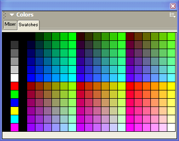
An 8-bit indexed image has a palette of up to 256 colors that the image can contain. Color information is not stored for each pixel, but rather just a reference to which color in the palette.
Palettes
- Exact (if 256 or fewer colors)
- Adaptive (weighted based upon colors in document)
But what happens to the other colors?
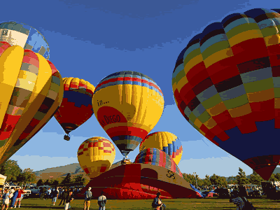
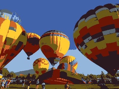
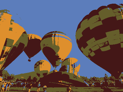
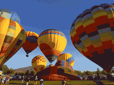
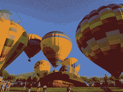
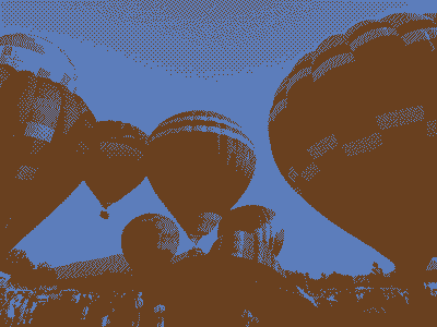
If you take a photo that is saved in an RGB system (millions of colors) and then convert it to an indexed system with 256 colors, what happens?
- dither
- color-shift
Bitmap images: Size and Quality
Factors that can contribute to image size:
- Dimension
- Format
- Compression
Images and Sizes
Take an 800x600 px image:
800 × 600 = 480,000 pixels total
Assuming no compression:
- For RGB
- 8 + 8 + 8 = 24 bits per pixel
- (480,000 px × 24 bits/px) ÷ (8 bits / byte) = 15,360,000 bytes
- 1,440,000 bytes = 1,406 kb = 1.37 Mb (divide by 1024 for each step)
- For 8-bit Indexed (256 colors)
- 8 bits per pixel to reference the palette
(480,000 px × 8 bits/px) ÷ (8 bits / byte) = 480,000 bytes - 256 colors in palette ÷ 256 bits per color = 65,536 bits = 8192 bytes
- 480,000 + 8,192 = 488,192 bytes = 477 kb = 0.47 Mb
- 8 bits per pixel to reference the palette
Either way, this isn't good.
The page weight in September 2022 was around 2.2 Mb desktop and 2 Mb mobile
But, of course, there is "compression"
- Compression algorithms that are part of image formats
- Compression can be "lossy" or "lossless"
Graphics Formats for the Web
| Property | GIF
Graphics Interchange Format | JPEG
Joint Photographic Experts Group | PNG
Portable Network Graphic | SVG
Scalable Vector Graphics | WebP | |
|---|---|---|---|---|---|---|
| Color System | 8 bit indexed (256 colors) | RGB (24 bit; millions of colors) |
| RGB | RGB | |
| Compression | Lossless Compression (LZW; horizontal repeating units) | "Lossy" Compression
(compression optimized for gradual color changes) | Lossless Compression | Lossless Compression | Lossless and Lossy | |
| Other Features |
|
|
|
|
| |
| Typical Uses |
|
|
|
|
| |
| Property | GIF
Graphics Interchange Format | JPEG
Joint Photographic Experts Group | PNG
Portable Network Graphic | SVG Scalable Vector Graphics | WebP | |
| Photograph
250 × 188 px |  29.3 kb |  16.8 kb |  25.8 kb (indexed, 8-bit) |  81.9 kb (RGB, 24-bit) | N/A |  9.6 kb |
| Illustration
148 × 179 px |  1.47 kb |  6.12 kb |  1.02 kb (indexed, 8-bit) |  1.89 kb (RGB, 24-bit) | 0.575 kb (compressed, 1.7 kb uncompressed; RGB, 24-bit) |  0.724 kb |
Hot Air Balloon image is in the Public Domain and was obtained from PD Photo.

Illustration image from the original works of David Heitmeyer
JPEG
Joint Photographic Experts Group
| Property | JPEG
Joint Photographic Experts Group |
|---|---|
| Color System | RGB (24 bit; millions of colors) |
| Compression | "Lossy" Compression
(compression optimized for gradual color changes) |
| Other Features |
|
| Typical Uses |
|
| Property | JPEG
Joint Photographic Experts Group |
| Photograph
250 × 188 px |  16.8 kb |
| Illustration
148 × 179 px |  6.12 kb |
JPEG Compression
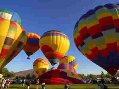
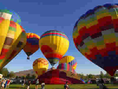
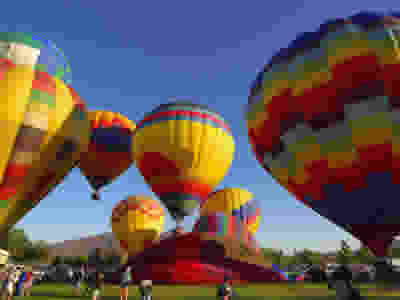
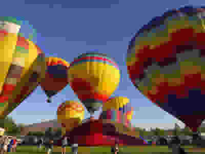
The amount of compression (quality of image) for a JPEG image can be chosen (from a scale of 0 to 100). The image quality is inversely related to the amount of compression since the compression algorithm is "lossy".
| Properties | Image |
|---|---|
|  |
|  |
|  |
|  |
|  |
|  |
|  |
|  |
|  |
JPEG Compression Artifacts
Typically first appears at boundaries in images. Portions of image can also become "blocky".
Schlieren at boundaries: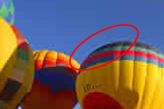
Blockyness
GIF
| Property | GIF
Graphics Interchange Format |
|---|---|
| Color System | 8 bit indexed (256 colors) |
| Compression | Lossless Compression (LZW; horizontal repeating units) |
| Other Features |
|
| Typical Uses |
|
| Property | GIF
Graphics Interchange Format |
| Photograph
250 × 188 px |  29.3 kb |
| Illustration
148 × 179 px |  1.47 kb |
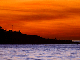
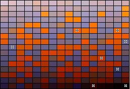
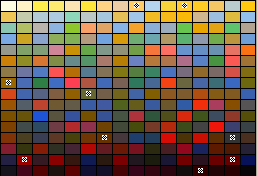
Palettes

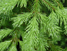
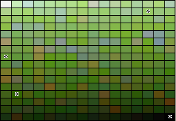
An 8-bit indexed image has a palette of up to 256 colors that the image can contain. Color information is not stored for each pixel, but rather just a reference to which color in the palette.
Palettes
- Exact (if 256 or fewer colors)
- Adaptive (weighted based upon colors in document)
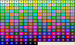
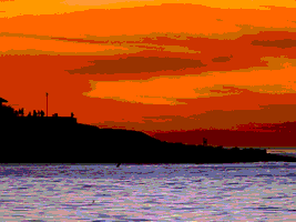
Not relevant today, but in the web's history:
- Web Palette (216 Web Safe Colors)
- System
- Windows
- Macintosh
Palettes: Exact, Adaptive, Web 216
Exact Palette | |
|---|---|
| Image | Palette |
 |  |
Adaptive Palette | |
| Image | Palette |
 |  |
 |  |
Web 216 Palette | |
| Image | Palette |
 |  |
 |  |
Adaptive Palette: Shift and Dither
Color Shift
| Image (16 colors; Color Shift) | Zoom |
|---|---|
 |  |
Dither
| Image (16 colors; Dither) | Zoom |
|---|---|
 |  |
GIF Images and Bit Depth: Color Shift
| Properties | Image | Palette (adaptive) |
|---|---|---|
|  |  |
|  |  |
|  |  |
|  |  |
|  |  |
|  |  |
|  |  |
|  |  |
GIF Images and Bit Depth: Dither
| Properties | Image | Palette (adaptive) |
|---|---|---|
|  |  |
|  |  |
|  |  |
|  |  |
|  |  |
|  |  |
|  |  |
|  |  |
Compression for Indexed GIF
GIF LZW compression operates on horizontal blocks of the same color. Here are two images that are identical except for a 90 degree rotation. The vertical stripe GIF image is nearly twice as large as the horizontal stripe GIF image. The PNG images are the same size.
| Format | Horizontal Stripes | Vertical Stripes |
|---|---|---|
| GIF |  471 bytes |  911 bytes |
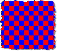
Compression and Dithering
A purple shade was created by alternating red and blue pixels.
32× magnification:
| Image Format | Dithered Grid | Solid |
|---|---|---|
| GIF |  601 bytes |  303 bytes |
Transparency
With PNG images, a color in the palette can be designated as "transparent". This lets any background colors or background images show through the transparent portions.

Star Image

Background Image
(satin.png)
| Format | Background Color (gray) | Background Image satin.png |
|---|---|---|
| GIF
No transparency |  |  |
| GIF
White is transparent |  |  |
| GIF
Blue is transparent |  |  |
GIF Animation
- GIF supports animation
- giphy.com



PNG
| Property | PNG
Portable Network Graphic | |
|---|---|---|
| Color System |
| |
| Compression | Lossless Compression | |
| Other Features |
| |
| Typical Uses |
| |
| Property | PNG - 8 bit | PNG - 24 bit |
| Photograph
250 × 188 px |  25.8 kb (indexed, 8-bit) |  81.9 kb (RGB, 24-bit) |
| Illustration
148 × 179 px |  1.02 kb (indexed, 8-bit) |  1.89 kb (RGB, 24-bit) |
Compression for Indexed PNG
PNG images use a different compression algorithm than GIF. Note that for PNG, the vertical and horizontal striped images are the same size.
| Format | Horizontal Stripes | Vertical Stripes |
|---|---|---|
| PNG |  232 bytes |  221 bytes |
| GIF |  471 bytes |  911 bytes |
Compression and Dithering
A purple shade was created by alternating red and blue pixels.
32× magnification:

| Image Format | Dithered Grid | Solid |
|---|---|---|
| PNG |  225 bytes |  209 bytes |
| GIF |  601 bytes |  303 bytes |
Transparency
With PNG images, a color in the palette can be designated as "transparent". This lets any background colors or background images show through the transparent portions.

Star Image

Background Image
(satin.png)
| Format | Background Color (gray) | Background Image satin.png |
|---|---|---|
| PNG
No transparency |  |  |
| PNG
White is transparent |  |  |
| PNG
Blue is transparent |  |  |
WebP - Web Picture
- WebP
- Compression can be "lossless" and "lossy"
- Supports transparency
- 20% to 33% smaller than corresponding JPEG or PNG formats
1920 x 1280 px
SVG
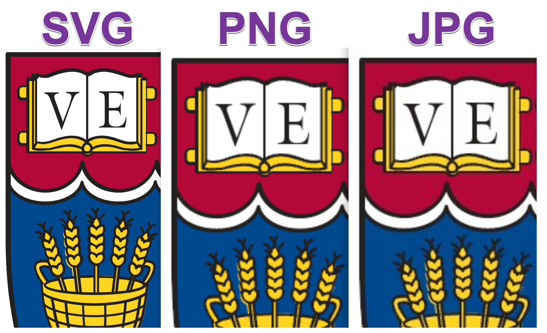
Vector aspect make SVGs a powerful format. They are inherently responsive to different sizes using the same image file!
| Property | SVG
Scalable Vector Graphics |
|---|---|
| Type | Vector |
| Color System | RGB |
| Compression | Lossless Compression |
| Other Features |
|
| Typical Uses |
|
| Illustration
300x300px | 575 bytes compressed; 1.7 kb uncompressed |
Basic SVG Shapes
<?xml version="1.0" encoding="utf-8"?>
<!DOCTYPE svg PUBLIC "-//W3C//DTD SVG 1.1//EN"
  "http://www.w3.org/Graphics/SVG/1.1/DTD/svg11.dtd">
<svg width="300" height="200" xmlns="http://www.w3.org/2000/svg" version="1.1">
  <rect x="100" y="100" height="30" width="70" rx="10" ry="10"
    style="fill:green; stroke: black;"/>
  <circle cx="50" cy="20" r="15" style="fill:red; stroke: black;"/>
  <ellipse cx="60" cy="75" rx="15" ry="40" fill="yellow" stroke="black"/>
  <line x1="10" y1="3" x2="30" y2="70" stroke-width="5" stroke="magenta"/>
  <polyline fill="none" points="160,15,170,25,180,15,190,25,200,15,210,25,220,15"
    stroke="blue" stroke-width="3"/>
  <polygon points="100,80,150,40,200,60" fill="orange" stroke="black"/>
  <path d="M0 0 C 10 20, 30 20, 40 0" style="stroke: black; stroke-width: 3px; fill: transparent"  transform="translate(-20,-30)"/>
</svg>
SVG - Increasing Importance in the Future
- Vector (size and resolution advantages)
- HTML5
canvaselement - CSS control
- CSS stylesheets
- SVG style attributes same/similar to CSS properties
Colorado State Flag
<?xml version="1.0" encoding="UTF-8" standalone="no"?>
  <svg xmlns="http://www.w3.org/2000/svg" width="1800" height="1200">
  <!-- Created per specification at http://www.50states.com/flag/coflag.htm by Robert Fleming -->
  <!-- from https://en.wikipedia.org/wiki/File:Flag_of_Colorado.svg -->
   <rect width="1800" height="1200" fill="#002868"/>
   <rect width="1800" height="400" y="400" fill="white"/>
   <!-- 76 + 180*sqrt(55)/36 ~= 113.1 -->
   <path d="M1130.81,750A400,400 0 1,1 1130.81,450L760,600Z" fill="#bf0a30"/>
   <circle cx="760" cy="600" r="200" fill="#FFD700"/>
  </svg>
Harvard Division of Continuing Education Shield
Icons
![]()
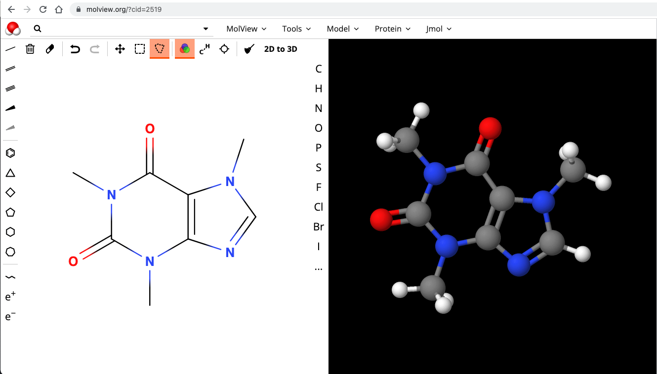
SVG Example - Molecule Viewer
Comparison of Image Formats
Graphics Formats for the Web
| Property | GIF
Graphics Interchange Format | JPEG
Joint Photographic Experts Group | PNG
Portable Network Graphic | SVG
Scalable Vector Graphics | WebP | |
|---|---|---|---|---|---|---|
| Color System | 8 bit indexed (256 colors) | RGB (24 bit; millions of colors) |
| RGB | RGB | |
| Compression | Lossless Compression (LZW; horizontal repeating units) | "Lossy" Compression
(compression optimized for gradual color changes) | Lossless Compression | Lossless Compression | Lossless and Lossy | |
| Other Features |
|
|
|
|
| |
| Typical Uses |
|
|
|
|
| |
| Property | GIF
Graphics Interchange Format | JPEG
Joint Photographic Experts Group | PNG
Portable Network Graphic | SVG Scalable Vector Graphics | WebP | |
| Photograph
250 × 188 px |  29.3 kb |  16.8 kb |  25.8 kb (indexed, 8-bit) |  81.9 kb (RGB, 24-bit) | N/A |  9.6 kb |
| Illustration
148 × 179 px |  1.47 kb |  6.12 kb |  1.02 kb (indexed, 8-bit) |  1.89 kb (RGB, 24-bit) | 0.575 kb (compressed, 1.7 kb uncompressed; RGB, 24-bit) |  0.724 kb |
Hot Air Balloon image is in the Public Domain and was obtained from PD Photo.

Illustration image from the original works of David Heitmeyer
Cartoon Art
| GIF | PNG | JPEG | SVG | WebP |
|---|---|---|---|---|
| GIF
1,511 bytes ![[Cartoon GIF]](images/cartoon.gif) | PNG; 8 bit
1,031 bytes ![[Cartoon PNG 8bit]](images/cartoon.8.png) | JPEG (Quality 100)
14,660 bytes ![[Cartoon JPEG]](images/cartoon.best.jpg) | SVG 575 bytes (compresssed) | WebP 725 bytes ![[cartoon webp]](images/cartoon.exact.webp) |
| PNG; 24 bit
1,944 bytes ![[Cartoon PNG 24bit]](images/cartoon.24.png) | JPEG (Quality 6)
1,530 bytes ![[Cartoon JPEG]](images/cartoon.jpg) |
Original image from the works of David P. Heitmeyer
Wordmarks
- hes-wordmark.svg SVG 95 kb
- hes-wordmark.png PNG 109 kb
- hes-wordmark-93.jpg JPG (Q 93) 159 kb
- hes-wordmark-80.jpg JPG (Q 80) 132 kb
- hes-wordmark-60.jpg JPG (Q 60) 93 kb
Maintain aspect ratio for images
If you have an image and are setting the size via CSS, make sure you constrain in only one axis (one direction) - either height or width. Let the other direction scale as appropriate.
Otherwise you will squish or stretch your image.
See the Pen Aspect Ratio and Object Fit - Avoid distorting images! by David Heitmeyer (@dpheitmeyer) on CodePen.
Working with Images
Graphics Tools
- Pixlr (Web, Desktop, Mobile)
- Adobe
- Gimp (Open Source)
- Corel
- PaintShop
- CorelDRAW
- Gravit
- Acorn
- Affinity Photo (Mac Only)
- Sketch
Command Line Tool
- ImageMagick
Creating thumbnails, converting formats.
Services - imgix
Imgix
- imgix.com
- Make your images available; get different versions or maniuplations via URL parameters
Manipulations
- Original Image - Glacier National Park
https://cs12.imgix.net/gnp06.jpg - Different widths:
- Different formats:
?w=1024&fm=jpg- JPG?w=1024&fm=png- PNG?w=1024&fm=webp- WebP
- Different compression quality:
- Auto:
?auto=format,compress,enhance&w=1024
imgix and thumbnails and cropping
Large image:
Thumbnail images and cropping
- Thumbnail - 300 px wide:
?w=300
- Thumbnail - 300x300 cropped:
?w=300&h=300&fit=crop
- Thumbnail - 300x300 entropy cropped:
?w=300&h=300&fit=crop&crop=entropy
Finding Images to Use
- Unsplash. “Photos for everyone. Unsplash is internet’s source of freely usable images.”
- Pixabay. “Pixabay is a vibrant community of creatives, sharing copyright free images, videos and music. All contents are released under the Pixabay License, which makes them safe to use without asking for permission or giving credit to the artist - even for commercial purposes.”
- Pexels. Free stock photos and videos you can use everywhere. ✓ High-quality ✓ 100% free ✓ No attribution needed
- unDraw. Open source illustrations for any idea.
- Creative Commons Search. “Browse over 500 million images, available for reuse. All our content is under Creative Commons licenses or in the public domain.”
- WikiMedia Commons. a collection of 85,454,985 freely usable media files to which anyone can contribute
Placeholder Images
placeholder.com is a free image placeholder service for web designers, serving billions and billions of images each year.
You can specify image size & format (.GIF, .JPG, .PNG, .WEBP), background color & text color, as well as the text.
https://via.placeholder.com/300x150/a51c30/ffffff.png?text=CSCI%20E-12
300x150– dimensionsa51c30– hexadecimal color of imageffffff– hexadecimal color of text.png– image format?text=CSCI+E-12– specifies text

Other examples:
https://via.placeholder.com/400x200/007A33/ffffff.jpg?text=Boston+Celtics
https://via.placeholder.com/600x225/BD3039/0C2340.webp?text=Red+Sox
https://via.placeholder.com/300x150/FFB81C/000000.gif?text=Boston+Bruins
Start with Original PSD/AI/etc. or High Resolution PNG or JPEG
- If you contract out: get the original/source files!
Keep track of them!
Make sure others know! - Always start with the original file format (e.g. PSD, AI, etc.) or high-resolution PNG or JPEG.
- Size images accordingly!
- Don't shrink full-resolution images by using "height" and "width" CSS
- Don't enlarge images from smaller ones -- you can only go one way (larger to smaller)
Video
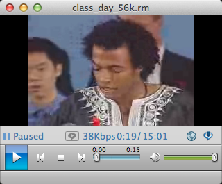
- 2001. RealVideo, RealPlayer, 56 kbps
- 2021. AV1, HTML5 Browser, Broadband
Dune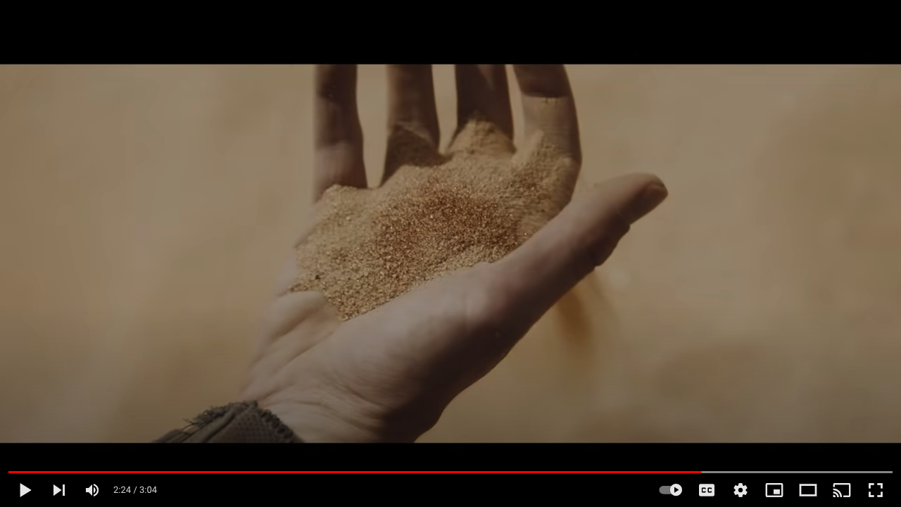
What's Changed since 2001
- Better codecs
- Faster CPUs
- Greater Bandwidth
- Standards
Video vs Images
<img src="images/flower.png" alt="flower"/>

Video is Different
- Large volume of data
- Time-sensitive, real-time delivery
- Native (HTML5) players
Formats & Codecs
- File format (containers)
- mp4, webm
- Codecs
- H.264, AV1, VP9
Video and the Browser
- HTML5
<video >tag and native player, often configured via JavaScript libraries
Download vs Stream
- Download
- HTTP Download
- Progressive download allows play to begin before file download is complete
- Streaming
- Files in small chunks, delivered by HTTP
- HLS (HTTP Live Streaming)
HTTP Live/Dynamic Streaming
- Video split into many smaller files
- Different flavors of bitrate (size + compression) are created
- Manifest provides listing of the files and options, including bit rates
- Adaptive Streaming: Video player can switch to best video quality available for the network bitrate it has available
Example Video
- Bandwidth: 2,516,370
Resolution: 1280x720 - Bandwidth: 1,640,580
Resolution: 960x540 - Bandwidth: 994,068
Resolution: 640x360 - Bandwidth: 697,078
Resolution: 480x270
m3u8 manifest file from Mux Video
  #EXTM3U
  #EXT-X-VERSION:5
  #EXT-X-INDEPENDENT-SEGMENTS

  #EXT-X-STREAM-INF:BANDWIDTH=2516370,AVERAGE-BANDWIDTH=2516370,CODECS="mp4a.40.2,avc1.640020",RESOLUTION=1280x720,CLOSED-CAPTIONS=NONE
  https://manifest-gce-us-east1-production.fastly.mux.com/.../rendition.m3u8
  #EXT-X-STREAM-INF:BANDWIDTH=1640580,AVERAGE-BANDWIDTH=1640580,CODECS="mp4a.40.2,avc1.640020",RESOLUTION=960x540,CLOSED-CAPTIONS=NONE
  https://manifest-gce-us-east1-production.fastly.mux.com/.../rendition.m3u8
  #EXT-X-STREAM-INF:BANDWIDTH=994068,AVERAGE-BANDWIDTH=994068,CODECS="mp4a.40.2,avc1.64001f",RESOLUTION=640x360,CLOSED-CAPTIONS=NONE
  https://manifest-gce-us-east1-production.fastly.mux.com/9.../rendition.m3u8
  #EXT-X-STREAM-INF:BANDWIDTH=697078,AVERAGE-BANDWIDTH=697078,CODECS="mp4a.40.2,avc1.64001e",RESOLUTION=480x270,CLOSED-CAPTIONS=NONE
  https://manifest-gce-us-east1-production.fastly.mux.com/.../rendition.m3u8
rendition.m3u8
#EXTM3U
#EXT-X-TARGETDURATION:6
#EXT-X-VERSION:3
#EXT-X-PLAYLIST-TYPE:VOD
#EXTINF:5,
https://chunk-gce-us-east1-production.fastly.mux.com/v1/chunk/0.ts
#EXTINF:5,
https://chunk-gce-us-east1-production.fastly.mux.com/v1/chunk/1.ts
#EXTINF:5,
https://chunk-gce-us-east1-production.fastly.mux.com/v1/chunk/2.ts
#EXTINF:5,
https://chunk-gce-us-east1-production.fastly.mux.com/v1/chunk/3.ts
#EXTINF:5,
https://chunk-gce-us-east1-production.fastly.mux.com/v1/chunk/4.ts
#EXTINF:5,
https://chunk-gce-us-east1-production.fastly.mux.com/v1/chunk/5.ts
....continues......
Video Quality
- Frame size
480p, 720p, 1080p, 1920p - Frame rate
24, 30 fps - Image quality (adjusting lossy compression to work within a bitrate)
Video Hosting
- Youtube, Vimeo
- Wowza
- Mux Video
- Panopto
- Kaltura
- Limelight
- Brightcove
Embedding Video
- "embed" click, copy :)
- More control with JavaScript video libraries. Some are proprietary to the service, others are open.
Examples
- Example 1 - video element and mp4 file
<video controls width="600" poster="images/bigbuckbunny.png"> <source src="video/BigBuckBunny.mp4" type="video/mp4"> Sorry, your browser doesn't support embedded videos. </video> - Example 2 - Video JS library and video from Mux Video platform
<video
    id="my-video" class="video-js" controls preload="auto"
    data-setup='{"poster": "images/bigbuckbunny.png"}'>

    <source src="https://stream.mux.com/K7mw8M3qOl5t35gUaYy9FxmYkGcZHMYq7xkwab01Q9MM.m3u8"
            type="application/x-mpegURL" />

    <p class="vjs-no-js">
      To view this video please enable JavaScript, and consider upgrading to a
      web browser that
      <a href="https://videojs.com/html5-video-support/" target="_blank">supports HTML5 video</a>
    </p>
</video>
<script src="https://vjs.zencdn.net/7.15.4/video.min.js"></script>
Elements of User Experience
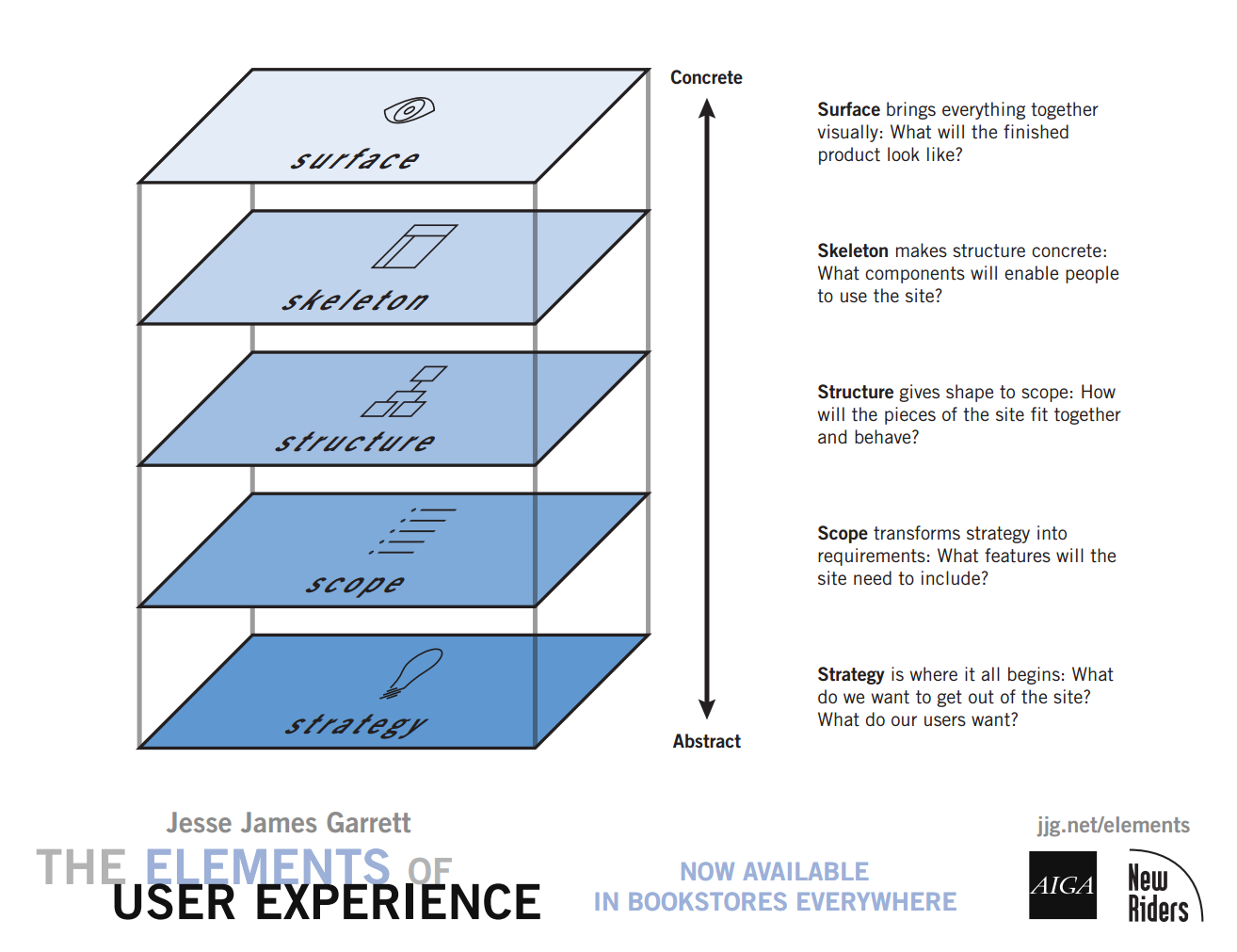
- The Elements of User Experience: User-Centered Design for the Web
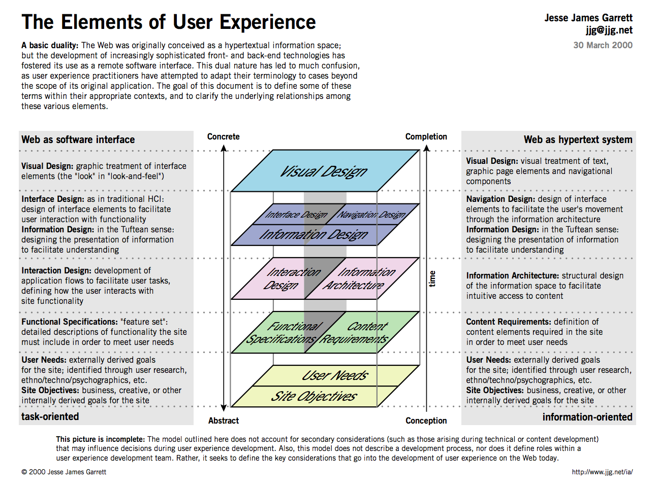
- Planes Poster - Detailed
- The Elements of User Experience -- Harvard Library Online Resource
5 Planes in More Detail
Design and UX Resources

Williams, Robin. The Non-designer's Design Book : Design and Typographic Principles for the Visual Novice. Fourth ed. 2015.Harvard Library: The non-designer's design book by Robin Williams

Krug, Steve. Don't Make Me Think, Revisited : A Common Sense Approach to Web Usability. Third ed. 2014.
Strategy
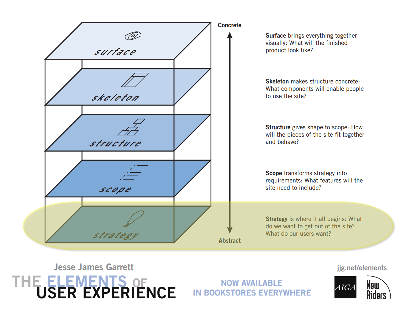
Clear and explicit understanding of
- What does the company/organization want from the site? What is "success"?
- What do the users want from the site?
Who are our Users?
- Most sites get a variety of users
- Some audiences will be "primary", others "secondary"
- What are the target audience(s) and what are their information needs?
Most sites will have multiple audiences.
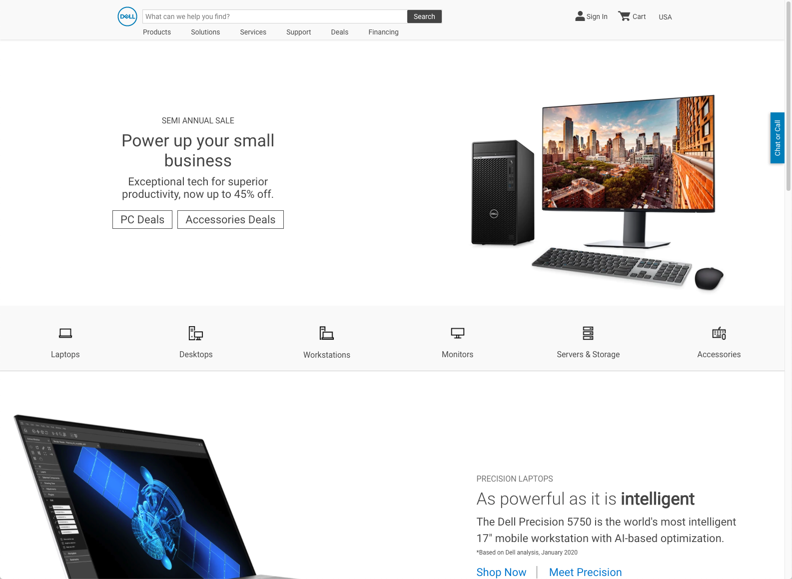
What Audiences can be identified?
University of Colorado
Dell
Audience(s)
- Who are they?
- What are their goals?
- their information needs
- tasks/actions they are performing
Know Your Audience
- Be clear on who you are building for. Understand their needs.
- User testing, market research, focus groups.
- Feedback from users. Pay attention to what your users do, not just what they say.
- Keep in mind that as number of target audiences increase, difficulty of web design increases.
Audiences for an Academic Department
- Undergraduate Students
- Concentrators (Majors)
- Potential concentrators
- Non-concentrators
- Graduate Students
- Potential Graduate Students
- Faculty
- Current
- Potential
- Researchers
- Public

Scope
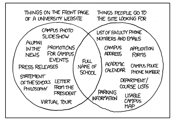
Define content or functionality requirements.
What's "in" and what's "out" -- or at least what's "later".
Start broad, then narrow and refine.
Content
Questions to ask about content:
- Does it fit purpose of site?
- Does it suit the audience?
- Would your users find this useful?
Approaching a Project
- What content already exists in web or other media types (brochures, pamphlets, statements, etc.).
- Adapt (or re-adapt) it for the web
- What content would be good to develop for the site?
- Create it for the web
- Define incremental goals to avoid "scope creep"
- Initial Phase
- Additional Phases
Think About the User
Structure
Structuring Content
information architecture defined:
- The structural design of shared information environments.
- The combination of organization, labeling, search, and navigation systems within web sites and intranets.
- The art and science of shaping information products and experiences to support usability and findability.
- An emerging discipline and community of practice focused on bringing principles of design and architecture to the digital landscape.
Organize, Label, (Navigate)
- Organize and Categorize
- Label
- Navigate
Organize
- Strategy-driven: Top-down
- Content-driven: Bottom-up
Plan for Growth

How to?
- Sticky-notes or index cards
- whiteboard or wall
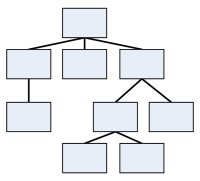
Structural Models
- Hierarchical
- Sequential

- Organic

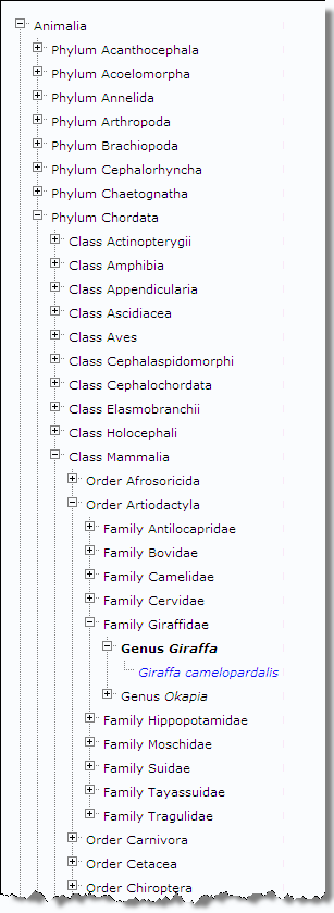
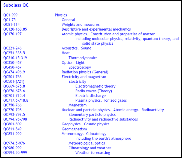
Hierarchical

Library of Congress Classification
"Q" - Science
"QC" - Physics
Biological
- Kingdom
- Phylum
- Class
- Order
- Family
- Genus
- Species
- Genus
- Family
- Order
- Class
- Phylum
Too deep or too shallow?
Deep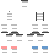 | Shallow |
Sequential

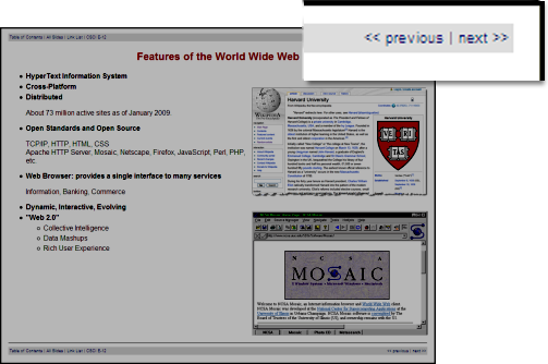
- Useful when "workflow" is important in web applications.
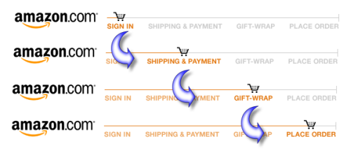
- When order is important or part of presentation.
Organic

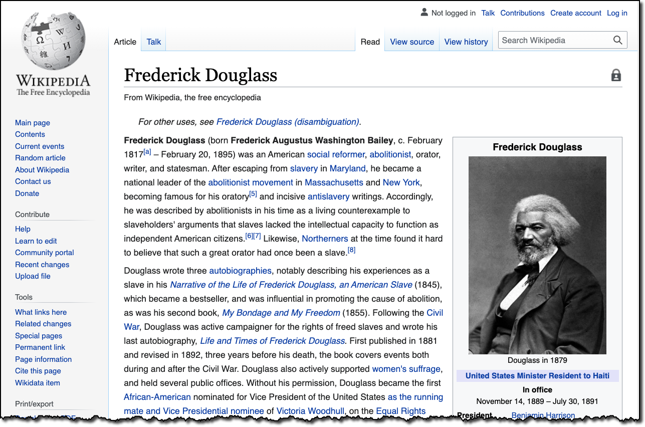
Site Architecture
- Topics
- Audience
- Task-Oriented
- Search
- Internal Organization
Label
- Know your audience
- Test your labels (ask your audience)
- Card Sort - physical or online, e.g. Optimal Sort
- Ask questions
- Where can I get a driver for my HP ENVY 5540?
- What would expect to find in the category of Synergetic Integrated Scalable Enterprise Solutions?
- What IT degree programs are available?
Labels - Are there conventions?
Categories and Labels from News Sites
CNN
ABC News
CBS
New York Times
NPR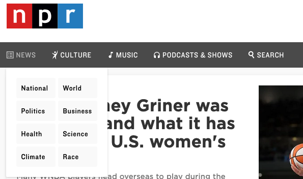
Fox News
BBC
NBC
Al Jazerra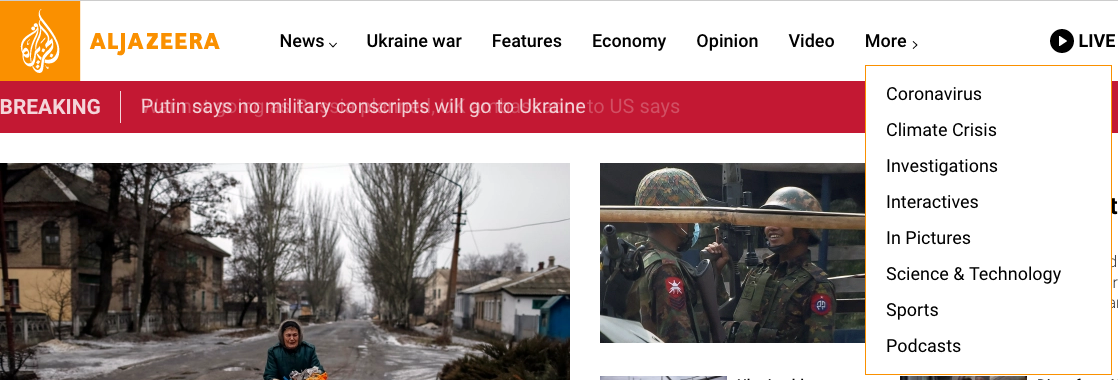
Skeleton
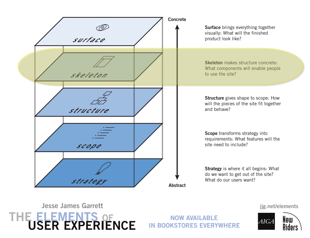
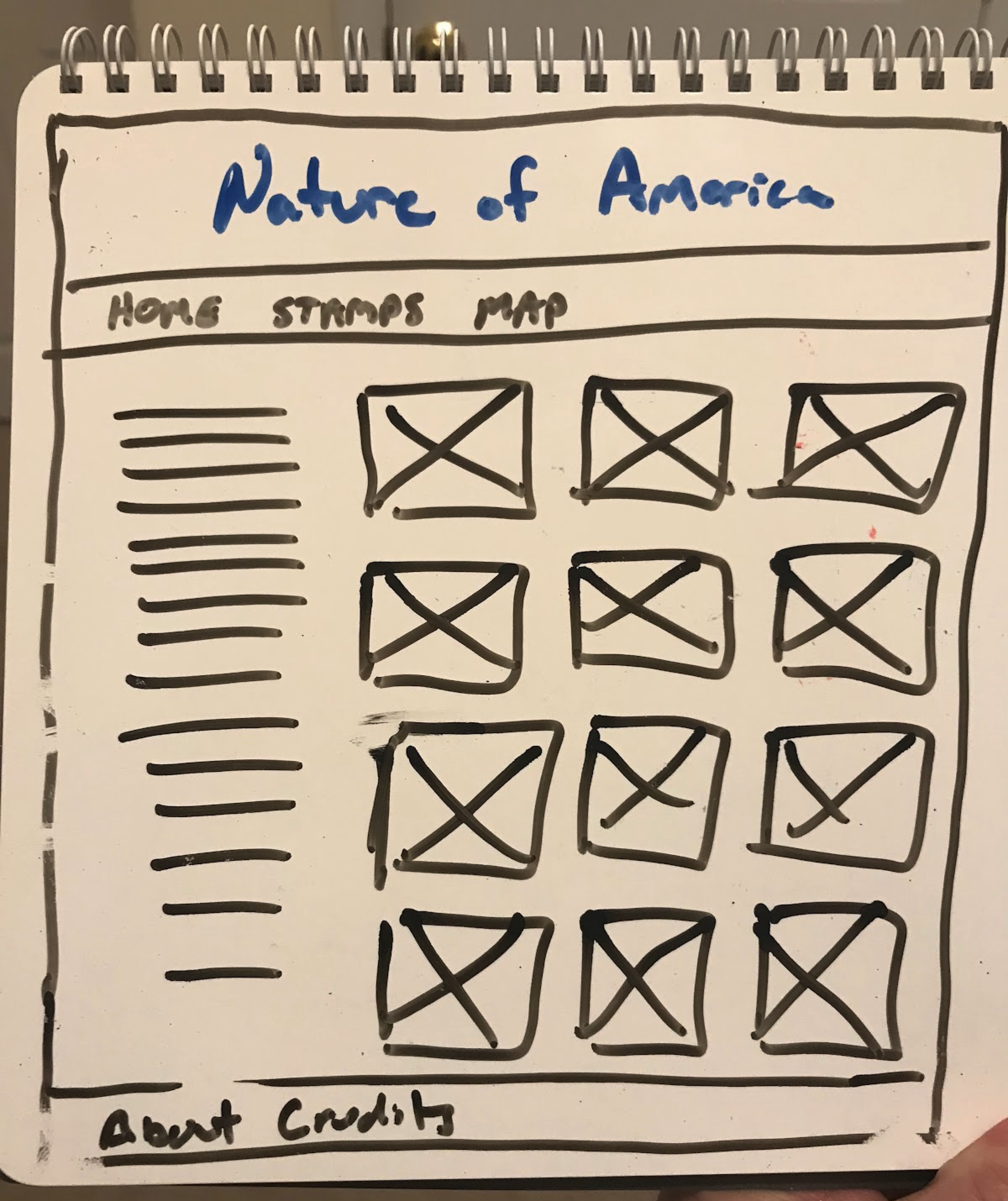
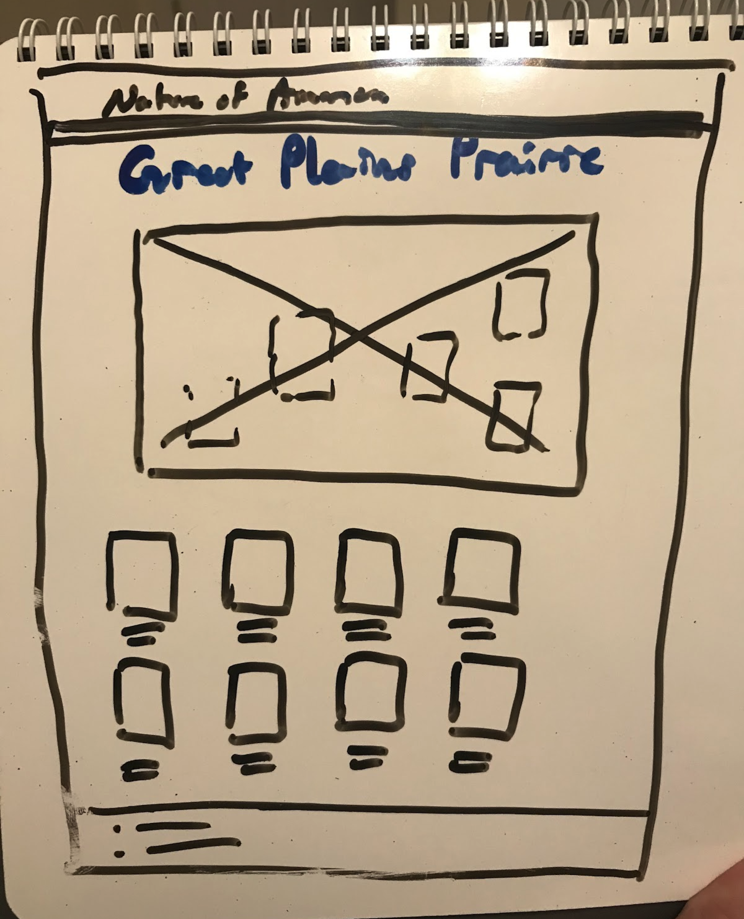
Page Components
- Header
- Navigation
- Content
- Footer

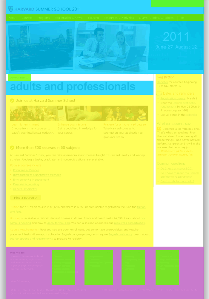
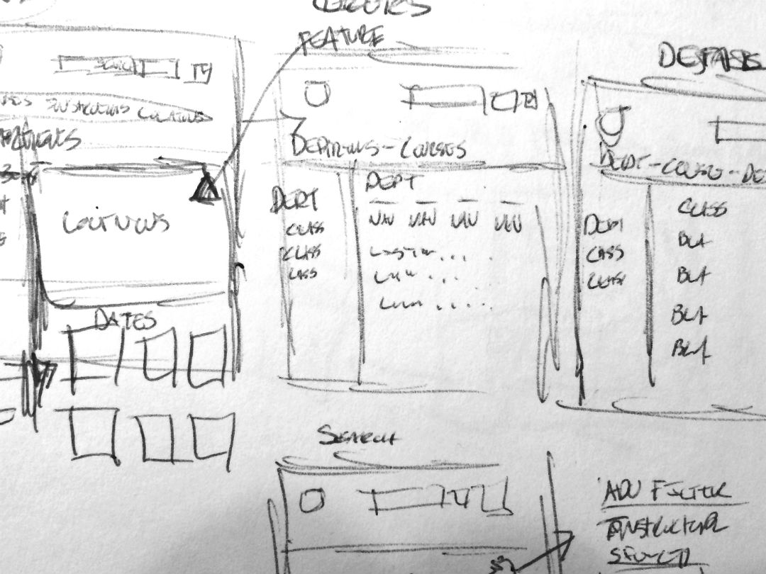
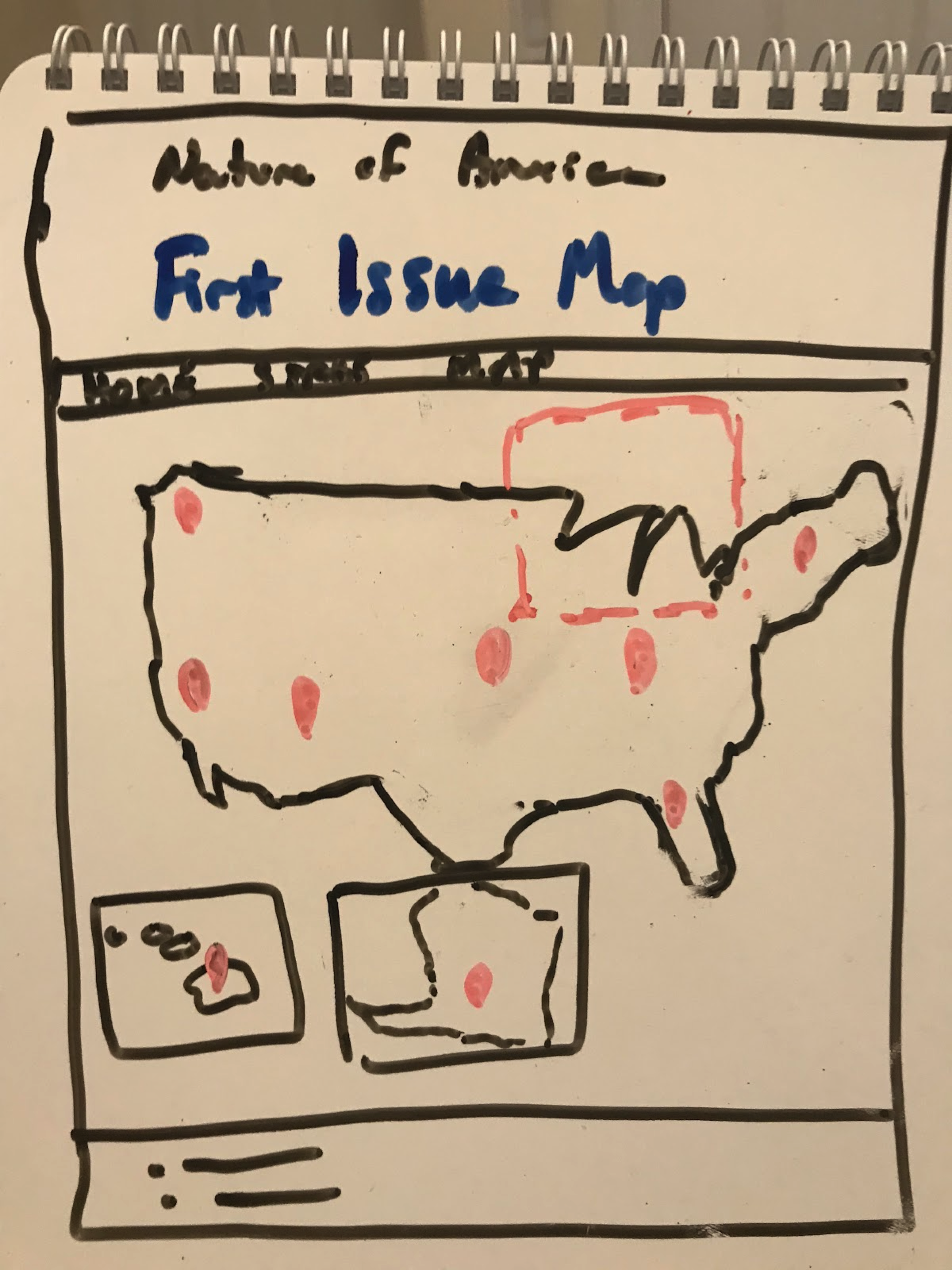
Wireframes and Sketches - "Low" to "High" Fidelity
Tools to consider:
Sketches
Wireframes
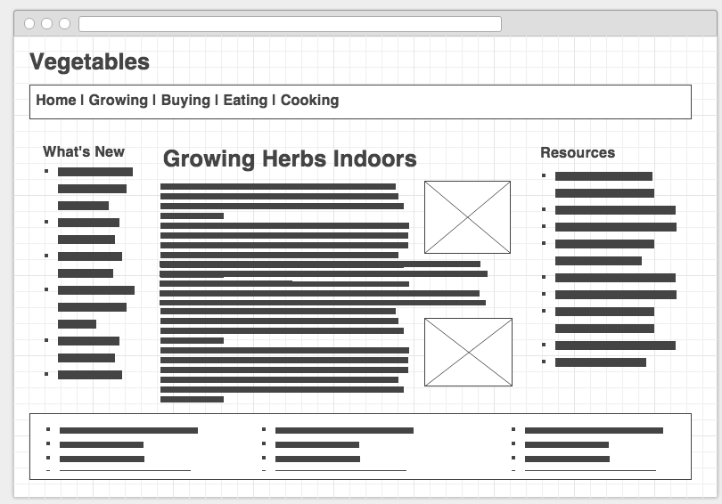
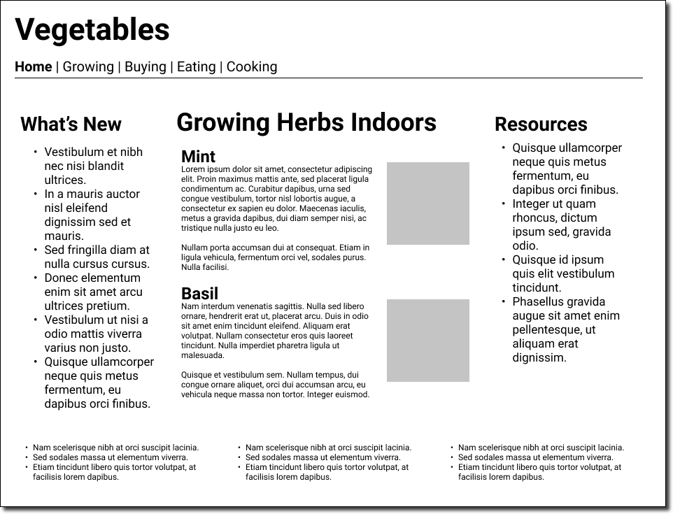
Wireframes - Drawing and prototype
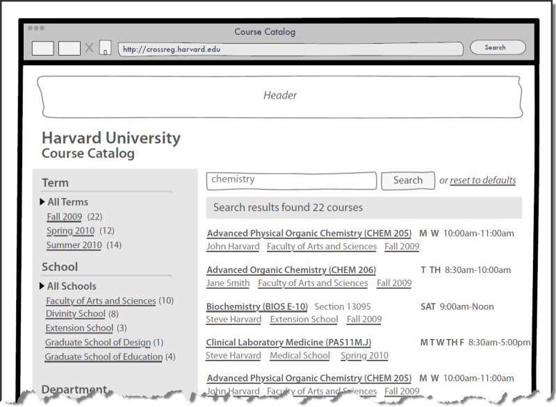
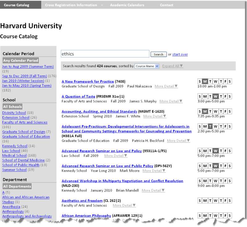
First Low-fidelity Skeleton for a Project
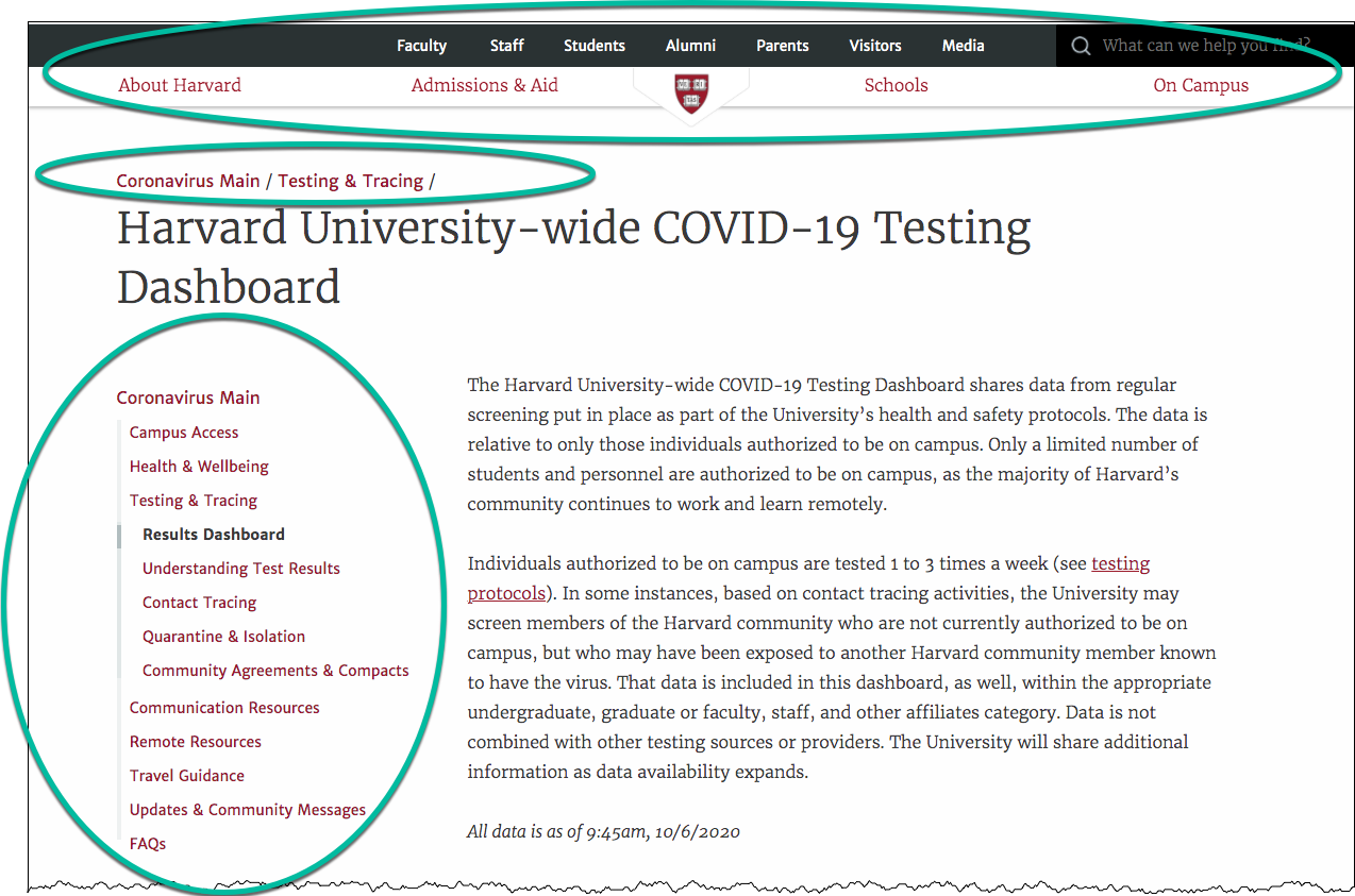
Navigation Systems
- Where am I?
- Where can I go?
- What is close by?
- What is further away?
Don't Make Me Think: Navigation
- it tells us what's here
- it tells us how to use the site
- it gives us confidence in the people who built it
Some navigation systems illustrated
Breadcrumb, Clamshell, Tab / Horizontal List, Dropdown
Surface
Non-Designer's Design Book
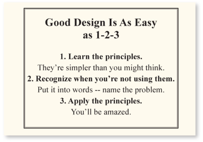
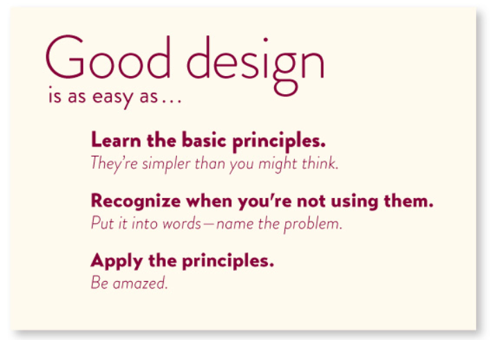

The non-designer's design book by Robin Williams
Non-Designer's Design Book
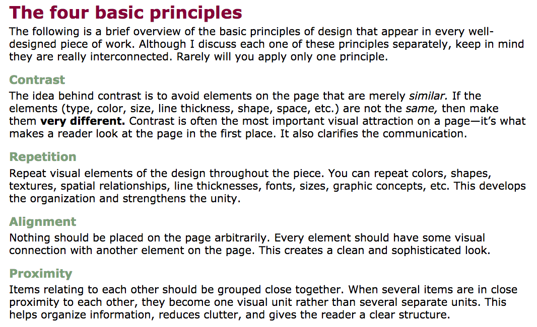

The non-designer's design book by Robin Williams
Colors
- Non-Designer's Design Book: Chapter 7, Design with Color
Creating Color Palettes:
Home Page -- Don't Make Me Think (Steven Krug)
- What is this?
- What do they have here?
- What can I do here?
- Why should I be here and not somewhere else?
Don't make me think

Don't make me think, revisited : a common sense approach to Web usability by Steve Krug
Three Princples of Usability
- Don't make me think.
- It doesn't matter how many times I have to click, as long as each click is a mindless, unambiguous choice.
- Get rid of half the words on each page, then get rid of half of what is left.
