Session 06 - CSS - Responsiveness, Navigation, Other Techniques
Harvard Extension School
Spring 2021
Course Web Site: https://cscie12.dce.harvard.edu/
Topics
- Responsive Layouts
- Responsive Example
- CSS "Print" stylesheets
- Navigation Systems
- CSS and Lists for Navigation
- Navigation and Lists
- Lists as Side Navigation
- Dropdown Menus
- Breadcrumb Navigation
- CSS Rounded Borders
- CSS Shadows
- CSS Gradients
Presentation contains 37 slides
Responsive Layouts
Site is "responsive" to different devices.

Responsive Site Live Example
Live Example of a responsive site
Responsive Web Design
- A Book Apart: Responsive Web Design
- Article: Responsive Web Design by Ethan Marcotte on A List Apart
- A List Apart: Responsive Design Articles

Responsive Web Design: CSS Media Query
Media queries can be used to include style sheets (media attribute) or in CSS rules (@media rule) or @import statement
Three ways:
CSS rule
@media screen and (max-width: 480px) {
          /* rules for small screens */
          .column { float: none; }
          }
Link to stylesheet
<link rel="stylesheet" type="text/css"
          media="screen and (max-width: 480px)"
          href="smallscreen.css" />
@import statement
@import url('smallscreen.css') screen and (max-width: 480px);
CSS media query
CSS media query:
/* Larger than mobile */
@media (min-width: 400px) { /* specific rules go here */ }

/* Larger than phablet */
@media (min-width: 550px) { /* specific rules go here */ }

/* Larger than tablet */
@media (min-width: 750px) { /* specific rules go here */ }

/* Larger than desktop */
@media (min-width: 1000px) { /* specific rules go here */ }

/* Larger than Desktop HD */
@media (min-width: 1200px) { /* specific rules go here */ }Have your breakpoints make sense for your design!!
Start with one breakpoint.
meta viewport
A typical mobile-optimized site contains something like the following:<meta name="viewport" content="width=device-width, initial-scale=1" />
Responsive Example
"Wide" screen: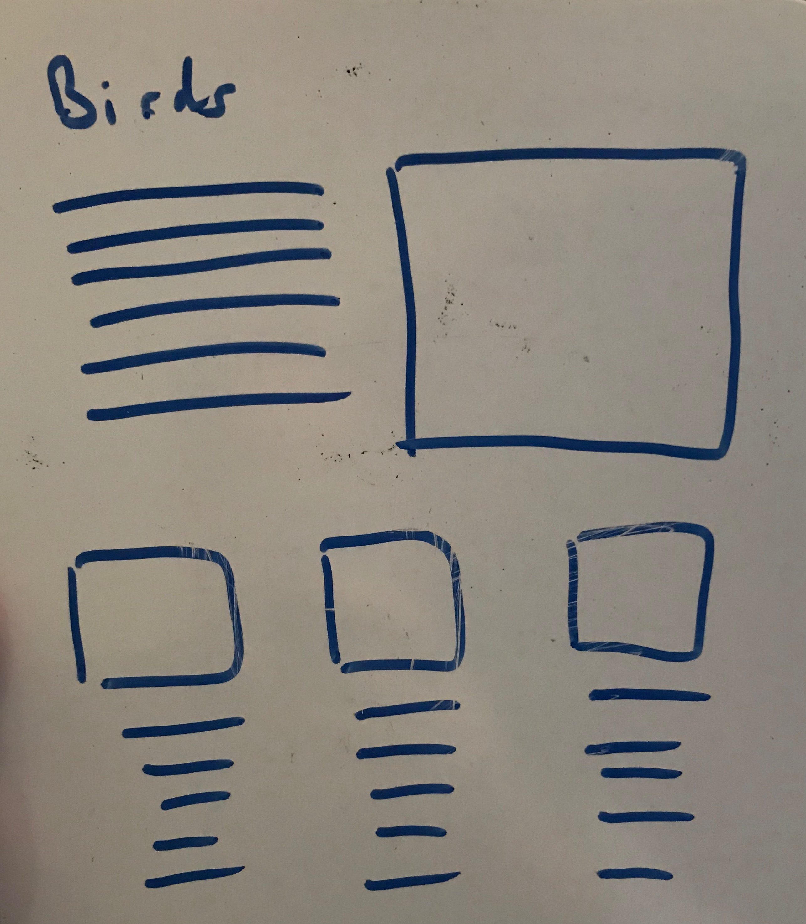
"Small" screen: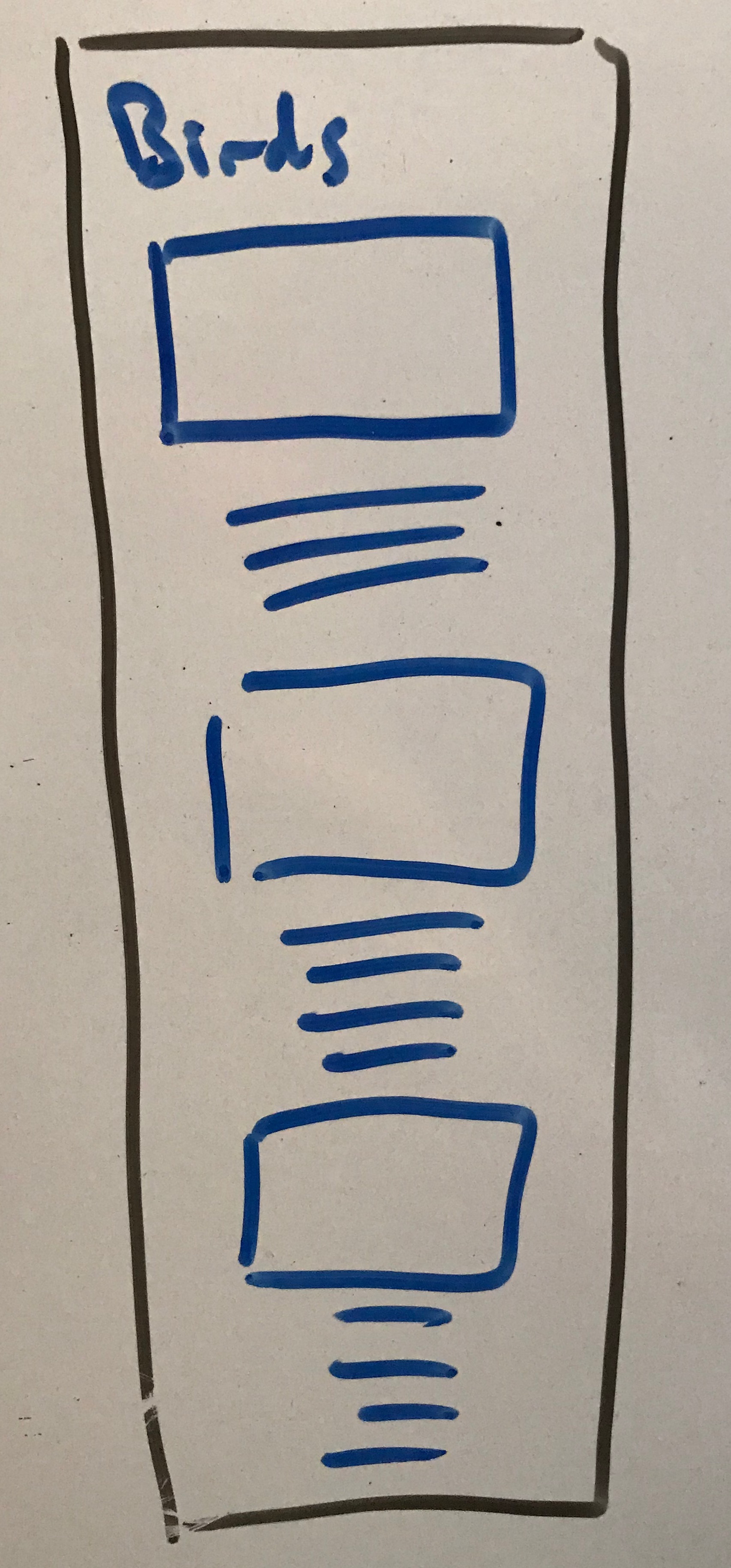
<!DOCTYPE html>
<html lang="en">

<head>
    <title>Birds</title>
    <meta charset="UTF-8" />
    <link rel="stylesheet" href="styles/site.css" />
    <meta name="viewport" content="width=device-width,initial-scale=1">
</head>

<body>
    <header>
        <h1>Birds, Birds, Birds!</h1>
    </header>

    <main>
        <article class="primary">
            <h2>Hummingbirds</h2>
            <img src="images/animal-avian-beak-349758.jpg" alt="bird" />
            <p>Lorem ipsum dolor sit amet, ...</p>
        </article>

        <div class="secondaryarticles">

            <article class="secondary">
                <h2>Integer magna</h2>
                <img src="images/animal-avian-beak-905248.jpg" alt="bird" />
                <p>Integer magna tortor, aliquam eget lacus sit amet,...</p>
            </article>

            <article class="secondary">
                <h2>Quisque amet</h2><img src="images/animal-avian-bird-162141.jpg" alt="bird" />
                <p>Pellentesque aliquam ultricies. ...</p>
            </article>

            <article class="secondary">
                <h2>Aliquam blandit </h2><img src="images/animal-avian-bird-117139.jpg" alt="birds" />
                <p>Aliquam blandit luctus...</p>
            </article>
        </div>

    </main>
    <footer>Demo page for responsive layout for CSCI E-12, Spring 2021</footer>
</body>
</html>
CSS "Print" stylesheets
Harvard College Funding Database
<link rel="stylesheet" type="text/css" media="all" href="screen.css" />
<link rel="stylesheet" type="text/css" media="print" href="print.css" />
Screen display (screen.css):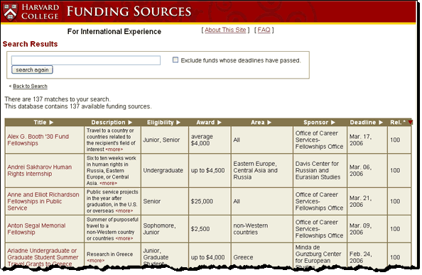
Print display (print.css):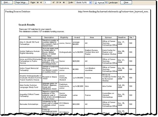
media selector
CSS2 defines a media selector for different media types.
link
Incorporate as part of the "link" element:
<link rel="stylesheet" type="text/css" media="all" href="screen.css" />
<link rel="stylesheet" type="text/css" media="print" href="print.css" />
@media selector
Or, use "@media" selector in style rule:
@media screen {
 body { font-size: medium; }
}
@media print {
   body {
     font-size: 12pt;
     color: black;
     background-image: none;
     background-color: white;
   }
   nav {
     display: none;
   }
   hr {
     page-after: page;
   }
}
Navigation Systems
- Where am I?
- Where can I go?
- What is close by?
- What is further away?
Don't Make Me Think: Navigation
- it tells us what's here
- it tells us how to use the site
- it gives us confidence in the people who built it
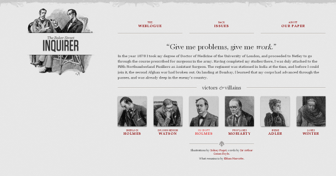
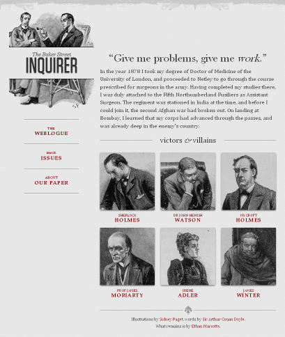
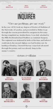
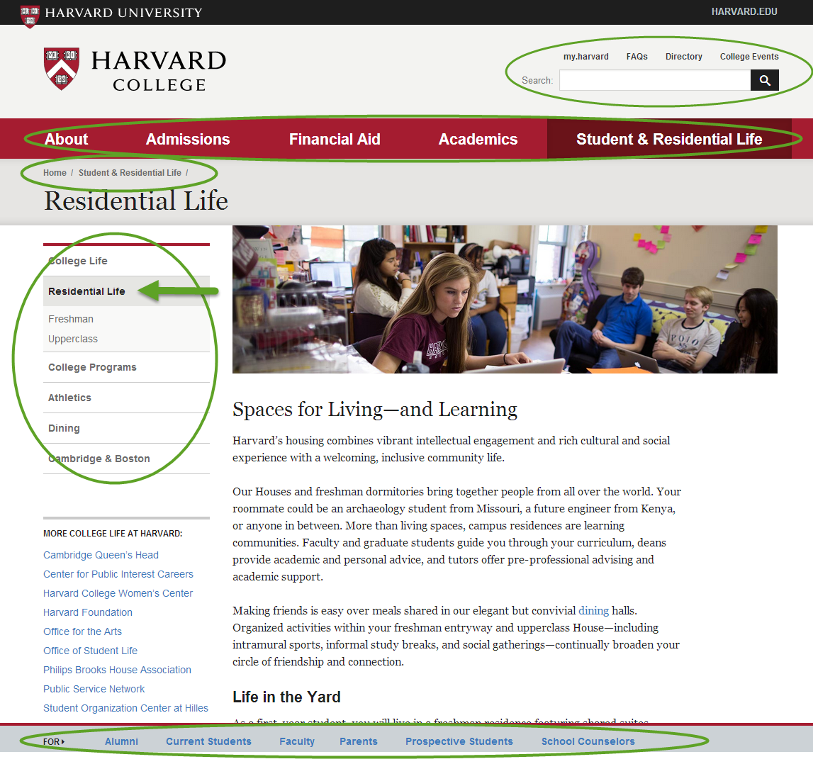
Harvard College
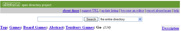
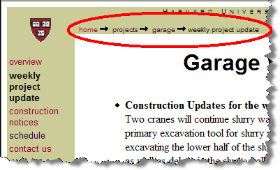
Breadcrumb Navigation
"Just wait, Gretel, until the moon rises, and then we shall see the crumbs of bread which I have strewn about, they will show us our way home again.", Hansel in Hansel and Gretel
DMOZ
Harvard Summer School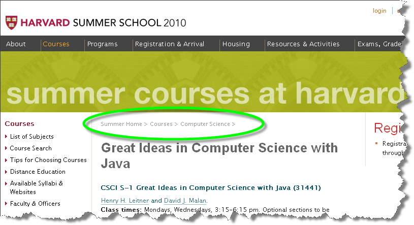
Construction Projects at FAS, Harvard University
Clamshell navigation
Harvard University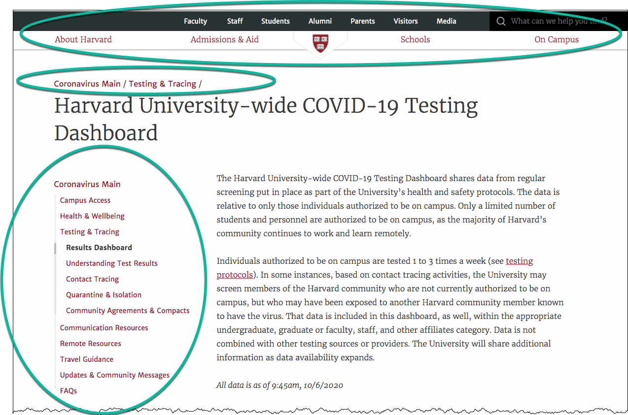
Dropdown/Popout Menus

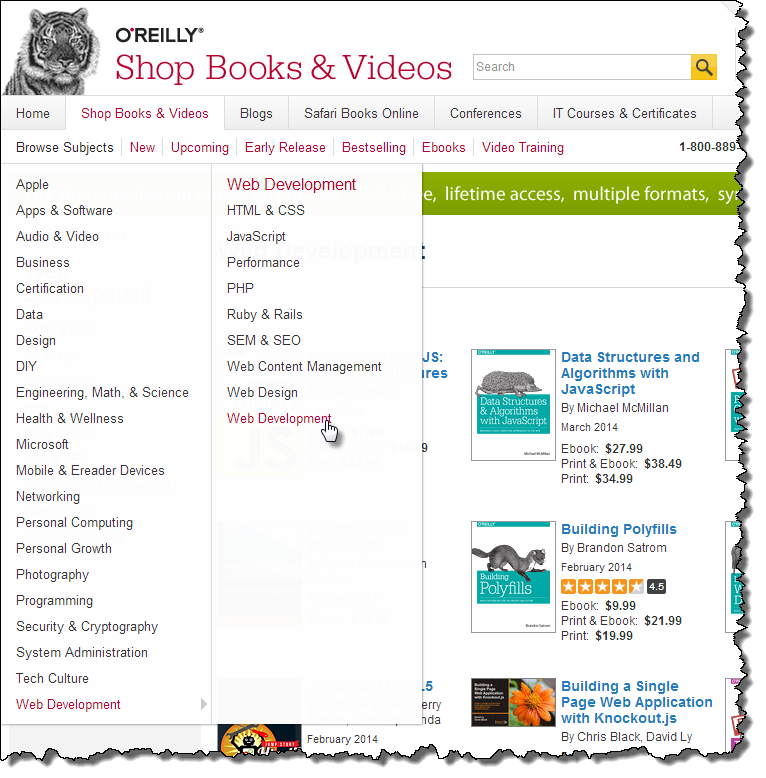
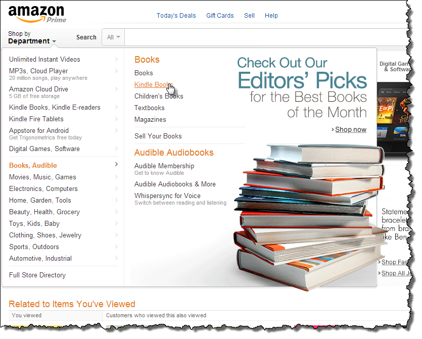
"Mega" Dropdown Menus

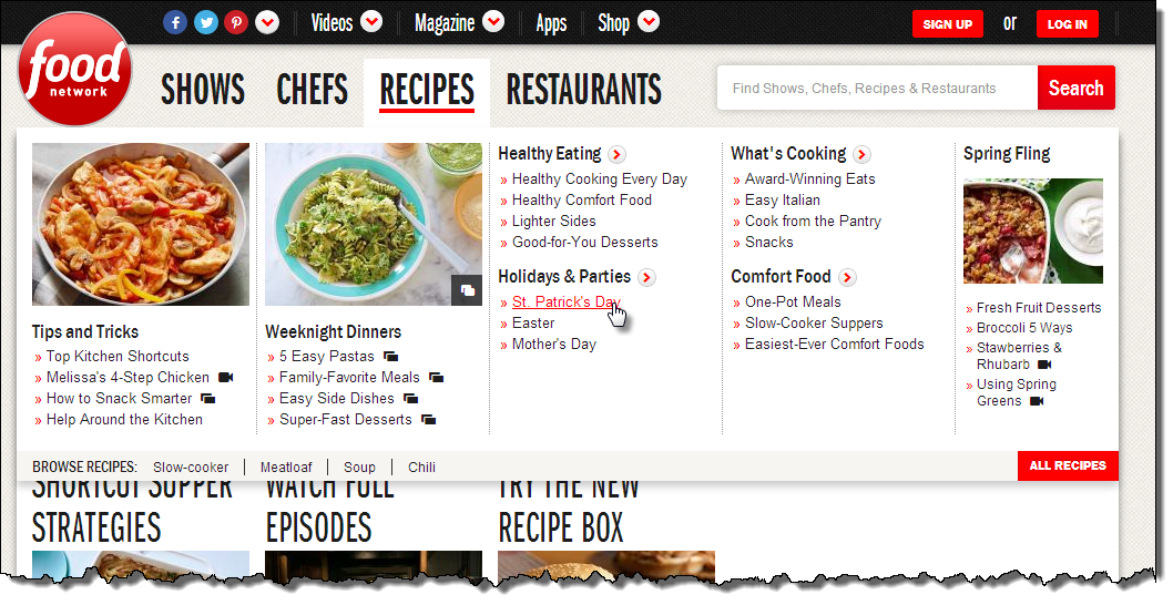
Multiple Navigation Modes
Harvard University

CSS and Lists for Navigation
Harvard Homepage - lists are outlined in magenta and list items in green. Note that some lists are "horizontal" and some are "vertical" -- exactly how a list is rendered can be controlled by CSS
Top: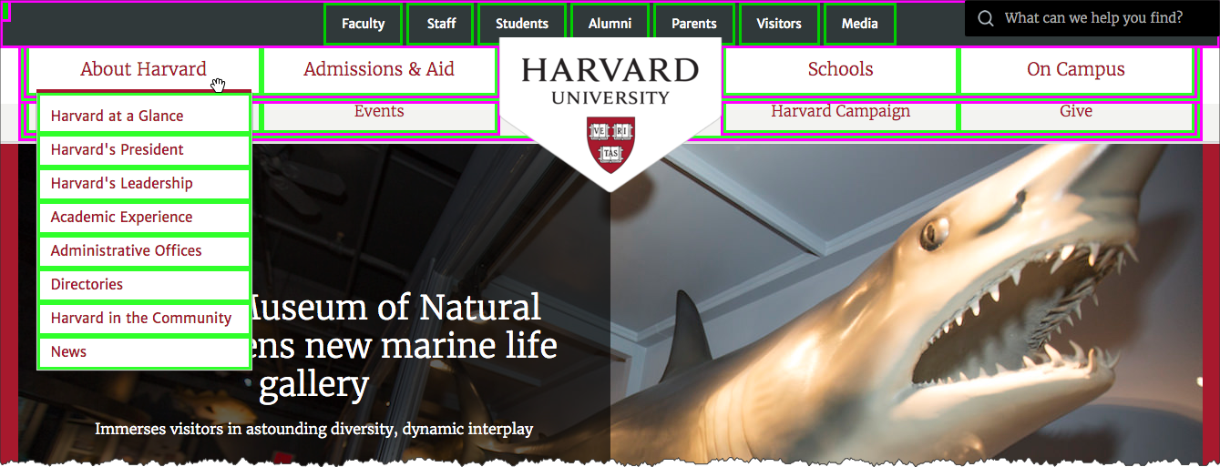
Footer: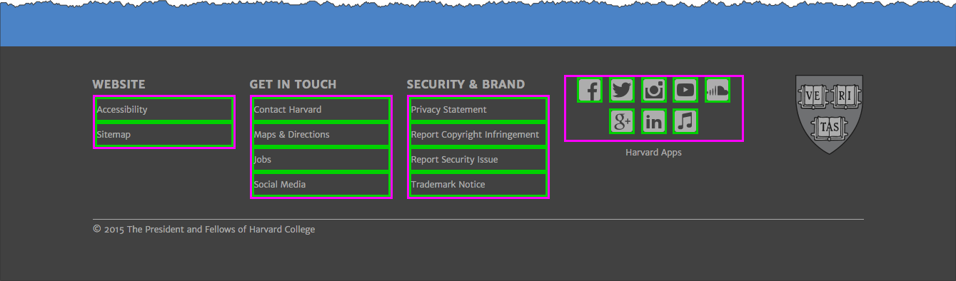
Navigation and Lists
- list-style: none
- display: inline
- display: none
- display: block
The "display" property
Common values:
- block
- inline
- none
- (flex)
display: inline

Key points:
- remove list styling
- change from "block" to "inline" display
ul { list-style: none; }li { display: inline; }
 <nav>
   <ul>
     <li>Academics
     </li>
     <li>Registration & Admissions
     </li>
     <li>Resources Policies
     </li>
     <li>Blog
     </li>   </ul> </nav>
In style
element
(<style>) within head element:
nav ul { list-style: none; }
nav ul li {
  display: inline;
  padding-left: 2em;
}
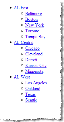
display: none
 <nav>
   <ul>
     <li>American League
       <ul>
         <li id="ale">East
           <ul>
             <li>Baltimore
             </li>
             <li>Boston
             </li>
             <li>New York
             </li>
             <li>Toronto
             </li>
             <li>Tampa Bay
             </li>           </ul>
         </li>
         <li id="alc">Central
           <ul>
             <li>Chicago
             </li>
             <li>Cleveland
             </li>
             <li>Detroit
             </li>
             <li>Kansas City
             </li>
             <li>Minnesota
             </li>           </ul>
         </li>
         <li id="alw">West
           <ul>
             <li>Houston
             </li>
             <li>Los Angeles
             </li>
             <li>Oakland
             </li>
             <li>Texas
             </li>
             <li>Seattle
             </li>           </ul>
         </li>       </ul>
     </li>   </ul> </nav>
In style
element
(<style>) within head element:
#ale ul { display: none; }
#alw ul { display: none; }
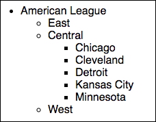
Full list for the American League: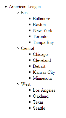
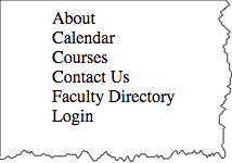
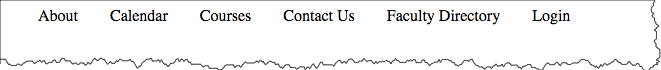
Inline Lists
Key points:
- remove list styling
- change from "block" to "inline" display
ul { list-style: none; }
li { display: inline; }
list-style: none
 <nav>
   <ul id="extglobalnav">
     <li>About
     </li>
     <li>Calendar
     </li>
     <li>For Degree Candidates
     </li>
     <li>Courses
     </li>
     <li>Faculty Directory
     </li>
     <li>Login
     </li>   </ul> </nav>
In style
element
(<style>) within head element:
ul#extglobalnav {
  list-style: none;
}
li {display: inline;}
 <nav>
   <ul id="extglobalnav">
     <li>About
     </li>
     <li>Calendar
     </li>
     <li>For Degree Candidates
     </li>
     <li>Courses
     </li>
     <li>Faculty Directory
     </li>
     <li>Login
     </li>   </ul> </nav>
In style
element
(<style>) within head element:
ul#extglobalnav {
  list-style: none;
  padding-left: 0;
}
ul#extglobalnav li {
  display: inline;
  padding-left: 2em;
}
With Other Styles - TODO
 <nav>
   <ul id="extglobalnav">
     <li>
       <a href="#">About       </a>
     </li>
     <li>
       <a href="#">Calendar       </a>
     </li>
     <li>
       <a href="#">For Degree Candidates       </a>
     </li>
     <li>
       <a href="#">Courses       </a>
     </li>
     <li>
       <a href="#">Faculty Directory       </a>
     </li>
     <li class="login">
       <a href="#">Login       </a>
     </li>   </ul> </nav>
In style
element
(<style>) within head element:
#extglobalnav {
 list-style: none;
 padding-left: 0;
 float: right;
 margin-right: 2em;
 font-family: Arial Narrow, sans-serif;
}
#extglobalnav li {
 display: inline;
 padding-left: 2em;
 font-weight: bold;
}
#extglobalnav a:link,
#extglobalnav a:visited,
#extglobalnav a:hover,
#extglobalnav a:active
{
  color: #4d84c4;
  text-decoration: none;
}
#extglobalnav li.login {
  padding: 0.3em 1em;
  border: 3px solid #4d84c4;
  margin-left: 2em;
}
Lists as Horizontal Navigation
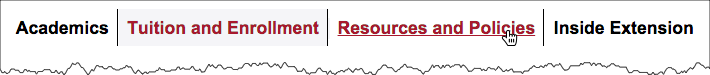
Key points:
- remove list styling
- change from "block" to "inline" (or "inline-block") display
 <ul>
   <li>Academics
   </li>
   <li>Tuition and Enrollment
   </li>
   <li>Resources and Policies
   </li>
   <li>Inside Extension
</li> </ul>- Academics
- Tuition and Enrollment
- Resources and Policies
- Inside Extension
 <nav>
   <ul id="extnav">
     <li>Academics
     </li>
     <li>Tuition and Enrollment
     </li>
     <li>Resources and Policies
     </li>
     <li>Inside Extension
     </li>   </ul> </nav>
In style
element
(<style>) within head element:
ul#extnav {
  list-style: none;
}
ul#extnav li {
  display: inline-block;
}
Note the labeling of the current area of the site the user is in with the "active" class.
 <nav>
   <ul id="extnav">
     <li>
       <a href="#">Academics       </a>
     </li>
     <li class="active">
       <a href="#">Tuition and Enrollment       </a>
     </li>
     <li>
       <a href="#">Resources and Policies       </a>
     </li>
     <li>
       <a href="#">Inside Extension       </a>
     </li>   </ul> </nav>
In
head element:
<link rel="stylesheet" href="example8.css"/>In example8.css
* {
  background-color: white;
}

ul#extnav {
  list-style: none;
  font-weight: bold;
  font-family: Arial, Verdana, Helvetica, sans-serif;
  color: #1e1e1e;
  background-color: white;
  margin-top: 1em;
}

ul#extnav li {
  display: inline;
  margin: 0;
  padding: 0;
}

ul#extnav a {
  padding: 0.5em;
  margin-right: 0;
  background-color: white;
  border-right: 1px solid black;
}
ul#extnav li:last-child a {
  border-style: none;
}
ul#extnav a:link,
ul#extnav a:visited {
  color: black;
  text-decoration: none;
}

ul#extnav a:hover {
  color: #a51c30;
  text-decoration: underline;
}
ul#extnav .active {  background-color: #f5f5f8;}
ul#extnav .active a:link,
ul#extnav .active a:visited,
ul#extnav .active a:hover,
ul#extnav .active a:active {
  background-color: #f5f5f8;
  color: #a51c30;
  text-decoration: none;
}
Lists as Side Navigation
Key points:
- remove list styling
- make "a" element "block" display
Default styling: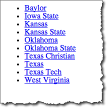
Note: "a" display property is set to "block". This makes the hyperlink active over the whole area, not just with the text.
 <nav id="navigation1">
   <ul>
     <li>
       <a href="http://www.baylor.edu/">Baylor       </a>
     </li>
     <li>
       <a href="http://www.iastate.edu/">Iowa State       </a>
     </li>
     <li>
       <a href="http://www.ku.edu/">Kansas       </a>
     </li>
     <li>
       <a href="http://www.ksu.edu/">Kansas State       </a>
     </li>
     <li>
       <a href="http://www.ou.edu/">Oklahoma       </a>
     </li>
     <li>
       <a href="http://www.okstate.edu/">Oklahoma State       </a>
     </li>
     <li>
       <a href="http://www.tcu.edu/">Texas Christian       </a>
     </li>
     <li>
       <a href="http://www.utexas.edu/">Texas       </a>
     </li>
     <li>
       <a href="http://www.ttu.edu/">Texas Tech       </a>
     </li>
     <li>
       <a href="http://www.wvu.edu/">West Virginia       </a>
     </li>   </ul> </nav>
In
head element:
<link rel="stylesheet" href="example9.css"/>In example9.css
#navigation1 {
  font-family: Arial, Verdana, Helvetica, sans-serif;
  font-weight: bold;
  font-size: 0.7em;
  width: 15em;
  border-right: 1px solid #333;
  margin-bottom: 1em;
  background-color: #ddd;
  color: #900;
}
#navigation1 ul {
  list-style: none;
  margin: 0;
  padding: 0;
}
#navigation1 ul li {
  margin: 0;
  border-top: 1px solid #333;
}
#navigation1 ul li a {
  display: block;
  background-color: #ddd;
  border-top: 1px solid #333;
  border-left: 5px solid #333;
  text-decoration: none;
  padding: 5px 2px 5px 0.5em;
}
#navigation1 ul li a:link,
#navigation1 ul li a:visited
{ color: #900; }
#navigation1 ul li a:hover {
     color: #fff;
     background-color: #900;}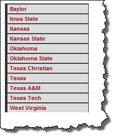
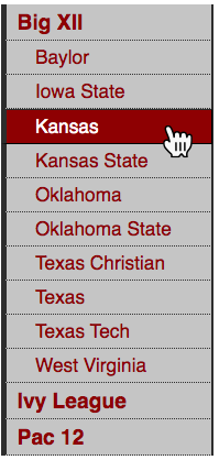
Lists as Navigation
Nested list styled as "clamshell" navigation.
- remove list styling
- make "a" element "block" display
- styles for secondary nested lists (e.g. selector for
ul ul a) display: nonefor nested lists that you don't want to display
 <nav id="navclam">
   <ul>
     <li>
       <a href="http://big12sports.collegesports.com/">Big XII       </a>
       <ul>
         <li>
           <a href="http://www.baylor.edu/">Baylor           </a>
         </li>
         <li>
           <a href="http://www.iastate.edu/">Iowa State           </a>
         </li>
         <li>
           <a href="http://www.ku.edu/">Kansas           </a>
         </li>
         <li>
           <a href="http://www.ksu.edu/">Kansas State           </a>
         </li>
         <li>
           <a href="http://www.ou.edu/">Oklahoma           </a>
         </li>
         <li>
           <a href="http://www.okstate.edu/">Oklahoma State           </a>
         </li>
         <li>
           <a href="http://www.tcu.edu/">Texas Christian           </a>
         </li>
         <li>
           <a href="http://www.utexas.edu/">Texas           </a>
         </li>
         <li>
           <a href="http://www.ttu.edu/">Texas Tech           </a>
         </li>
         <li>
           <a href="http://www.wvu.edu/">West Virginia           </a>
         </li>       </ul>
     </li>
     <li>
       <a href="http://www.ivyleaguesports.com/">Ivy League       </a>
       <ul class="collapse">
         <li>
           <a href="http://www.brown.edu/">Brown           </a>
         </li>
         <li>
           <a href="http://www.columbia.edu/">Columbia           </a>
         </li>
         <li>
           <a href="http://www.cornell.edu/">Cornell           </a>
         </li>
         <li>
           <a href="http://www.dartmouth.edu/">Dartmouth           </a>
         </li>
         <li>
           <a href="http://www.harvard.edu/">Harvard           </a>
         </li>
         <li>
           <a href="http://www.upenn.edu/">Penn           </a>
         </li>
         <li>
           <a href="http://www.princeton.edu/">Princeton           </a>
         </li>
         <li>
           <a href="http://www.yale.edu/">Yale           </a>
         </li>       </ul>
     </li>
     <li>
       <a href="http://www.pac-12.com/">Pac 12       </a>
       <ul class="collapse">
         <li>
           <a href="http://www.arizona.edu/">Arizona           </a>
         </li>
         <li>
           <a href="http://www.asu.edu/">Arizona State           </a>
         </li>
         <li>
           <a href="http://www.berkeley.edu/">California           </a>
         </li>
         <li>
           <a href="http://www.cu.edu/">Colorado           </a>
         </li>
         <li>
           <a href="http://www.uoregon.edu/">Oregon           </a>
         </li>
         <li>
           <a href="http://www.oregonstate.edu/">Oregon State           </a>
         </li>
         <li>
           <a href="http://www.stanford.edu/">Stanford           </a>
         </li>
         <li>
           <a href="http://www.ucla.edu/">UCLA           </a>
         </li>
         <li>
           <a href="http://www.usc.edu/">USC           </a>
         </li>
         <li>
           <a href="http://www.utah.edu/">Utah           </a>
         </li>
         <li>
           <a href="http://www.washington.edu/">Washington           </a>
         </li>
         <li>
           <a href="http://www.wsu.edu/">Washington State           </a>
         </li>       </ul>
     </li>   </ul> </nav>
In
head element:
<link rel="stylesheet" href="example10.css"/>#navclam {
font-family: Arial, Verdana, Helvetica, sans-serif;
font-weight: bold;
font-size: 1.2em;
width: 10em;
border-right: 1px solid #333;
margin-bottom: 1em;
background-color: #ddd;
color: #900;
}
#navclam ul {
list-style: none;
margin: 0;
padding: 0;
}
#navclam ul li {
margin: 0;
border-top: 1px none #333;
}
#navclam ul li a {
display: block;
background-color: #ccc;
border-top: 1px none #333;
border-right: 1px solid #333;
border-bottom: thin dotted #333;
border-left: 5px solid #333;
text-decoration: none;
padding: 5px 2px 5px 0.5em;
}
#navclam a:link {
color: #900;
}
#navclam a:visited {
color: #900;
}
#navclam a:hover {
color: #fff;
background-color: #900;
border-top: 1px outset #333;
border-right: 1px outset #333;
border-bottom: 1px outset #333;
border-left: 5px outset #333;
}
#navclam a:active {
color: #fff;
background-color: #900;
border-top: 1px inset #333;
border-right: 1px inset #333;
border-bottom: 1px inset #333;
border-left: 5px inset #333;
}
#navclam ul ul {
list-style: none;
}
#navclam ul ul a {
padding-left: 1.5em;
font-size: 90%;
font-weight: normal;
}
#navclam ul.collapse {
display: none;
}
Default styling of nested list: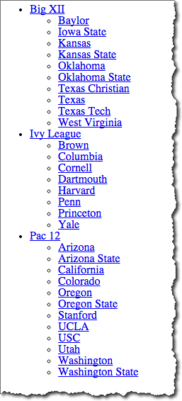
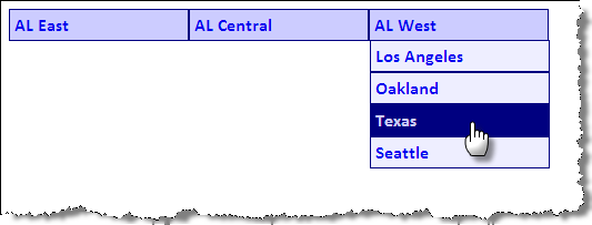
Dropdown Menus
Key points:
- Make the list 'horizontal'
- Hide the secondary lists
- Use the CSS ":hover" pseudo-class to change secondary list display property
 <ul id="dropdown1">
   <li>
     <a href="#">AL East     </a>
     <ul>
       <li>
         <a href="#">Baltimore         </a>
       </li>
       <li>
         <a href="#">Boston         </a>
       </li>
       <li>
         <a href="#">New York         </a>
       </li>
       <li>
         <a href="#">Toronto         </a>
       </li>
       <li>
         <a href="#">Tampa Bay         </a>
       </li>     </ul>
   </li>
   <li>
     <a href="#">AL Central     </a>
     <ul>
       <li>
         <a href="#">Chicago         </a>
       </li>
       <li>
         <a href="#">Cleveland         </a>
       </li>
       <li>
         <a href="#">Detroit         </a>
       </li>
       <li>
         <a href="#">Kansas City         </a>
       </li>
       <li>
         <a href="#">Minnesota         </a>
       </li>     </ul>
   </li>
   <li>
     <a href="#">AL West     </a>
     <ul>
       <li>
         <a href="#">Houston         </a>
       </li>
       <li>
         <a href="#">Los Angeles         </a>
       </li>
       <li>
         <a href="#">Oakland         </a>
       </li>
       <li>
         <a href="#">Texas         </a>
       </li>
       <li>
         <a href="#">Seattle         </a>
       </li>     </ul>
   </li> </ul>
In style
element
(<style>) within head element:
ul {
  padding: 0;
  margin: 0;
  list-style: none;
  }
li {
  float: left;
  position: relative;
  width: 10em;
  }
li ul {
  display: none;
  top: 1em;
  left: 0;
  }
li:hover ul { display: block; }
Dropdown Menus
 <ul id="dropdown2">
   <li>
     <a href="#">AL East     </a>
     <ul>
       <li>
         <a href="#">Baltimore         </a>
       </li>
       <li>
         <a href="#">Boston         </a>
       </li>
       <li>
         <a href="#">New York         </a>
       </li>
       <li>
         <a href="#">Toronto         </a>
       </li>
       <li>
         <a href="#">Tampa Bay         </a>
       </li>     </ul>
   </li>
   <li>
     <a href="#">AL Central     </a>
     <ul>
       <li>
         <a href="#">Chicago         </a>
       </li>
       <li>
         <a href="#">Cleveland         </a>
       </li>
       <li>
         <a href="#">Detroit         </a>
       </li>
       <li>
         <a href="#">Kansas City         </a>
       </li>
       <li>
         <a href="#">Minnesota         </a>
       </li>     </ul>
   </li>
   <li>
     <a href="#">AL West     </a>
     <ul>
       <li>
         <a href="#">Houston         </a>
       </li>
       <li>
         <a href="#">Los Angeles         </a>
       </li>
       <li>
         <a href="#">Oakland         </a>
       </li>
       <li>
         <a href="#">Texas         </a>
       </li>
       <li>
         <a href="#">Seattle         </a>
       </li>     </ul>
   </li> </ul>
In style
element
(<style>) within head element:
ul {
  padding: 0;
  margin: 0;
  list-style: none;
  }
li {
  float: left;
  position: relative;
  width: 10em;
  }
li ul {
  display: none;
  top: 1.7em;
  left: 0;
}
li > ul {
  top: auto;
  left: auto;
}
li:hover ul { display: block; }
#dropdown2  li {
  border: thin solid navy;
  font-family: calibri,verdana,tahoma,helvetica,sans-serif;
  background-color: #ccf;
  }
#dropdown2 ul li { background-color: #eef; }
#dropdown2 a {display:block; padding: 0.25em;}
#dropdown2 a:link,
#dropdown2 a:visited,
#dropdown2 a:hover,
#dropdown2 a:active
  { text-decoration: none; font-weight: bold; }
#dropdown2 a:hover { background-color: navy; color: #ccf; }
Dropdown Menus: Vertical
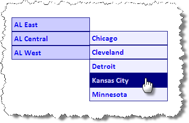
 <ul id="dropdown3">
   <li>
     <a href="#">AL East     </a>
     <ul>
       <li>
         <a href="#">Baltimore         </a>
       </li>
       <li>
         <a href="#">Boston         </a>
       </li>
       <li>
         <a href="#">New York         </a>
       </li>
       <li>
         <a href="#">Toronto         </a>
       </li>
       <li>
         <a href="#">Tampa Bay         </a>
       </li>     </ul>
   </li>
   <li>
     <a href="#">AL Central     </a>
     <ul>
       <li>
         <a href="#">Chicago         </a>
       </li>
       <li>
         <a href="#">Cleveland         </a>
       </li>
       <li>
         <a href="#">Detroit         </a>
       </li>
       <li>
         <a href="#">Kansas City         </a>
       </li>
       <li>
         <a href="#">Minnesota         </a>
       </li>     </ul>
   </li>
   <li>
     <a href="#">AL West     </a>
     <ul>
       <li>
         <a href="#">Houston         </a>
       </li>
       <li>
         <a href="#">Los Angeles         </a>
       </li>
       <li>
         <a href="#">Oakland         </a>
       </li>
       <li>
         <a href="#">Texas         </a>
       </li>
       <li>
         <a href="#">Seattle         </a>
       </li>     </ul>
   </li> </ul>
In style
element
(<style>) within head element:
ul {
  padding: 0;
  margin: 0;
  list-style: none;
  }
li {
  position: relative;
  width: 10em;
}
li ul {
  display: none;
  position: absolute;
  top: 1.7em;
  left: 0;
}
li > ul {
  top: auto;
  left: auto;
}
li:hover ul { display: block; }

#dropdown3 li ul {
  margin-left: 10em;
  margin-top: -1.8em;
}
#dropdown3  li {
  border: thin solid navy;
  font-family: calibri,verdana,tahoma,helvetica,sans-serif;
  background-color: #ccf;
  }
#dropdown3 ul li { background-color: #eef; }
#dropdown3 a {display:block; padding: 0.25em;}
#dropdown3 a:link,
#dropdown3 a:visited,
#dropdown3 a:hover,
#dropdown3 a:active
  { text-decoration: none; font-weight: bold; }
#dropdown3 a:hover { background-color: navy; color: #ccf; }
Breadcrumb Navigation
"Just wait, Gretel, until the moon rises, and then we shall see the crumbs of bread which I have strewn about, they will show us our way home again.", Hansel in Hansel and Gretel
Key points:
- inline display
- background image for arrows
Markup "breadcrumb" navigation using nested lists so that markup reflects the parent/child or hierarchy relationship.
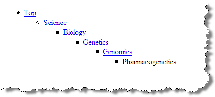
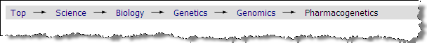
Strategy is similar to that of creating tabs. Use "display: inline" to make list items inline; use background image for "li" to show arrow.
 <nav id="breadcrumb">
   <ul>
     <li>
       <a href="#">Top       </a>
       <ul>
         <li>
           <a href="#">Science           </a>
           <ul>
             <li>
               <a href="#">Biology               </a>
               <ul>
                 <li>
                   <a href="#">Genetics                   </a>
                   <ul>
                     <li>
                       <a href="#">Genomics                       </a>
                       <ul>
                         <li>
                           <span>Pharmacogenetics                           </span>
                         </li>                       </ul>
                     </li>                   </ul>
                 </li>               </ul>
             </li>           </ul>
         </li>       </ul>
     </li>   </ul> </nav>
In
head element:
<link rel="stylesheet" href="example14.css"/>/*
Order of pseudo-"a" elements:
LoVe HAte (Link, Visited, Hover, Active
*/
#breadcrumb a:link ,
#breadcrumb a:visited ,
#breadcrumb a:hover ,
#breadcrumb a:active ,
#breadcrumb li span {
color: navy;
font-family: Tahoma, Arial, Helvetica, sans-serif;
font-size: small;
font-weight: normal;
padding: 0.5em;
text-decoration: none;
}
#breadcrumb a:hover {
text-decoration: underline;
}
#breadcrumb li span {
color: black;
}
#breadcrumb {
background-color: #ddd;
}
#breadcrumb ul {
display: inline;
margin-left: 0;
padding-left: 0;
}
#breadcrumb ul li {
display: inline;
}
#breadcrumb ul ul li {
background-image: url(images/arrow.gif);
background-position: left;
background-repeat: no-repeat;
padding-left: 25px;
}Breadcrumbs with a flat list
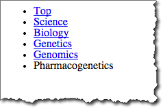

Strategy is similar to that of creating tabs. Use "display: inline" to make list items inline; use background image for "li" to show arrow.
 <nav id="breadcrumbf">
   <ul>
     <li>
       <a href="#">Top       </a>
     </li>
     <li>
       <a href="#">Science       </a>
     </li>
     <li>
       <a href="#">Biology       </a>
     </li>
     <li>
       <a href="#">Genetics       </a>
     </li>
     <li>
       <a href="#">Genomics       </a>
     </li>
     <li>
       <span>Pharmacogenetics       </span>
     </li>   </ul> </nav>
In
head element:
<link rel="stylesheet" href="example15.css"/>/*
Order of pseudo-"a" elements:
LoVe HAte (Link, Visited, Hover, Active
*/
#breadcrumbf a:link, #breadcrumbf a:visited, #breadcrumbf a:hover, #breadcrumbf a:active, #breadcrumbf li span {
color: navy;
font-family: Tahoma, Arial, Helvetica, sans-serif;
font-size: small;
font-weight: normal;
padding: 0.5em;
text-decoration: none;
}
#breadcrumbf a:hover {
text-decoration: underline;
}
#breadcrumbf li span {
color: black;
}
#breadcrumbf ul {
background-color: #ddd;
padding-left: 0px;
margin-left: 0px;
}
#breadcrumbf ul li {
display: inline;
}
#breadcrumbf li:first-child {
background-image: none;
padding-left: 0px;
}
#breadcrumbf li {
background-image: url(images/arrow.gif);
background-position: left;
background-repeat: no-repeat;
padding-left: 25px;
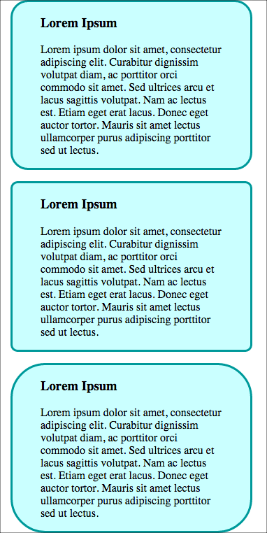
}CSS Rounded Borders

CSS3 border-radius
 <div class="box rounded">
   <h3>Lorem Ipsum   </h3>
   <p>Lorem ipsum dolor sit amet, consectetur adipiscing elit. Curabitur dignissim volutpat diam, ac porttitor orci commodo sit amet. Sed ultrices arcu et lacus sagittis volutpat. Nam ac lectus est. Etiam eget erat lacus. Donec eget auctor tortor. Mauris sit amet lectus ullamcorper purus adipiscing porttitor sed ut lectus.
   </p>
 </div>
 <div class="box tightrounded">
   <h3>Lorem Ipsum   </h3>
   <p>Lorem ipsum dolor sit amet, consectetur adipiscing elit. Curabitur dignissim volutpat diam, ac porttitor orci commodo sit amet. Sed ultrices arcu et lacus sagittis volutpat. Nam ac lectus est. Etiam eget erat lacus. Donec eget auctor tortor. Mauris sit amet lectus ullamcorper purus adipiscing porttitor sed ut lectus.
   </p>
 </div>
 <div class="box looserounded">
   <h3>Lorem Ipsum   </h3>
   <p>Lorem ipsum dolor sit amet, consectetur adipiscing elit. Curabitur dignissim volutpat diam, ac porttitor orci commodo sit amet. Sed ultrices arcu et lacus sagittis volutpat. Nam ac lectus est. Etiam eget erat lacus. Donec eget auctor tortor. Mauris sit amet lectus ullamcorper purus adipiscing porttitor sed ut lectus.
   </p>
 </div>
In style
element
(<style>) within head element:
.box {
    width: 260px;
    padding: 0 40px;
    border: 3px solid #009999;
    background-color: #CCFFFF;
    margin: 1em;
}
.rounded {
     border-radius: 25px;
}
.tightrounded {
     border-radius: 10px;
}
.looserounded {
     border-radius: 50px;
}
CSS Shadows

Photo by D Sharon Pruitt
- box-shadow (MDN)
- text-shadow (MDN)
- CanIUse: box-shadow? or text-shadow?
box-shadow
- box-shadow (MDN)
box-shadow: x-offset y-offset color
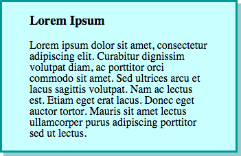
CSS3 box-shadow
 <div class="box shadow">
   <h3>Lorem Ipsum   </h3>
   <p>Lorem ipsum dolor sit amet, consectetur adipiscing elit. Curabitur dignissim volutpat diam, ac porttitor orci commodo sit amet. Sed ultrices arcu et lacus sagittis volutpat. Nam ac lectus est. Etiam eget erat lacus. Donec eget auctor tortor. Mauris sit amet lectus ullamcorper purus adipiscing porttitor sed ut lectus.
   </p>
 </div>
In style
element
(<style>) within head element:
.box {
    width: 260px;
    padding: 0 40px;
    border: 3px solid #009999;
    background-color: #CCFFFF;
}
.shadow {
    box-shadow: 5px 5px #99cccc;
}
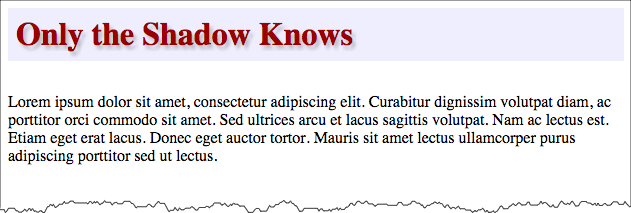
Text Shadow

 <div>
   <h3 class="shadow">Only the Shadow Knows   </h3>
   <p>Lorem ipsum dolor sit amet, consectetur adipiscing elit. Curabitur dignissim volutpat diam, ac porttitor orci commodo sit amet. Sed ultrices arcu et lacus sagittis volutpat. Nam ac lectus est. Etiam eget erat lacus. Donec eget auctor tortor. Mauris sit amet lectus ullamcorper purus adipiscing porttitor sed ut lectus.
   </p>
 </div>
In style
element
(<style>) within head element:
h3.shadow {
  background-color: #eef;
  font-size: 24pt;
  padding: 0.25em;
  color: #900;
  /* offset-x | offset-y | blur-radius | color */
  text-shadow: 3px 4px 4px rgba(150,150,150,0.5)
}
Only the Shadow Knows
Lorem ipsum dolor sit amet, consectetur adipiscing elit. Curabitur dignissim volutpat diam, ac porttitor orci commodo sit amet. Sed ultrices arcu et lacus sagittis volutpat. Nam ac lectus est. Etiam eget erat lacus. Donec eget auctor tortor. Mauris sit amet lectus ullamcorper purus adipiscing porttitor sed ut lectus.
Opacity - RGBA - red, green, blue, alpha
A = alpha channel, used for opacity.
Values of 0 to 1, where 0 is fully transparent, 1 is fully opaque
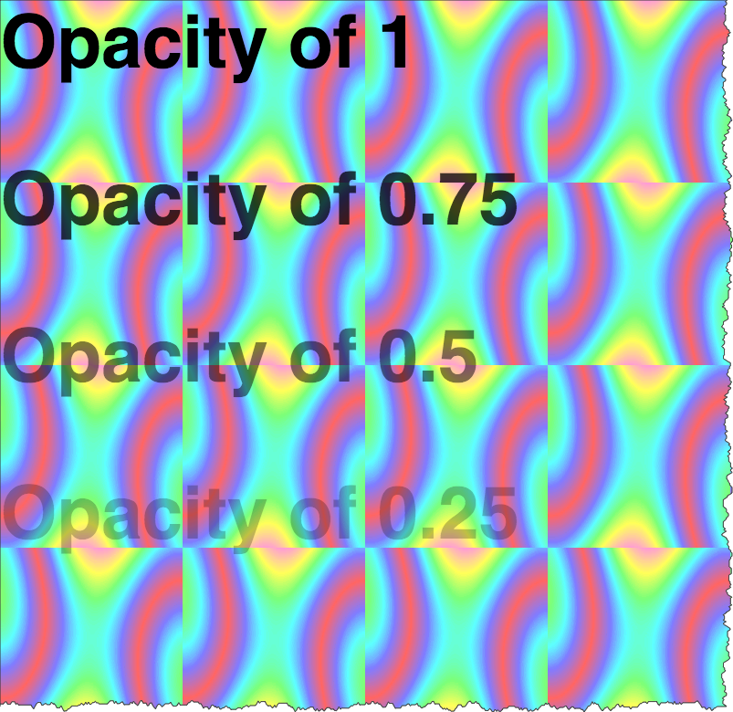
 <div class="opacity-demo">
   <p style="color: rgba(0,0,0,1)">Opacity of 1
   </p>
   <p style="color: rgba(0,0,0,0.75)">Opacity of 0.75
   </p>
   <p style="color: rgba(0,0,0,0.5)">Opacity of 0.5
   </p>
   <p style="color: rgba(0,0,0,0.25)">Opacity of 0.25
   </p>
   <p style="color: rgba(0,0,0,0)">Opacity of 0
   </p>
 </div>
In style
element
(<style>) within head element:
.opacity-demo {
  background-image: url('images/satin.png');
  color: white;
}
.opacity-demo p { font-size: 200%; font-weight: bold; font-family: helvetica,sans-serif;}
Opacity of 1
Opacity of 0.75
Opacity of 0.5
Opacity of 0.25
Opacity of 0
CSS Gradients
- linear-gradient
- radial-gradient
linear-gradient
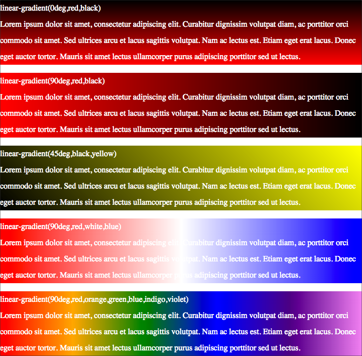
<div class="highlight1">
<p>linear-gradient(0deg,red,black)
<br/>
Lorem ipsum dolor sit amet, consectetur adipiscing elit. Curabitur dignissim volutpat diam, ac porttitor orci commodo sit amet. Sed ultrices arcu et lacus sagittis volutpat. Nam ac lectus est. Etiam eget erat lacus. Donec eget auctor tortor. Mauris sit amet lectus ullamcorper purus adipiscing porttitor sed ut lectus.
</p>
</div>
<div class="highlight2">
<p>linear-gradient(90deg,red,black)
<br/>
Lorem ipsum dolor sit amet, consectetur adipiscing elit. Curabitur dignissim volutpat diam, ac porttitor orci commodo sit amet. Sed ultrices arcu et lacus sagittis volutpat. Nam ac lectus est. Etiam eget erat lacus. Donec eget auctor tortor. Mauris sit amet lectus ullamcorper purus adipiscing porttitor sed ut lectus.
</p>
</div>
<div class="highlight3">
<p>linear-gradient(45deg,black,yellow)
<br/>
Lorem ipsum dolor sit amet, consectetur adipiscing elit. Curabitur dignissim volutpat diam, ac porttitor orci commodo sit amet. Sed ultrices arcu et lacus sagittis volutpat. Nam ac lectus est. Etiam eget erat lacus. Donec eget auctor tortor. Mauris sit amet lectus ullamcorper purus adipiscing porttitor sed ut lectus.
</p>
</div>
<div class="highlight4">
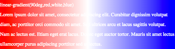
<p>linear-gradient(90deg,red,white,blue)
<br/>
Lorem ipsum dolor sit amet, consectetur adipiscing elit. Curabitur dignissim volutpat diam, ac porttitor orci commodo sit amet. Sed ultrices arcu et lacus sagittis volutpat. Nam ac lectus est. Etiam eget erat lacus. Donec eget auctor tortor. Mauris sit amet lectus ullamcorper purus adipiscing porttitor sed ut lectus.
</p>
</div>
<div class="highlight5">
<p>linear-gradient(90deg,red,orange,yellow,green,blue,indigo,violet)
<br/>
Lorem ipsum dolor sit amet, consectetur adipiscing elit. Curabitur dignissim volutpat diam, ac porttitor orci commodo sit amet. Sed ultrices arcu et lacus sagittis volutpat. Nam ac lectus est. Etiam eget erat lacus. Donec eget auctor tortor. Mauris sit amet lectus ullamcorper purus adipiscing porttitor sed ut lectus.
</p>
</div> In style
element
(<style>) within head element:
.highlight1 {
  background-image: linear-gradient(0deg,red,black);
  color: white;
  line-height: 200%;
}
.highlight2 {
  background-image: linear-gradient(90deg,red,black);
  color: white;
  line-height: 200%;
}
.highlight3 {
  background-image: linear-gradient(45deg,black,yellow);
  color: white;
  line-height: 200%;
}
.highlight4 {
  background-image: linear-gradient(90deg,red,white,blue);
  color: white;
  line-height: 200%;
}
.highlight5 {
  background-image: linear-gradient(90deg, red,orange,yellow,green,blue,indigo,violet);
  color: white;
  line-height: 200%;
}
radial-gradient
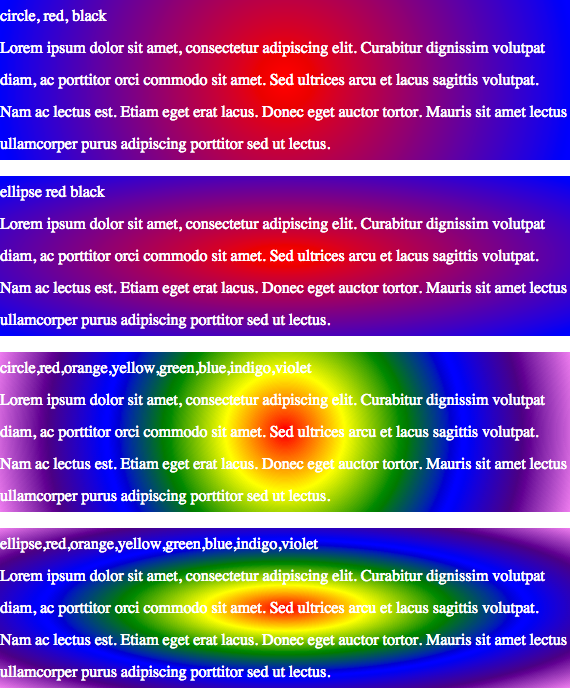
<div class="highlight6">
<p>circle, red, black
<br/>
Lorem ipsum dolor sit amet, consectetur adipiscing elit. Curabitur dignissim volutpat diam, ac porttitor orci commodo sit amet. Sed ultrices arcu et lacus sagittis volutpat. Nam ac lectus est. Etiam eget erat lacus. Donec eget auctor tortor. Mauris sit amet lectus ullamcorper purus adipiscing porttitor sed ut lectus.
</p>
</div>
<div class="highlight7">
<p>ellipse red black
<br/>
Lorem ipsum dolor sit amet, consectetur adipiscing elit. Curabitur dignissim volutpat diam, ac porttitor orci commodo sit amet. Sed ultrices arcu et lacus sagittis volutpat. Nam ac lectus est. Etiam eget erat lacus. Donec eget auctor tortor. Mauris sit amet lectus ullamcorper purus adipiscing porttitor sed ut lectus.
</p>
</div>
<div class="highlight8">
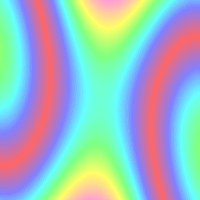
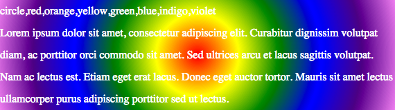
<p>circle,red,orange,yellow,green,blue,indigo,violet
<br/>
Lorem ipsum dolor sit amet, consectetur adipiscing elit. Curabitur dignissim volutpat diam, ac porttitor orci commodo sit amet. Sed ultrices arcu et lacus sagittis volutpat. Nam ac lectus est. Etiam eget erat lacus. Donec eget auctor tortor. Mauris sit amet lectus ullamcorper purus adipiscing porttitor sed ut lectus.
</p>
</div>
<div class="highlight9">
<p>ellipse,red,orange,yellow,green,blue,indigo,violet
<br/>
Lorem ipsum dolor sit amet, consectetur adipiscing elit. Curabitur dignissim volutpat diam, ac porttitor orci commodo sit amet. Sed ultrices arcu et lacus sagittis volutpat. Nam ac lectus est. Etiam eget erat lacus. Donec eget auctor tortor. Mauris sit amet lectus ullamcorper purus adipiscing porttitor sed ut lectus.
</p>
</div> In style
element
(<style>) within head element:
.highlight6 {
  background-image: radial-gradient(circle,red,blue);
  color: white;
  line-height: 200%;
}
.highlight7 {
  background-image: radial-gradient(ellipse,red,blue);
  color: white;
  line-height: 200%;
}
.highlight8 {
  background-image: radial-gradient(circle,red,yellow,green,blue,indigo,violet);
  color: white;
  line-height: 200%;
}
.highlight9 {
  background-image: radial-gradient(ellipse,red,yellow,green,blue,indigo,violet);
  color: white;
  line-height: 200%;
}