Session 05 - CSS and Layouts
Harvard Extension School
Spring 2021
Course Web Site: https://cscie12.dce.harvard.edu/
Topics
- CSS Rules and Specificity
- CSS Colors
- Fonts
- CSS Normalize and Reset
- CSS and Layouts
- CSS Flexbox and Grid
- CSS Flexbox
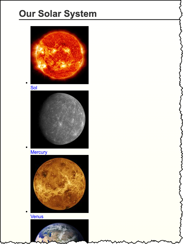
- Solar System
- Responsive Layouts
Presentation contains 32 slides
CSS Best Practices
- Format consistently (e.g. use the default in your text editor)
- Comment
/* || General Styles */ - Have logical sections in your CSS (e.g. General Styles, Header, Footer, content specific, etc.)
- Use semantic names
CSS Best Practices
Use semantic "class" and "id" values
You can choose class and id values when authoring your CSS and HTML. A good rule is to create
"logical" class and id values and not "descriptive" ones. Remember, you've gone to the trouble of
separating markup and presentation -- keep this separation when creating class
names.
If you can guess how the class is styled based upon the name, this should cause you to consider changing the name.
| Good Class/ID Names | Poor Class Names |
|---|---|
|
|
Choosing class and id names appropriately will help with:
- evolution
Your#rightnavmay very well become navigation positioned on the left side or the top.
Your.redboldmay very be changed to another color or background entirely. - specificity and semantics
If you have a.dottedborderclass, you may wish to change how your thumbnail images are styled, but leave presentation of other markup that you've given the same class to unchanged.
Beware of Divitis and Classitis
- divitis
- An unhealthy markup condition characterized by the profligate use of the "div" element
- classitis
- An unhealthy markup condition characterized by the profligate use of "class" attributes
Avoid Divitis, Classitis, Tagitis, etc.
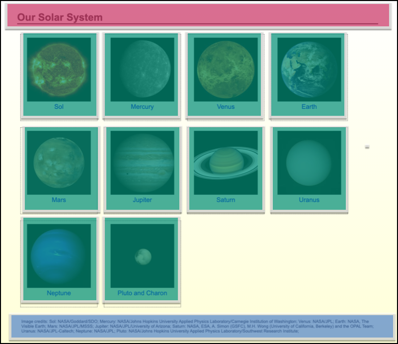
<div class="header">Our Solar System</div>or even
<div class="header"><h1>Our Solar System</h1></div><h1>Our Solar System</h1><div class="basketball">
<ul>
<li>Mark Few</li>
<li>Roy Williams</li>
<li>John Calipari</li>
...
<ul class="basketball">
<li>Mark Few</li>
<li>Roy Williams</li>
<li>John Calipari</li>
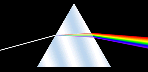
...CSS Rules and Specificity
See: Calculating a selector's specificity.
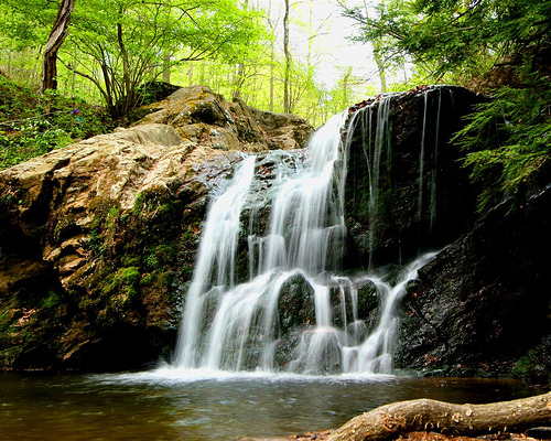
Image from Flickr user Cayusa, used under Creative Commons license.
Stylesheet Origin
- author stylesheet
- reader (user) stylesheet
- browser (user agent) stylesheet
Specificity of Selector
- style attribute
- count "id" attributes
- count number of other attributes ("class")
- count element names
Order
- last occurence has higher specificity
@import-ed stylesheets come before rules in the importing sheet.
CSS Selector Specificity
Specificity is expressed in a form of a list of four numbers: (a,b,c,d)
- inline style
- id
- class, pseudo-class and attributes
- element and pseudo-elements
Start comparing at "a", if equal go to "b", etc.
nav li {...}                     /* (0,0,0,2) */
nav.primary {...}                /* (0,0,1,1) */
nav.primary li {...}             /* (0,0,1,2) */
nav.primary li:first-child {...} /* (0,0,2,2) */
nav.primary li.getinfo {...}     /* (0,0,2,2) */
#globalnav {...}                 /* (0,1,0,0) */
And for a fun take on CSS Specificity, take a look at CSS SpeciFISHity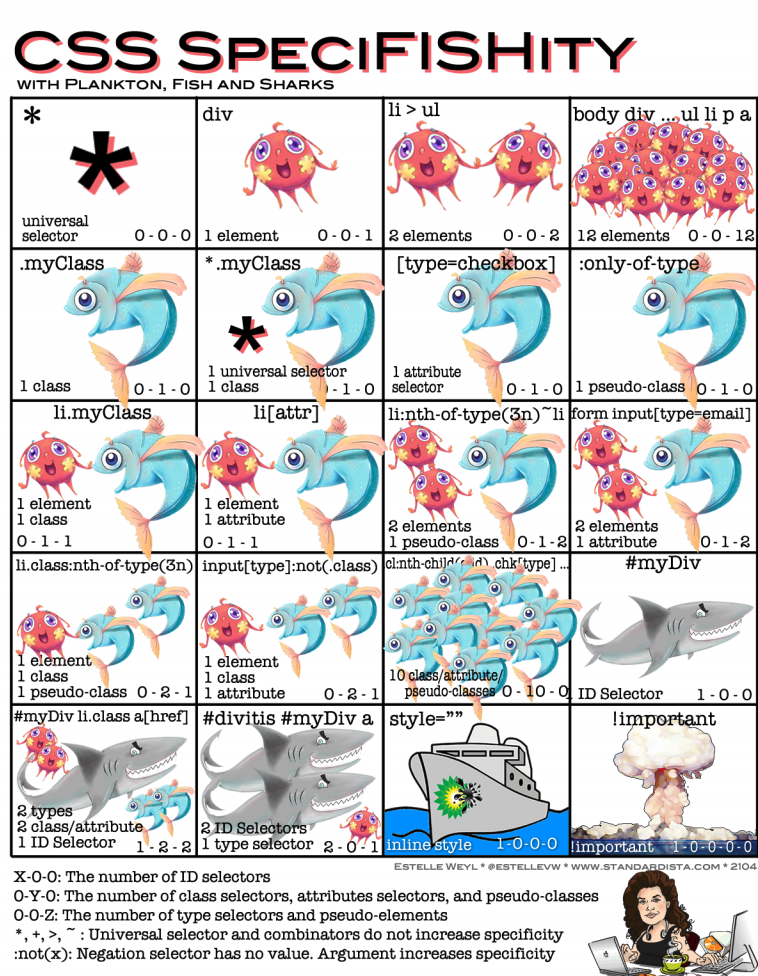
CSS Best Practices
- Format consistently (e.g. use the default in your text editor)
- Comment
/* || General Styles */ - Have logical sections in your CSS (e.g. General Styles, Header, Footer, content specific, etc.)
- Use semantic names
CSS Best Practices
Use semantic "class" and "id" values
You can choose class and id values when authoring your CSS and HTML. A good rule is to create
"logical" class and id values and not "descriptive" ones. Remember, you've gone to the trouble of
separating markup and presentation -- keep this separation when creating class
names.
If you can guess how the class is styled based upon the name, this should cause you to consider changing the name.
| Good Class/ID Names | Poor Class Names |
|---|---|
|
|
Choosing class and id names appropriately will help with:
- evolution
Your#rightnavmay very well become navigation positioned on the left side or the top.
Your.redboldmay very be changed to another color or background entirely. - specificity and semantics
If you have a.dottedborderclass, you may wish to change how your thumbnail images are styled, but leave presentation of other markup that you've given the same class to unchanged.
Beware of Divitis and Classitis
- divitis
- An unhealthy markup condition characterized by the profligate use of the "div" element
- classitis
- An unhealthy markup condition characterized by the profligate use of "class" attributes
Avoid Divitis, Classitis, Tagitis, etc.
<div class="header">Our Solar System</div>or even
<div class="header"><h1>Our Solar System</h1></div><h1>Our Solar System</h1><div class="basketball">
<ul>
<li>Mark Few</li>
<li>Roy Williams</li>
<li>John Calipari</li>
...
<ul class="basketball">
              <li>Mark Few</li>
              <li>Roy Williams</li>
              <li>John Calipari</li>
              ...
CSS Colors
Name
As defined in HTML: aqua, black, blue, fuchsia, gray, green, lime, maroon, navy, olive, purple, red, silver, teal, white, yellow
There are also Extended Color Keywords for CSS3, which are the same as SVG 1.0 colors (SVG is a type of image file format).
RGB Color Space
- decimal numbers (0 to 255)
- hexadecimal numbers (00 to ff)
- percentages (0 to 100%)
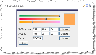
The following are all equivalent ways of defining a shade of orange:
|
HSL Color Space
Hue, Saturation, Lightness (HSL) is another way to specify color value. It is based on a cylindrical model of color. Fore more information see:
In CSS3, you can use HSL values (e.g. hsl(29,100%,66%))
Same Color, Expressed differently
 <div style="background-color: rgb(100%,66%,33%); padding: 1em; ; margin: 1em;">Lorem ipsum dolor sit amet, consectetuer adipiscing elit.
   <br/>
rgb(100%,66%,33%)
 </div>
 <div style="background-color: #ffa854; padding: 1em; margin: 1em; ">Lorem ipsum dolor sit amet, consectetuer adipiscing elit.
   <br/>
#ffa854
 </div>
 <div style="background-color: rgb(255,168,84); padding: 1em; ; margin: 1em;">Lorem ipsum dolor sit amet, consectetuer adipiscing elit.
   <br/>
rgb(255,168,84)
 </div>
 <div style="background-color: hsl(29,100%,66%); padding: 1em; ; margin: 1em;">Lorem ipsum dolor sit amet, consectetuer adipiscing elit.
   <br/>
hsl(29,100%,66%)
</div>rgb(100%,66%,33%)
#ffa854
rgb(255,168,84)
hsl(29,100%,66%)
Colorpicker
- MDN Color picker tool
- DIY -
<input type="color" />
Color Picker
Colors
Exploring Colors and Palettes
- Adobe Color CC
- coolors by Fabrizio Bianchi
- Paletton.com
- WebFX Color Schemes
Fonts
font-family
CSS font-family property takes a comma-separated list of fonts,
and should always end with a generic font-family (e.g. serif, sans-serif, monospace).
body {
  font-family: 'Merriweather Regular', 'Times New Roman', serif;
}
How are fonts defined?
Two approaches with fonts:
- Rely on system fonts
- Use web fonts to deliver font definition as part of the resources loaded by a page
- load the font definition
- use in "font-family" CSS property
Note:
- hosted fonts or our fonts
- multiple ways of loading fonts
linkelement inheadof HTML@importor@font-facein CSS
Font - @font-face
@import url('https://fonts.googleapis.com/css2?family=Montserrat:ital@1&display=swap');

h1,h2,h3,h4,h5,h6 {
  font-family: Montserrat, sans-serif;
}

h1 {
  font-size: 5em;
}

h2 {
  font-size: 3em;
}

body {
  font-family: Georgia, serif;
}
Font - Include through link element
Using a link element to include CSS with @font-face definitions is how some font hosting services recommend including their fonts. Google Fonts does this.
The server delivering the fonts does browser detection and delivers the CSS file with the appropriate font format.
Note that we are having using two Google Fonts -- Cabin Sketch and Cabin.
<link href="https://fonts.googleapis.com/css2?family=Cabin+Sketch:wght@400;700&family=Cabin:wght@400;700&display=swap"
rel="stylesheet">Our CSS:
h1,h2,h3,h4,h5,h6 {
  font-family:"Cabin Sketch", sans-serif;
}

h1 {
  font-size: 3em;
}

h2 {
  font-size: 2em;
}

body {
  font-family: Cabin, serif;
}
Note that nothing magical is going on here -- Google is simply returning CSS that uses @font-face with the font format appropriate for the browser making the request.
/* latin */
@font-face {
  font-family: 'Cabin Sketch';
  font-style: normal;
  font-weight: 400;
  font-display: swap;
  src: local('Cabin Sketch Regular'), local('CabinSketch-Regular'), url(https://fonts.gstatic.com/s/cabinsketch/v14/QGYpz_kZZAGCONcK2A4bGOj8mNhNy_r-Kw.woff2) format('woff2');
  unicode-range: U+0000-00FF, U+0131, U+0152-0153, U+02BB-02BC, U+02C6, U+02DA, U+02DC, U+2000-206F, U+2074, U+20AC, U+2122, U+2191, U+2193, U+2212, U+2215, U+FEFF, U+FFFD;
}
/* latin */
@font-face {
  font-family: 'Cabin Sketch';
  font-style: normal;
  font-weight: 700;
  font-display: swap;
  src: local('Cabin Sketch Bold'), local('CabinSketch-Bold'), url(https://fonts.gstatic.com/s/cabinsketch/v14/QGY2z_kZZAGCONcK2A4bGOj0I_1Y5tjzAYOcFg.woff2) format('woff2');
  unicode-range: U+0000-00FF, U+0131, U+0152-0153, U+02BB-02BC, U+02C6, U+02DA, U+02DC, U+2000-206F, U+2074, U+20AC, U+2122, U+2191, U+2193, U+2212, U+2215, U+FEFF, U+FFFD;
}
Font Resources
Finding or exploring fonts:
CSS Normalize and Reset
Two approaches:
- CSS Reset: give yourself a "blank slate" to build upon; that is, effectively remove all browser default styles.
- CSS Normalize: give yourself consistency across browsers.
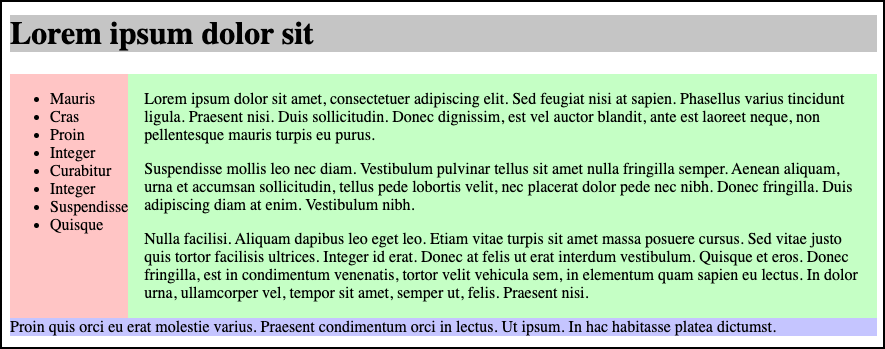
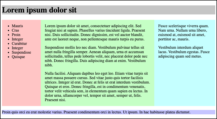
CSS "Reset"
Sometimes it is useful to use a CSS stylesheet to "reset" styling for all elements. This attempts to start your styling with a "blank slate" instead of the browser defaults.
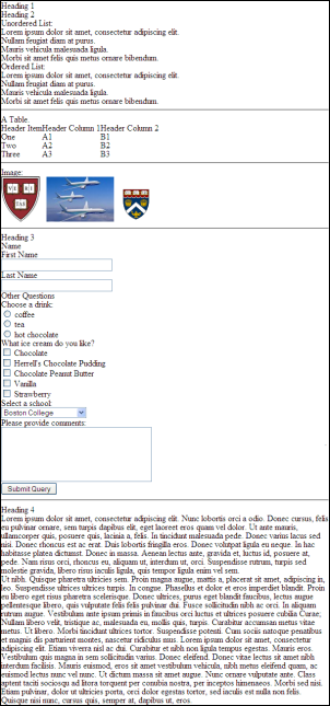
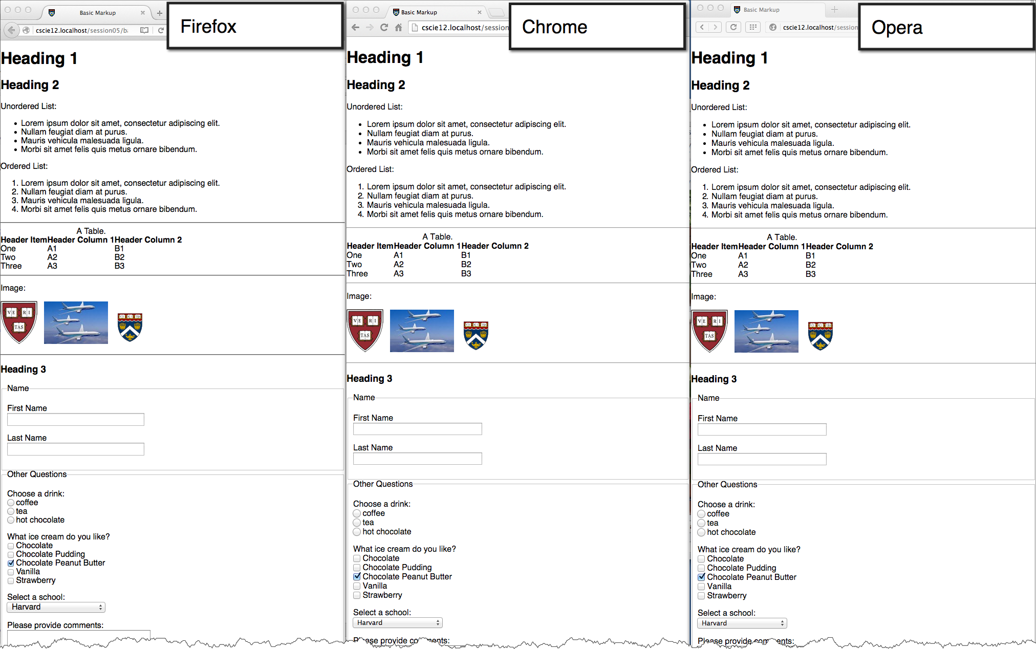
Basic Markup: | With CSS Reset: |
CSS from Eric Meyer for "Reset"
/* https://meyerweb.com/eric/tools/css/reset/
   v2.0 | 20110126
   License: none (public domain)
*/
html, body, div, span, applet, object, iframe,
h1, h2, h3, h4, h5, h6, p, blockquote, pre,
a, abbr, acronym, address, big, cite, code,
del, dfn, em, img, ins, kbd, q, s, samp,
small, strike, strong, sub, sup, tt, var,
b, u, i, center,
dl, dt, dd, ol, ul, li,
fieldset, form, label, legend,
table, caption, tbody, tfoot, thead, tr, th, td,
article, aside, canvas, details, embed,
figure, figcaption, footer, header, hgroup,
menu, nav, output, ruby, section, summary,
time, mark, audio, video {
  margin: 0;
  padding: 0;
  border: 0;
  font-size: 100%;
  font: inherit;
  vertical-align: baseline;
}
/* HTML5 display-role reset for older browsers */
article, aside, details, figcaption, figure,
footer, header, hgroup, menu, nav, section {
  display: block;
}
body {
  line-height: 1;
}
ol, ul {
  list-style: none;
}
blockquote, q {
  quotes: none;
}
blockquote:before, blockquote:after,
q:before, q:after {
  content: '';
  content: none;
}
table {
  border-collapse: collapse;
  border-spacing: 0;
}
CSS Normalize
CSS and Layouts
CSS Flexbox and Grid
Flexbox
- One primary axis
- Basic layouts
- Easier than "Grid"
Grid
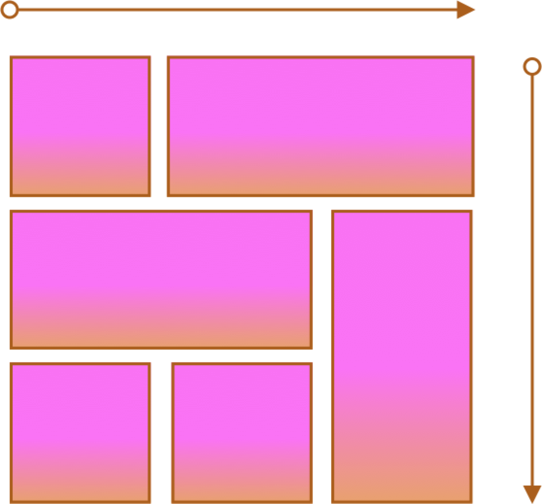
- Two axes
- Overlapping items
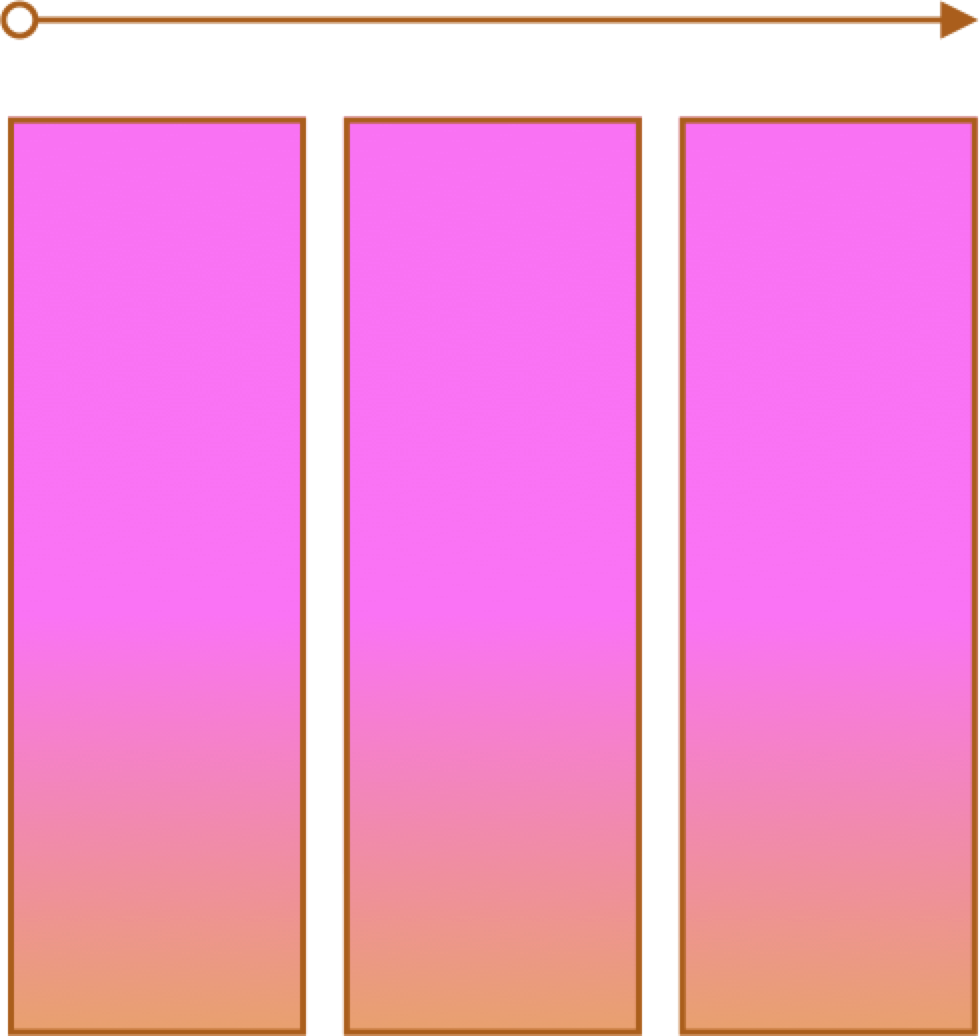
CSS Flexbox
Container and Items
- Set up your flex container
- Set the "flex" properties on things within your container
 <div id="f1container">
   <div class="box box1">1
   </div>
   <div class="box box2">2
   </div>
   <div class="box box3">3
   </div>
   <div class="box box4">4
   </div>
   <div class="box box5">5
   </div>
 </div>
In style
element
(<style>) within head element:
#f1container {
  display: flex;
}
.box {
  padding: 2em;
  border: medium solid black;
  width: 3em;
}
.box1, .box2, .box3, .box4, .box5 {
  flex-grow: 0;
  flex-shrink: 0;
  flex-basis: 5em;
}
.box1 { background-color: lightpink;}
.box2 { background-color: lightsteelblue;}
.box3 { background-color: wheat;}
.box4 { background-color: plum;}
.box5 { background-color: palegreen;}flex-basis
 <div id="f1container">
   <div class="box box1">1
   </div>
   <div class="box box2">2
   </div>
   <div class="box box3">3
   </div>
 </div>
In style
element
(<style>) within head element:
.box {
  padding: 2em;
  border: medium solid black;
  width: 3em;
}
#f1container {
  display: flex;
}
.box1 {
  flex-basis: 15%;
}
.box2 {
  flex-basis: 25%;
}
.box3 {
  flex-basis: 50%;
}
.box1 { background-color: lightpink;}
.box2 { background-color: lightsteelblue;}
.box3 { background-color: wheat;}
.box4 { background-color: plum;}
.box5 { background-color: palegreen;}
flex-grow and flex-shrink
 <div id="f1container">
   <div class="box box1">1
   </div>
   <div class="box box2">2
   </div>
   <div class="box box3">3
   </div>
 </div>
In style
element
(<style>) within head element:
.box {
  padding: 2em;
  border: medium solid black;
  width: 3em;
}
#f1container {
  display: flex;
}
.box1 {
  flex-grow: 1;
  flex-shrink: 1;
  flex-basis: 200px;
}
.box2 {
  flex-grow: 1;
  flex-shrink: 1;
  flex-basis: 100px;
}
.box3 {
  flex-grow: 1;
  flex-shrink: 1;
  flex-basis: 500px;
}
.box1 { background-color: lightpink;}
.box2 { background-color: lightsteelblue;}
.box3 { background-color: wheat;}
.box4 { background-color: plum;}
.box5 { background-color: palegreen;}
Flex
Solar System
Responsive Layouts
Site is "responsive" to different devices.

CSS media query:
/* Larger than mobile */
@media (min-width: 400px) { /* specific rules go here */ }

/* Larger than phablet (also point when grid becomes active) */
@media (min-width: 550px) { /* specific rules go here */ }

/* Larger than tablet */
@media (min-width: 750px) { /* specific rules go here */ }

/* Larger than desktop */
@media (min-width: 1000px) { /* specific rules go here */ }

/* Larger than Desktop HD */
@media (min-width: 1200px) { /* specific rules go here */ }
Responsive Web Design: CSS Media Query
Media queries can be used to include style sheets (media attribute) or in CSS rules (@media rule) or @import statement
Link to stylesheet
<link rel="stylesheet" type="text/css"
  media="screen and (max-device-width: 480px)"
  href="smallscreen.css" />
CSS rule
@media screen and (max-device-width: 480px) {
  /* rules for small screens */
  .column { float: none; }
}
@import statement
@import url('smallscreen.css') screen and (max-device-width: 480px);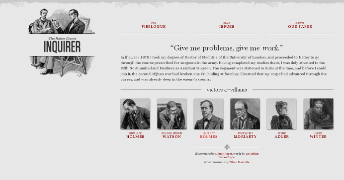
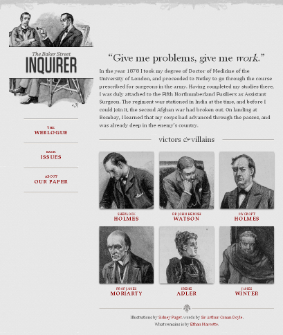
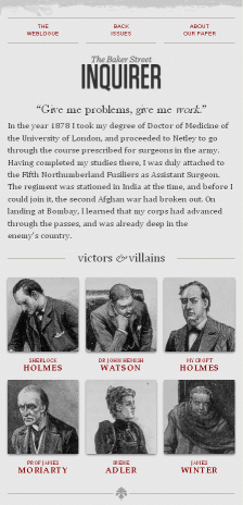
Responsive Web Design
- A Book Apart: Responsive Web Design
- Article: Responsive Web Design by Ethan Marcotte on A List Apart
- A List Apart: Responsive Design Articles
