Session 05 - CSS and Flex and Responsive CSS
Harvard Extension School
Fall 2021
Course Web Site: https://cscie12.dce.harvard.edu/
Topics
- A CSS Example: WebAIM
- CSS Best Practices
- CSS Rules and Specificity
- Box Sizing - How do you measure width?
- CSS calc()
- CSS Normalize and Reset
- CSS Flexbox and Grid
- CSS Flexbox
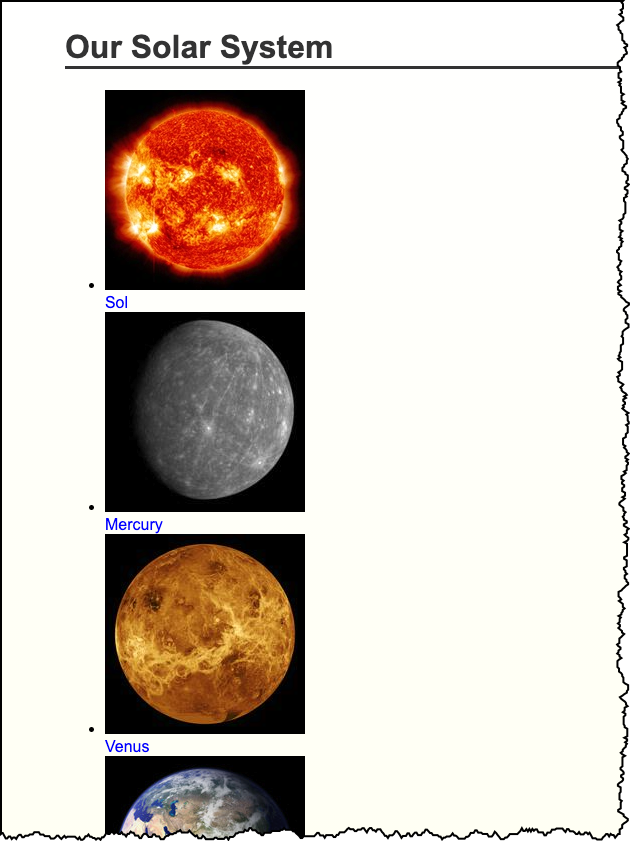
- Solar System
- Responsive Layouts
- Responsive Example - Birds!
Presentation contains 23 slides
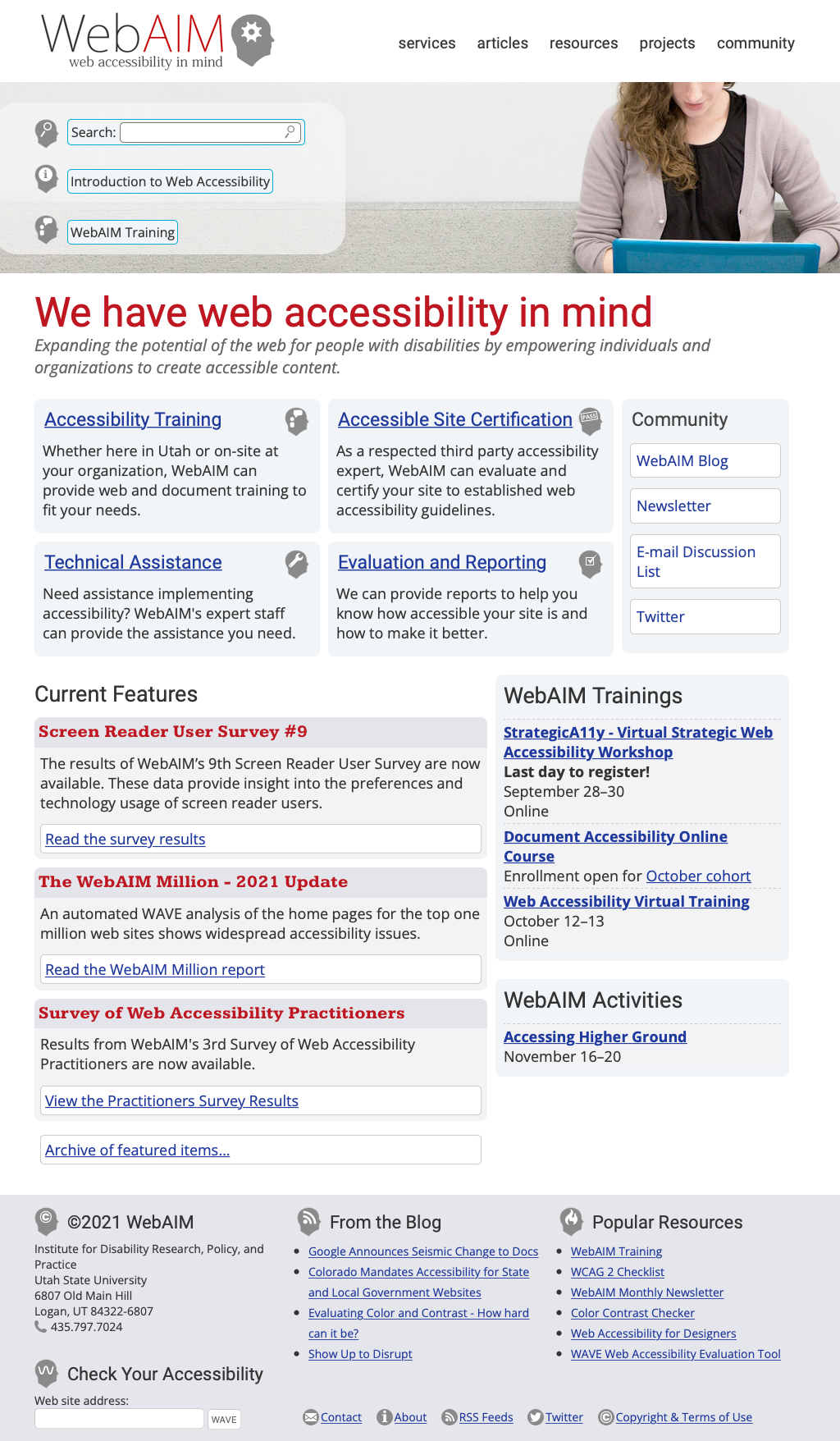
A CSS Example: WebAIM
CSS Best Practices
- Format consistently (e.g. use the default in your text editor)
- Comment
/* || General Styles */ - Have logical sections in your CSS (e.g. General Styles, Header, Footer, content specific, etc.)
- Use semantic names
CSS Best Practices
Use semantic "class" and "id" values
You can choose class and id values when authoring your CSS and HTML. A good rule is to create
"logical" class and id values and not "descriptive" ones. Remember, you've gone to the trouble of
separating markup and presentation -- keep this separation when creating class
names.
If you can guess how the class is styled based upon the name, this should cause you to consider changing the name.
| Good Class/ID Names | Poor Class Names |
|---|---|
|
|
Choosing class and id names appropriately will help with:
- evolution
Your#rightnavmay very well become navigation positioned on the left side or the top.
Your.redboldmay very be changed to another color or background entirely. - specificity and semantics
If you have a.dottedborderclass, you may wish to change how your thumbnail images are styled, but leave presentation of other markup that you've given the same class to unchanged.
Beware of Divitis and Classitis
- divitis
- An unhealthy markup condition characterized by the profligate use of the "div" element
- classitis
- An unhealthy markup condition characterized by the profligate use of "class" attributes
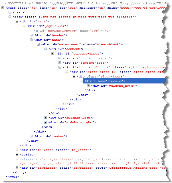
Avoid Divitis, Classitis, Tagitis, etc.
<div class="header">Our Solar System</div>or even
<div class="header"><h1>Our Solar System</h1></div><h1>Our Solar System</h1><div class="basketball">
<ul>
<li>Mark Few</li>
<li>Roy Williams</li>
<li>John Calipari</li>
...
<ul class="basketball">
              <li>Mark Few</li>
              <li>Roy Williams</li>
              <li>John Calipari</li>
              ...
CSS Rules and Specificity
See: Calculating a selector's specificity.
Image from Flickr user Cayusa, used under Creative Commons license.
Stylesheet Origin
- author stylesheet
- reader (user) stylesheet
- browser (user agent) stylesheet
Specificity of Selector
- style attribute
- count "id" attributes
- count number of other attributes ("class")
- count element names
Order
- last occurence has higher specificity
@import-ed stylesheets come before rules in the importing sheet.
CSS Selector Specificity
Specificity is expressed in a form of a list of four numbers: (a,b,c,d)
- inline style
- id
- class, pseudo-class and attributes
- element and pseudo-elements
Start comparing at "a", if equal go to "b", etc.
nav li {...}                     /* (0,0,0,2) */
nav.primary {...}                /* (0,0,1,1) */
nav.primary li {...}             /* (0,0,1,2) */
nav.primary li:first-child {...} /* (0,0,2,2) */
nav.primary li.getinfo {...}     /* (0,0,2,2) */
#globalnav {...}                 /* (0,1,0,0) */
And for a fun take on CSS Specificity, take a look at CSS SpeciFISHity
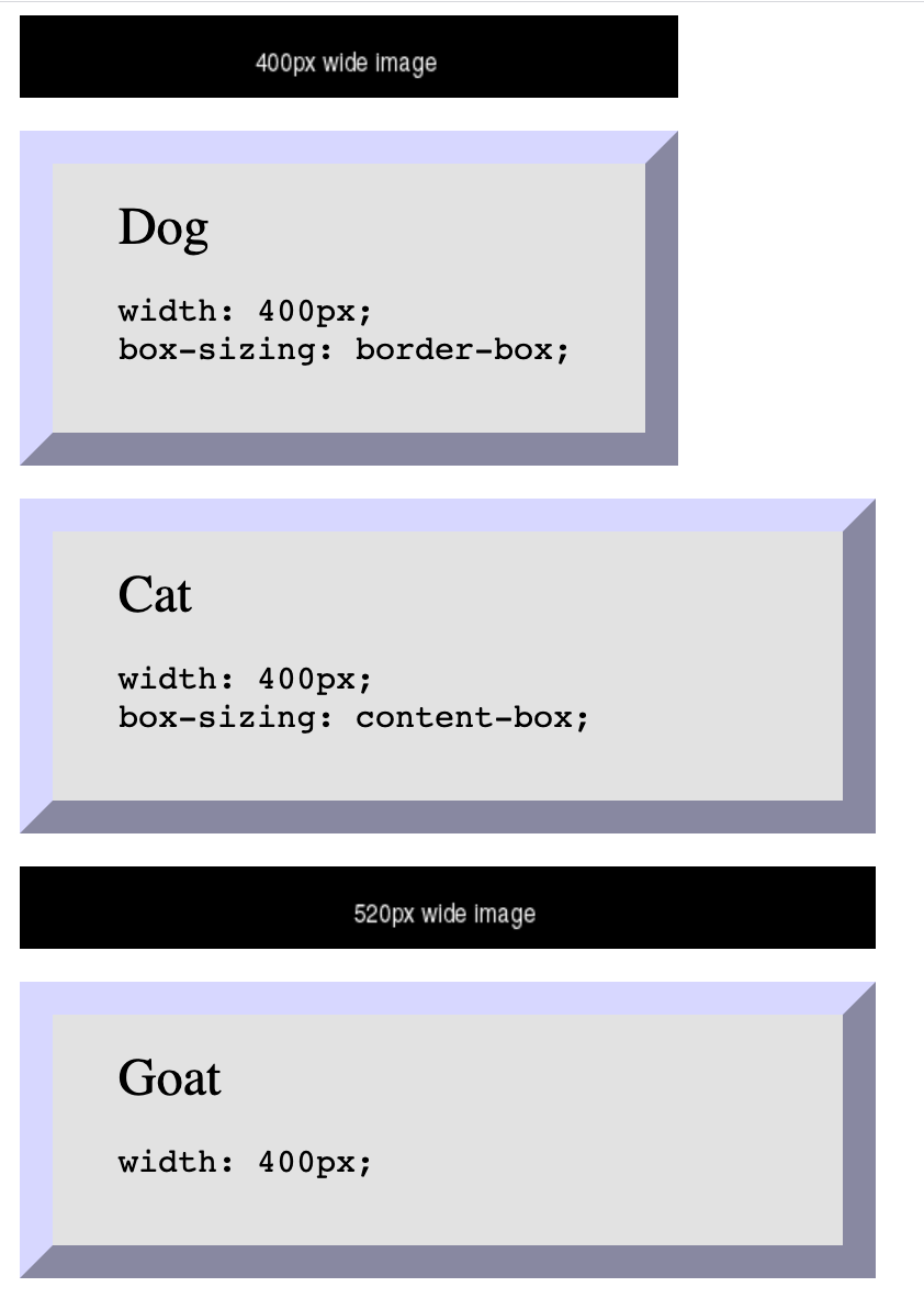
Box Sizing - How do you measure width?
By default, box sizing (width or height) is measured in terms of the "content-box". So any padding or border is "in addition to" the width set in CSS.
 <img src="https://via.placeholder.com/400x50/000000/ffffff.png?text=400px+wide+image"/>

 <div class="dog sizing">Dog
   <pre>width: 400px; box-sizing: border-box;   </pre>
 </div>
 <div class="cat">Cat
   <pre>width: 400px; box-sizing: content-box;   </pre>
 </div>
 <img src="https://via.placeholder.com/520x50/000000/ffffff.png?text=520px+wide+image"/>

 <div class="goat">Goat
   <pre>width: 400px;   </pre>
 </div>
In style
element
(<style>) within head element:
  .dog {
    box-sizing: border-box;
  }
  .cat {
    box-sizing: content-box;
  }
  .goat {
    box-sizing: unset;
  }
  div {
    margin: 20px;
    font-size: xx-large;
    background-color: rgb(230,230,230);
    padding: 20px 40px;
    text-align: left;
    width: 400px;
    border: 20px outset rgb(220,220,255);
  }
  div pre { font-size: x-large;}

  img { margin-left: 20px;}
CSS calc()
CSS calc() function give a way to calculate values. See: calc() function on MDN
width: calc(33% - 2rem);
 <ul>
   <li>Item One
   </li>
   <li>Item Two
   </li>
   <li>Item Three
   </li> </ul>
In style
element
(<style>) within head element:
  ul, li { margin-left: 0; padding-left: 0;}
  ul { list-style: none; overflow: auto; background-color: #ffffdd; border: thin solid black;}
  li { box-sizing: border-box; padding: 1rem; margin: 1rem; float: left; width: calc(33% - 2rem);
    font-weight: bold; text-align: center; border: 5px dotted green; }
CSS Normalize and Reset
Two approaches:
- CSS Reset: give yourself a "blank slate" to build upon; that is, effectively remove all browser default styles.
- CSS Normalize: give yourself consistency across browsers.
CSS "Reset"
Sometimes it is useful to use a CSS stylesheet to "reset" styling for all elements. This attempts to start your styling with a "blank slate" instead of the browser defaults.
CSS Normalize
CSS Flexbox and Grid
Flexbox
- One primary axis
- Basic layouts
- Easier than "Grid"
Grid
- Two axes
- Layouts and more complex layouts
- Overlapping items
CSS Flexbox
Container and Items
- Set up your flex container
- Set the "flex" properties on the items within your container
 <div id="f3container">
   <div class="box box1">1
   </div>
   <div class="box box2">2
   </div>
   <div class="box box3">3
   </div>
   <div class="box box4">4
   </div>
   <div class="box box5">5
   </div>
 </div>
In style
element
(<style>) within head element:
#f3container {
  display: flex;
}
.box1, .box2, .box3, .box4, .box5 {
  flex-grow: 0;
  flex-shrink: 0;
  flex-basis: 5em;
}
.box1 { background-color: lightpink;}
.box2 { background-color: lightsteelblue;}
.box3 { background-color: wheat;}
.box4 { background-color: plum;}
.box5 { background-color: palegreen;}
.box {
  padding: 2em;
  border: medium solid black;
  width: 3em;
}
flex-basis
 <div id="f4container">
   <div class="box box1">1
   </div>
   <div class="box box2">2
   </div>
   <div class="box box3">3
   </div>
 </div>
In style
element
(<style>) within head element:
#f4container {
  display: flex;
}
.box1 {
  flex-basis: 15%;
  background-color: lightpink;
}
.box2 {
  flex-basis: 25%;
  background-color: lightsteelblue;
}
.box3 {
  flex-basis: 50%;
  background-color: wheat;
}
.box {
  padding: 2em;
  border: medium solid black;
  width: 3em;
}
flex-grow and flex-shrink
 <div id="f5container">
   <div class="box box1">1
   </div>
   <div class="box box2">2
   </div>
   <div class="box box3">3
   </div>
 </div>
In style
element
(<style>) within head element:
#f5container {
  display: flex;
}
.box1 {
  flex-grow: 1;
  flex-shrink: 1;
  flex-basis: 200px;
  background-color: lightpink;
}
.box2 {
  flex-grow: 1;
  flex-shrink: 1;
  flex-basis: 100px;
  background-color: lightsteelblue;
}
.box3 {
  flex-grow: 1;
  flex-shrink: 1;
  flex-basis: 500px;
  background-color: wheat;
}
.box {
  padding: 2em;
  border: medium solid black;
  width: 3em;
}
Flex and Wrap
 <div id="f6container">
   <div class="box box1">1
   </div>
   <div class="box box2">2
   </div>
   <div class="box box3">3
   </div>
   <div class="box box4">4
   </div>
   <div class="box box5">5
   </div>
   <div class="box box6">6
   </div>
 </div>
In style
element
(<style>) within head element:
#f6container {
  display: flex;
  flex-wrap: wrap;
  justify-content: space-evenly;
  background-color: linen;
  border: thin solid black;
}
.box1, .box2, .box3, .box4, .box5, .box6 {
  flex-grow: 0;
  flex-shrink: 0;
  flex-basis: 28%;
  box-sizing: border-box;
  margin: 1rem 0;
}
.box1 { background-color: lightpink;}
.box2 { background-color: lightsteelblue;}
.box3 { background-color: wheat;}
.box4 { background-color: plum;}
.box5 { background-color: palegreen;}
.box6 { background-color: turquoise;}
.box {
  padding: 2em;
  border: medium solid black;
}
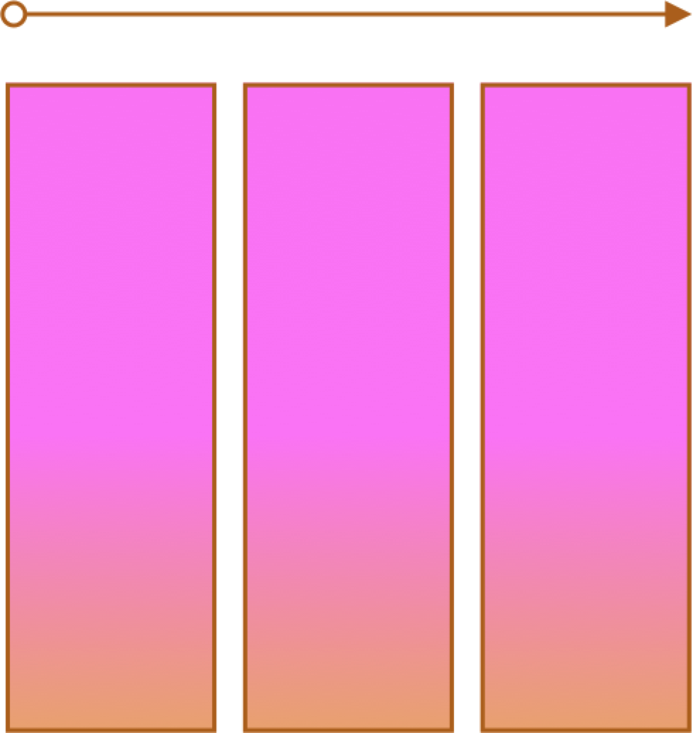
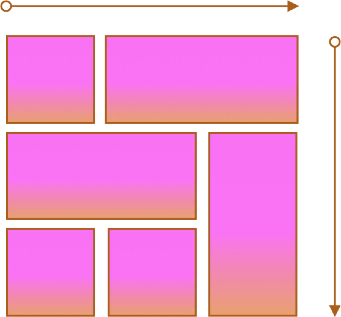
Flex and Simple Layouts
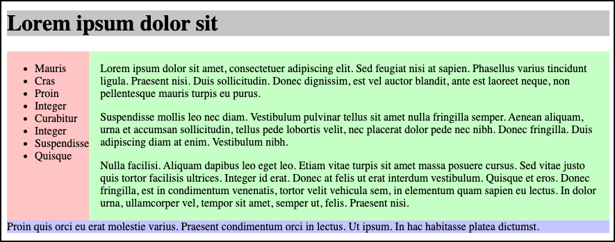
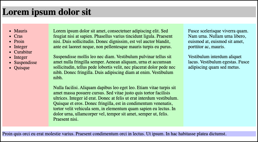
Solar System
Responsive Layouts
Site is "responsive" to different devices.

CSS media query:
/* Larger than mobile */
@media (min-width: 400px) { /* specific rules go here */ }

/* Larger than phablet (also point when grid becomes active) */
@media (min-width: 550px) { /* specific rules go here */ }

/* Larger than tablet */
@media (min-width: 750px) { /* specific rules go here */ }

/* Larger than desktop */
@media (min-width: 1000px) { /* specific rules go here */ }

/* Larger than Desktop HD */
@media (min-width: 1200px) { /* specific rules go here */ }
Responsive Web Design: CSS Media Query
Media queries can be used to include style sheets (media attribute) or in CSS rules (@media rule) or @import statement
Link to stylesheet
<link rel="stylesheet" type="text/css"
  media="screen and (max-device-width: 480px)"
  href="smallscreen.css" />
CSS rule
@media screen and (max-device-width: 480px) {
  /* rules for small screens */
  .column { float: none; }
}
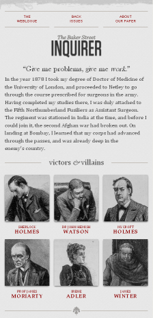
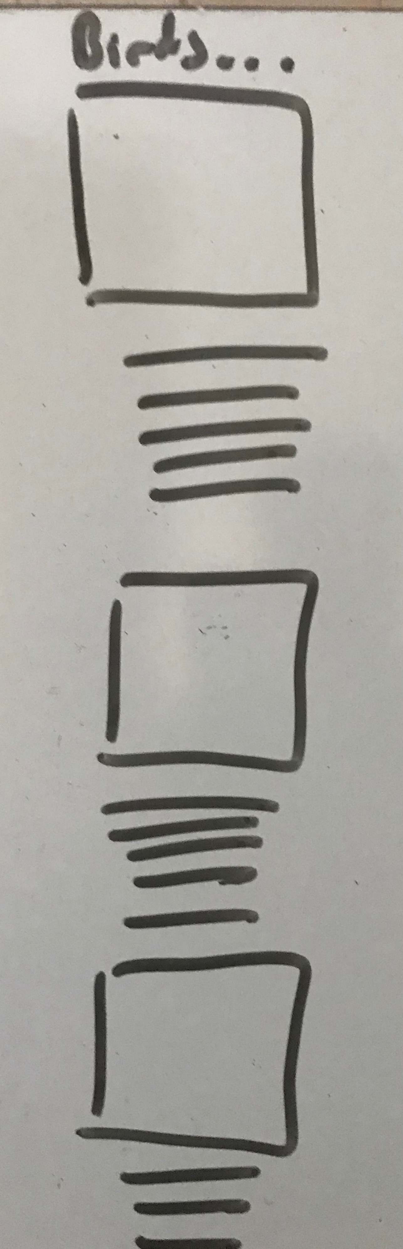
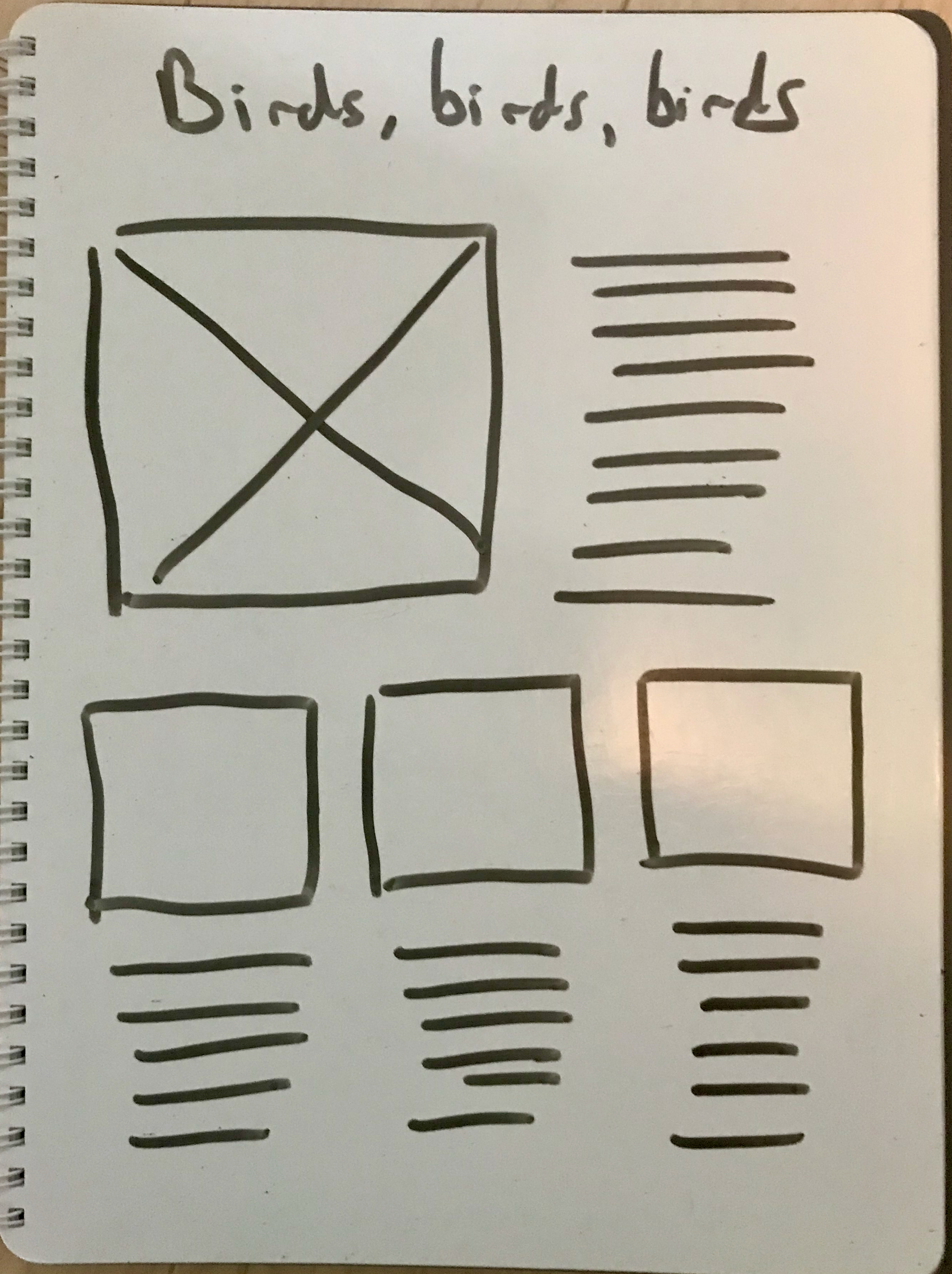
Responsive Example - Birds!